

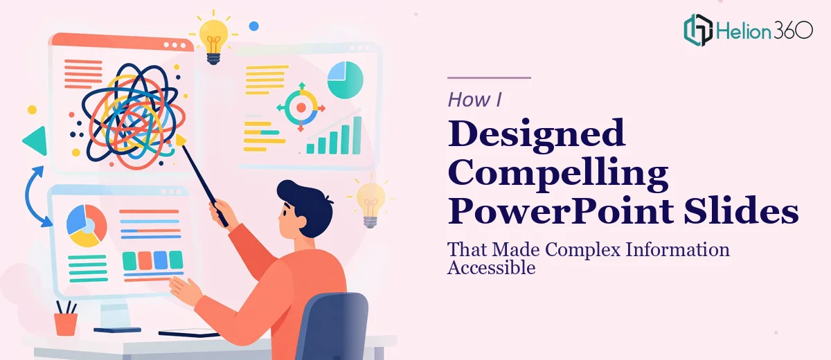
When a Good Idea Gets Lost in a Bad Slide
I had a presentation to put together for an internal business review — the kind that had a lot of moving parts. Data, process flows, strategic context, and a handful of key recommendations that leadership needed to walk away understanding clearly. The content was solid. The problem was making it actually look like something people would want to read.
I opened PowerPoint, started building, and within about an hour I had something that looked more like a dense report than a professional presentation. Too much text on every slide, mismatched layouts, charts that were technically accurate but visually overwhelming. The message was there — it just was not coming through.
Where the Real Challenge Started
The issue was not the information itself. It was the translation. Taking complex information and making it visually accessible is a specific skill, and I realized quickly that knowing what you want to say is very different from knowing how to show it.
I tried reworking the layouts, experimenting with different slide structures, simplifying the charts. I spent a few hours on it and got to a point where it was better — but still not at the level it needed to be for a high-stakes meeting. Some slides felt cluttered even after trimming. The visual hierarchy was inconsistent. And the overall deck lacked a coherent look that would hold attention from slide one through to the end.
There is a specific kind of PowerPoint design work that goes beyond just knowing the software. It involves visual storytelling, understanding how an audience processes information on a slide, and knowing how to use layout, typography, and spacing to guide the eye. I did not have the bandwidth or the background to get there on my own in the time I had.
Bringing in the Right Help
That is when I came across Helion360. I explained where I was — a deck that was content-complete but visually inconsistent — and sent over what I had. They came back with a few questions about the audience, the tone, and whether there were any brand guidelines to follow. The conversation was practical and efficient.
From there, their team took over the design work entirely. They restructured several slides to give breathing room to the key points, rebuilt the charts so data was easier to scan at a glance, and applied a consistent visual system across the full deck. The typography choices were clean and readable. The color palette was restrained but professional. The slides that had previously felt like walls of information now felt purposeful and clear.
What the Final Deck Actually Did
The redesigned presentation did what a good PowerPoint should do — it supported the conversation rather than distracting from it. Leadership could follow the narrative without needing to decode the slides. The data visualizations were easy to reference in the moment, and the layout made it natural to move from one point to the next without losing the thread.
That is the thing about compelling PowerPoint design that often gets overlooked: a well-designed slide does not call attention to itself. It just makes the content land more effectively. When I looked at the before and after, the difference was significant — not because anything dramatic had been added, but because everything unnecessary had been removed and what remained had been given the right amount of visual weight.
What I Took Away From the Process
I learned that professional presentation design is genuinely its own discipline. Understanding what information needs to be on a slide is one part of the work. Understanding how to present that information clearly and visually — with the right hierarchy, the right spacing, the right choice between a chart and a simple statement — is a completely different skill set.
For anyone working on a presentation where the stakes are real and the content is complex, getting the design right is not a cosmetic concern. It is a communication concern. A cluttered or visually inconsistent deck can undermine even the best-prepared content.
If you are sitting on a presentation that is content-ready but not quite there visually, Business Presentation Design Services from Helion360 is worth reaching out to — their team handles exactly this kind of work and delivers compelling visual presentations you can actually use with confidence.