

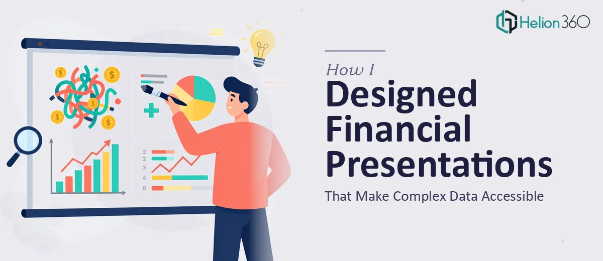
When Financial Data Meets Slide Design
I was tasked with creating a series of financial presentations for three different audiences — internal colleagues who knew the numbers well, clients who needed context, and external partners who needed the bigger picture. The raw material I had was solid: spreadsheets, quarterly reports, projection models, and research summaries. The challenge was turning all of that into slides that people would actually follow and understand.
On the surface, it sounded manageable. I had used PowerPoint before. I understood the financial data. How hard could it be?
Harder than I expected.
The Gap Between Understanding Data and Presenting It
The first few slides came together quickly enough — title slide, agenda, a simple revenue chart. But as I moved into the denser sections — risk analysis, multi-year projections, segmented performance breakdowns — I started running into real problems.
Every time I tried to put a complex financial concept onto a single slide, it either looked cluttered or lost its meaning. I tried shrinking the font to fit more in. I tried splitting content across multiple slides and then lost the narrative thread. The charts I pulled directly from Excel looked functional but flat, and the visual hierarchy was all over the place.
I also realized that the design principles for financial presentation design are genuinely different from general business slides. Financial data requires a careful balance — precise enough to be credible, visual enough to be accessible, and structured enough to guide a non-technical reader without losing the analytical audience. I was struggling to hit all three at once.
Bringing in the Right Help
After a week of back-and-forth revisions that were going nowhere productive, I reached out to Helion360. I explained what I was working on — the audience types, the data sources, the tone we needed, and the deadline. Their team asked the right questions upfront and took the brief seriously.
What stood out immediately was that they understood the specific demands of complex financial data visualization. They did not just make things look nice — they restructured how the information flowed. Dense tables became clean comparison visuals. Multi-variable projections were broken into a sequence that told a story rather than dumped numbers on a screen. Each slide had a clear focal point, and the visual hierarchy made it obvious what the viewer should read first.
They also maintained consistency across the entire deck — something I had been struggling to manage as the slide count grew. Fonts, color use, chart styles, and spacing all followed the same logic throughout.
What the Final Presentation Actually Did
The finished deck covered around forty slides across three versions — one tailored for each audience. The internal version kept the detail but organized it into clearly labeled sections. The client version simplified the visuals and led with outcomes. The partner version focused on context and forward-looking data with supporting charts.
When I presented the first version internally, the feedback was noticeably different from what I had been getting on my drafts. People followed along without asking me to explain the slides. The questions they asked were about the content — not about what they were looking at. That was the shift I had been trying to create.
The experience taught me something practical: knowing your financial data is not the same as knowing how to communicate it visually. Effective executive-ready presentations require a design layer that most subject-matter experts are not trained to provide on their own. The skill gap is real, and it shows up fast when the stakes are high.
The Lesson Worth Keeping
If you are working with complex financial data and need to present it to mixed audiences, the design work is not a finishing step — it is central to whether the presentation works at all. Investing in that layer early saves time, avoids last-minute rework, and produces slides that actually land.
If you are at the same point I was — good data, unclear slides, and a deadline getting closer — Helion360 is worth reaching out to. They handled exactly what I could not do alone and delivered a result that held up across all three audiences.