

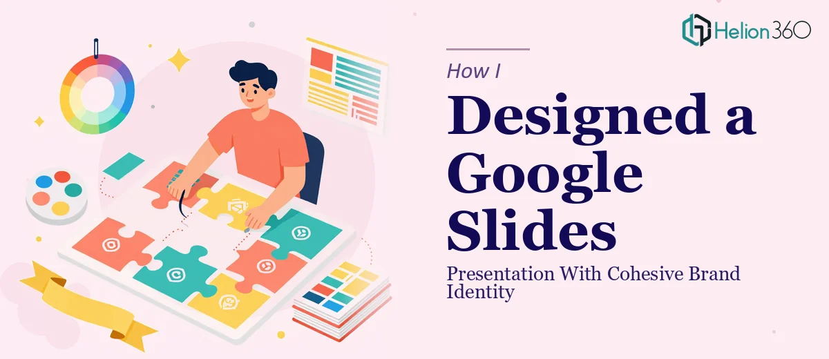
When the Content Is Ready but the Design Is Not
I had all the text finalized. Every slide had its copy, every section had its message. On paper, the presentation was done. But when I opened the Google Slides file and actually looked at it, something was clearly off. The backgrounds were inconsistent, the titles had no visual hierarchy, and the graphics were scattered without any real sense of layout. It looked like a working draft, not something ready to share with anyone outside the team.
The brandbook existed. Colors, typography, logo usage rules, spacing guidance — it was all documented. The problem was translating all of that into a live Google Slides deck in a way that felt intentional, not just decorated.
The Gap Between Having a Brandbook and Using It
I started making edits myself. I updated a few background colors to match the brand palette, repositioned a couple of graphics, and tried adjusting the title styles. It looked better slide by slide, but as a whole deck it still felt uneven. Some slides looked polished while others felt out of place. Getting everything to feel visually consistent across every single slide — with the right spacing, the right color weight, the right font treatment — turned out to be far more involved than I had expected.
Branding in presentations is not just about applying a logo or picking the right hex code. It is about how every visual element on every slide works together to communicate the same identity. That is harder to execute than it looks, especially when you are working across 20 or 30 slides with varying content structures.
I also realized the deadline was tighter than I had planned. The deck needed to be ready by February 19th, and I was running out of time to get it right on my own.
Bringing in the Right Support
That is when I reached out to Helion360. I explained the situation — the content was complete, the brandbook was in hand, and what I needed was someone who could take both and produce a Google Slides presentation that actually felt like the brand. I shared the file, the guidelines, and a few notes on what was not working.
Their team reviewed the brandbook thoroughly before touching the deck. That part stood out to me. Rather than jumping straight into making cosmetic changes, they treated the brand story presentation design as the actual brief. Every design decision — background color choices, title formatting, graphic placement, visual weight — came from what the brandbook defined.
What the Design Process Actually Looked Like
The changes went beyond surface-level styling. The background colors were adjusted slide by slide to reflect the brand's primary and secondary palette without becoming repetitive or heavy. Title treatments were standardized so that every heading followed a consistent visual pattern. Graphics were repositioned to support the content flow rather than compete with it.
The overall result was a deck that read as one cohesive piece. Not a collection of individually styled slides, but a presentation that held together visually from the first slide to the last. The brand persona came through clearly — the colors, the typography choices, the spacing — all of it mapped back to the identity the brandbook had defined.
Helion360 delivered the updated file ahead of the February 19th deadline, which gave me time to review it and request minor refinements before it needed to go out.
What I Took Away From This
Working through this project taught me how much skill goes into Google Slides presentation design when brand consistency is a genuine requirement. It is not just about knowing the colors — it is about understanding how design elements interact across multiple slides to create a unified visual experience. Reading a brandbook and applying it cohesively are two very different things.
The presentation ended up looking exactly like the brand it was meant to represent. That was not a small thing — it was the whole point of the exercise.
If you are in a similar position — the content is ready, the brand guidelines exist, but the slides just do not reflect either — Helion360 is worth reaching out to. They brought both the design skill and brand sensitivity that this kind of project requires.