

When the Brief Was Bigger Than I Expected
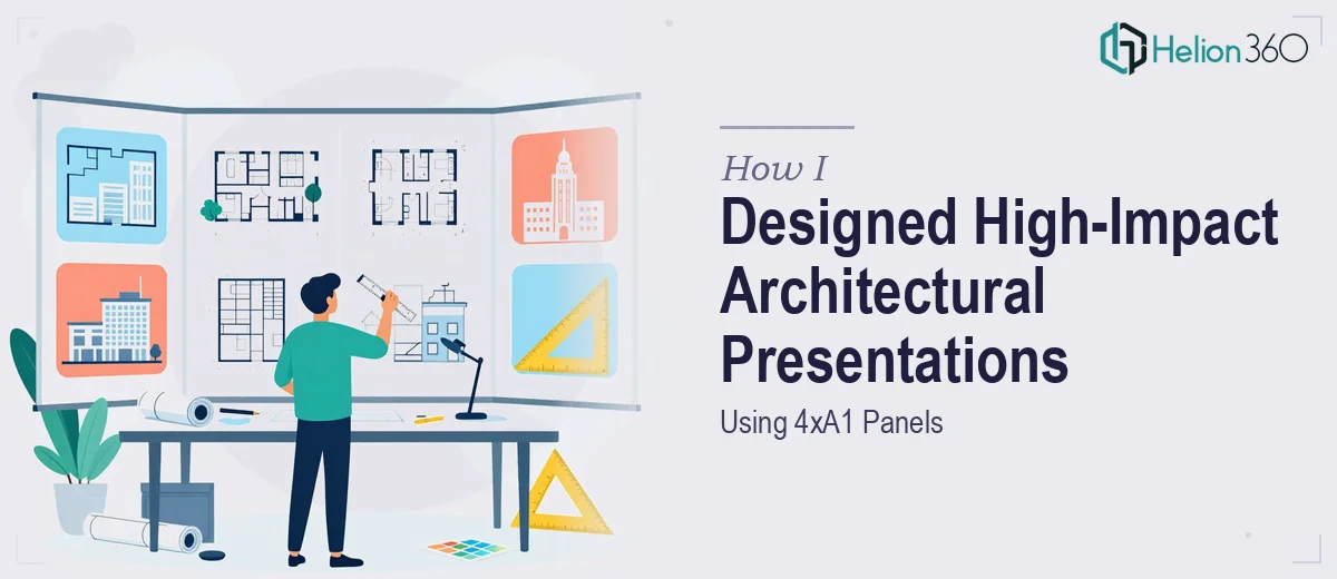
I have worked on plenty of design projects before, but this one came with a specific demand that stopped me in my tracks: four A1-format panels, each one carrying a different layer of architectural information, all of them needing to feel like part of a single cohesive story. The client wanted precision, visual clarity, and something that could hold up at large print size without losing quality or impact.
On paper, it sounded straightforward. In practice, it was anything but.
The Challenge With Large-Format Architectural Panels
The first thing I ran into was scale. Designing for A1 at 300 DPI is a completely different discipline from putting together a standard slide deck or a screen-based presentation. Every element — typography, imagery, spatial diagrams, section drawings — had to be considered at print resolution. What looks clean on screen can fall apart completely when stretched to 594 x 841mm.
I also had to balance technical accuracy with visual communication. Architectural presentations are not just about showing how a building looks. They are about conveying design intent, spatial logic, material choices, and contextual thinking — all within a limited amount of visual real estate. Cramming too much information onto a panel makes it unreadable. Stripping too much away makes it feel thin.
I spent a few days trying to build the layout framework myself. I had the raw content: site analysis drawings, floor plans, renderings, and written annotations. But the moment I started arranging them, I kept running into the same problem. The panels looked either cluttered or disconnected. I could not find the right visual hierarchy that let the eye move naturally from one element to the next.
Bringing in the Right Support
After hitting a wall with the layout, I reached out to Helion360. I explained the project — four A1 panels for an architectural presentation, each covering a distinct aspect of the design proposal, all needing to align visually while standing independently. I shared the raw content and outlined the hierarchy I had in mind.
Their team understood the brief immediately. They did not just jump into styling. They asked the right questions about how the panels would be used — whether they were for a jury review, a client meeting, or an exhibition — because that context shapes how information should be prioritized and how much breathing room the layouts need.
What the Final Panels Looked Like
The team worked through a clear visual system across all four panels. Consistent grid structure, typographic scale, and a restrained colour palette tied everything together while allowing each panel to carry its own content load. The site analysis panel used layered plan drawings with annotated callouts. The concept panel gave prominence to a key rendering while using supporting diagrams to explain the design logic. The materials and technical details panel was dense but legible, organized through careful column structure.
What impressed me most was how the spacing was handled. Large-format portfolio presentation design lives and dies on white space. The Helion360 team understood that giving elements room to breathe was not wasted space — it was what made the panels readable from a distance.
The final files came back print-ready, correctly set up at full A1 resolution with bleed and crop marks in place. No rework needed.
What I Took Away From This
Designing for large-format print is a specialized skill set. It requires a deep understanding of how visual hierarchy works at scale, how to handle high-resolution assets, and how to structure complex technical information so it reads clearly without being oversimplified. These are not skills you develop quickly, and trying to rush through them when a deadline is involved is how projects go wrong.
I also learned that the content you bring to the table matters enormously. Having organized drawings, clear annotations, and a rough sense of the narrative made it much easier for the design team to execute efficiently. The better the brief, the better the output.
If you are working on an architectural presentation — whether it is four A1 panels, a portfolio layout, or a client-facing proposal — and the visual execution is not coming together the way you need it to, Helion360 is worth reaching out to. They handled the parts of this project I could not manage alone and delivered something I was genuinely proud to present.