

The Conference Was Three Days Away and the Deck Wasn't Ready
I had a major conference coming up — the kind where first impressions matter and your materials either open doors or close them. We were presenting a business opportunity to a room full of potential investors and partners, and we needed a PowerPoint presentation that could carry that weight.
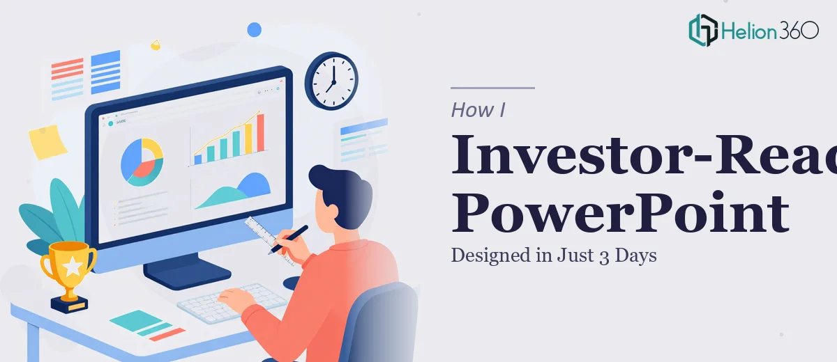
I figured I could pull it together myself. I had the content, I knew the story, and I had used PowerPoint enough times to feel reasonably confident. I started building out the slides, organizing the business model summary, adding some charts, and trying to make it look clean. A few hours in, I had something — but it didn't feel right.
The Problem With DIY Presentation Design Under Pressure
The structure was okay, but the visual side was where things fell apart. I kept second-guessing the layout. The slides looked inconsistent — some text-heavy, others too sparse. I tried to add interactive elements to grab attention, but they looked amateur rather than polished. The branding wasn't quite landing either. I had our existing materials for reference, but translating that into a cohesive, investor-ready business presentation was harder than I expected.
The bigger issue was time. I couldn't afford to spend two days going back and forth on slide design when I had the actual proposal package to finalize. This wasn't a situation where "good enough" would work. Investors notice when a presentation looks rushed.
Bringing in a Team That Could Handle It
After hitting that wall, I came across Helion360. I explained the situation — tight deadline, investor audience, branding requirements, and the need for interactive elements that felt intentional rather than flashy. Their team took it from there.
What helped was that they didn't just ask for the content and disappear. They asked the right questions upfront: Who is the audience? What's the core message on each slide? What materials exist for brand reference? That kind of intake process saved a lot of back-and-forth later.
What the Final Presentation Looked Like
Within the deadline, the deck came back completely transformed. The business model was laid out in a clear, visual flow — easy to follow even for someone seeing it for the first time. The slides had a consistent visual language that matched our existing branding without being a copy-paste job. The interactive elements were subtle but effective — the kind that guide attention rather than distract from it.
More importantly, it read like a professional business opportunity presentation. The hierarchy of information was right. The data visuals were clean. The opening slides set up the opportunity clearly, and the later slides backed it up with enough detail to hold up in a real investor conversation.
What I Learned From the Experience
PowerPoint design for investor presentations is genuinely different from putting together an internal update or a training deck. The bar is higher because the stakes are higher. Every slide is being evaluated not just for what it says but for how confidently the business presents itself.
I also learned that time is the most honest factor in these decisions. I could have eventually gotten the deck to a decent place on my own — but not in three days, not without cutting corners somewhere. The value in working with Helion360 wasn't just the design output. It was the time I got back to focus on the parts of the proposal only I could handle.
The presentation landed well at the conference. Several people asked about who designed it, which is usually a good sign.
If you're in a similar position — a tight deadline, an investor or partner audience, and a presentation that needs to look as credible as the opportunity it represents — Helion360 is worth reaching out to. They handled the complexity I couldn't manage alone and delivered exactly what the moment required.