

I Had Everything Ready — Or So I Thought
When I sat down to put together a 5-slide PowerPoint presentation, I felt confident. The brief was straightforward: take a set of images and bullet points that had already been prepared, lay them out across five slides, and make sure the whole thing looked polished and stayed consistent with the company's brand guidelines.
I had the assets. I had PowerPoint open. I thought it would take a couple of hours.
It took much longer than that — and the result still wasn't what I needed.
Where the Design Work Got Complicated
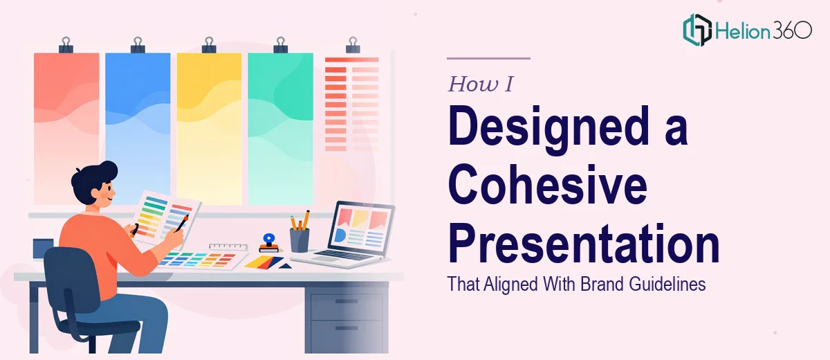
The actual challenge wasn't arranging content on a slide. It was making everything feel cohesive. Each slide had a different amount of text and a different image, and getting them to look like they belonged to the same deck required more than just using the same font and color.
I spent time adjusting layouts, tweaking spacing, resizing images so they didn't look stretched or cropped awkwardly, and trying to figure out the right visual hierarchy so that bullet points didn't end up competing with the photography. Then came the brand guidelines — specific colors, approved typefaces, logo placement rules, and margin requirements that I had to check constantly.
The more I adjusted one slide, the more the others started to drift. What looked consistent on slide two looked off on slide four. I was going in circles.
Custom PowerPoint design — even for just five slides — is a discipline in itself. Knowing the content is one thing. Knowing how to present it visually while keeping the deck on-brand is another.
Bringing in the Right Support
After about a day of iteration with results I wasn't satisfied with, I reached out to Helion360. I described the project: five slides, images and bullet points already provided, brand guidelines to follow, and a need for the final deck to look clean and professionally designed.
Their team asked a few focused questions about the brand palette, font preferences, and how formal the visual tone should be. Then they took the assets and got to work.
What the Finished Presentation Looked Like
The turnaround was faster than I expected. When I reviewed the slides, the difference was immediate. The layout on each slide felt intentional — images were placed in a way that complemented the text rather than crowding it. The bullet points were formatted cleanly, with visual weight that guided the eye naturally. Typography was consistent across all five slides, and the brand colors were applied correctly without feeling heavy-handed.
Most importantly, the deck felt like one cohesive presentation. Not five separate slides that had been assembled — a single, unified piece of communication.
Helion360 also made small structural choices I hadn't considered, like adjusting which elements were dominant on each slide based on what the content was trying to say. Those decisions made the final result feel thought-through, not just assembled.
What I Took Away From This
Designing a branded PowerPoint presentation — even a short one — is more involved than it looks. Having the content ready is the easy part. The hard part is translating that content into a slide design that's visually balanced, brand-accurate, and consistent from the first slide to the last.
If you're working with provided images and copy and need the output to look genuinely professional, the design layer takes real skill. Trying to handle it without that skill costs time and usually produces results that don't match the standard the content deserves.
For anyone in the same position — content in hand, but the actual presentation design feeling harder than it should — Helion360 is worth reaching out to. They handled the design work accurately and delivered a 5-slide PowerPoint that matched the brief exactly.