

The Pressure Was Real From the Start
We had a product launch event coming up in under a month, and somehow, the presentation was the last thing anyone had locked down. The content was mostly written, the key features were documented, we had testimonials from early adopters, and a handful of charts ready to go. On paper, it seemed like the hard part was done.
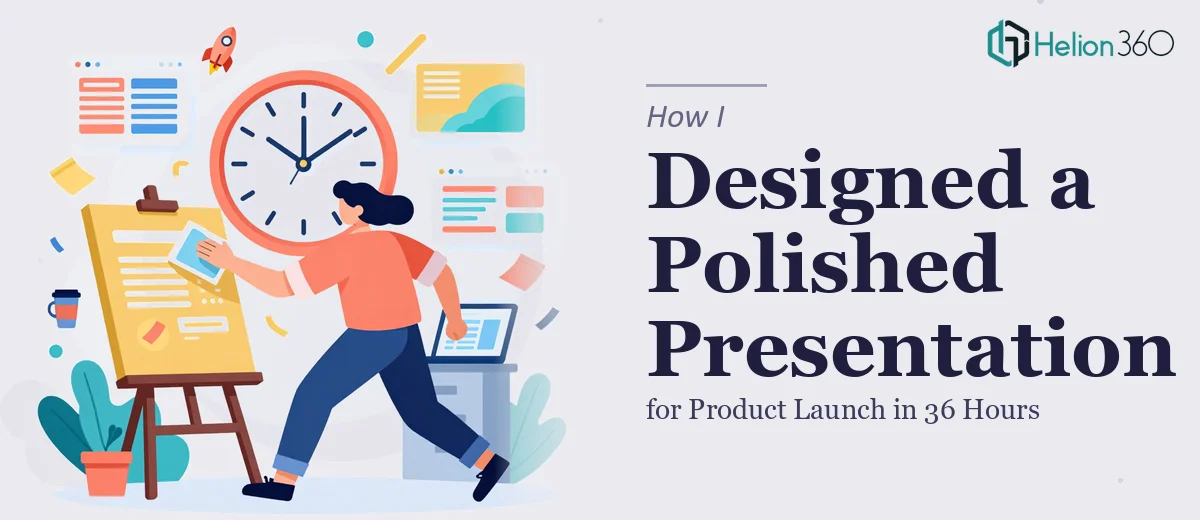
Then the deadline landed: 36 hours to turn all of it into a polished, event-ready PowerPoint.
I figured it was manageable. I opened the slides, pulled in the content, and started laying things out. An hour in, it was already clear this was not going to be a quick job.
Where It Started to Break Down
The problem was not the content — it was the design. Making a product launch presentation look truly polished is a different skill from just organizing information on slides. I could move text boxes around and pick a font, but every time I tried to build something that felt sleek and modern, it came out looking like a corporate template from 2014.
The charts needed to match the visual language of the rest of the deck. The testimonials needed to feel credible and clean, not like pull quotes dropped into a blank space. The feature slides needed hierarchy — a way to guide the eye without dumbing things down. I kept reworking the same three slides and losing time.
With the clock ticking, I knew I needed someone who could work fast without cutting corners on quality.
Bringing In the Right Team
A colleague had mentioned Helion360 after a similar crunch a few months back, so I reached out. I shared the content file, explained the event context, and flagged the 36-hour window. Their team confirmed they could handle it and got started quickly.
What I noticed immediately was that they asked the right questions upfront — about the audience, the tone, whether this was going to a live event or also being shared digitally afterward. Those details ended up shaping decisions throughout the deck.
What the Final Presentation Looked Like
Helion360 came back with a presentation that felt like a completely different product from what I had been wrestling with. The layout had a consistent visual rhythm across every slide. The feature section used iconography and spacing that made each point land without crowding the screen. The testimonials were formatted in a way that felt genuine and readable, not decorative.
The data slides were where I noticed the biggest shift. The charts were redesigned to emphasize the most important numbers without overwhelming the viewer. Color was used with intention — not just to look interesting, but to direct attention. Everything tied back to the product's visual identity in a way I had not been able to achieve on my own.
The full deck came together well within the deadline.
What I Took Away From This
The 36-hour turnaround taught me something I probably already knew but kept ignoring: presentation design is a specialized skill. Knowing how to use PowerPoint and knowing how to design a compelling product launch presentation are not the same thing. The gap shows most clearly when the stakes are high — a live event, a room full of potential customers, a product you have spent months building.
Getting the structure right and the content polished is genuinely half the job. But the visual execution, the slide-by-slide design decisions, the way information is prioritized and presented — that is where a presentation either earns attention or loses it.
If you are facing a tight timeline on a product launch presentation and the design is not coming together the way you need it to, Helion360 is worth a conversation. They handled what I could not in the time I had, and the result held up in front of a real audience.