

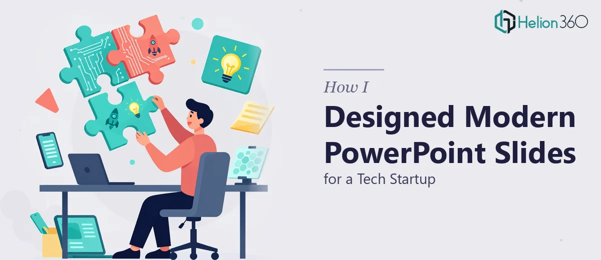
The Brief Sounded Simple Enough
When I took on this project, the ask seemed straightforward: refresh the home slides of an existing PowerPoint presentation for a tech startup. The company was focused on cutting-edge technology solutions, and they wanted their opening slides to reflect that — modern, clean, and immediately communicative to a specific target audience.
I had worked with PowerPoint before, so I figured this was a matter of cleaning up the layout, swapping some fonts, and updating the color palette. A few hours of work at most.
I was wrong.
Where It Started to Fall Apart
The first issue was the brand itself. The startup had a visual identity — colors, a logo, a general aesthetic — but no formal brand guidelines translated into a slide system. That meant I had to reverse-engineer what "modern" looked like for them based on their website, their product screenshots, and a few reference decks they sent over.
I spent more time than I expected just trying to pin down the right typographic hierarchy. Should the headline sit at the top with a bold weight, or anchored to the center with breathing room around it? Should the background be dark with light text, signaling innovation and depth, or light and minimal to signal clarity and trust? These are not arbitrary choices — for a tech startup presenting to potential clients or investors, the home slide sets the entire tone.
Then came the layout problem. The existing slides had content that was crammed and unstructured. Some text was formatted as dense paragraphs that belonged in a document, not a presentation. Replacing that with visual hierarchy — a headline, a supporting line, and a single strong visual element — required not just design sense but a real understanding of what the slide was trying to communicate.
I tried rebuilding the layout a few different ways. Each version felt either too generic or too far from the startup's brand signal. After several rounds of self-critique and a growing sense that I was going in circles, I realized the project needed more than one perspective.
Bringing In a Team That Could Execute It Properly
That's when I reached out to Helion360. I explained the situation — the startup's aesthetic direction, the content constraints, the visual reference points — and their team picked it up from there.
What stood out immediately was how they approached the brand gap. Rather than guessing, they asked the right questions upfront: What does the audience expect to feel when they see the first slide? Is this deck for internal use, external pitching, or both? That framing shaped every design decision that followed.
The home slides they produced were not just visually polished — they were structurally sound. The headline treatment was bold without being loud. The layout gave the content room to breathe. The color usage matched the startup's existing brand cues without rigidly copying them. And the overall presentation design communicated "tech-forward" in a way that felt earned rather than forced.
What a Well-Designed Home Slide Actually Does
This project taught me something I had underestimated: the home slide in a PowerPoint deck is not decorative. It is functional. It sets expectations, establishes credibility, and primes the audience for everything that follows.
For a tech startup especially, the opening slide needs to do a lot of quiet work — signal professionalism, hint at the product category, and make the viewer feel like they are in capable hands before a single word is spoken.
Getting that right requires both design skill and contextual judgment. It is not just about making something look good. It is about making something that works for a specific audience in a specific context.
The Outcome
Helion360 delivered slides that the startup was able to use immediately across multiple contexts — client introductions, internal alignment, and early-stage demos. The presentation design was consistent, the visual storytelling was coherent, and the home slides finally matched the level of the product being shown.
If you are working on a startup presentation and the opening slides are not landing the way you need them to, Helion360 is worth a conversation — they have the design depth to handle the kind of nuanced work that looks simple but rarely is.