

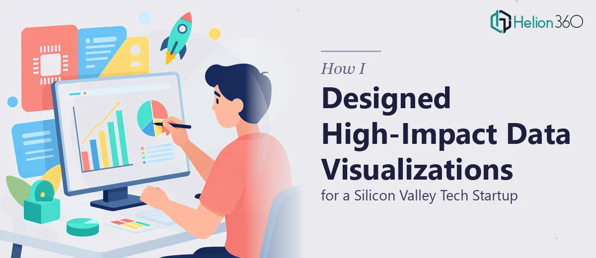
When a Startup Needed More Than Just Pretty Slides
I got pulled into a project for a fast-moving tech startup based in Silicon Valley. They were a small team — maybe fifteen people — but they were drowning in data and had a major stakeholder presentation coming up. The ask was clear: take their raw charts, internal metrics, and product performance data and turn them into polished, brand-consistent PowerPoint slides that could hold the room.
On paper, it sounded manageable. I had PowerPoint experience and had built a few decks before. I figured I could handle the data visualization work alongside the design.
I was wrong about how complicated it would get.
Where the Complexity Starts
The first challenge was the data itself. The startup tracked everything — user growth curves, churn rates, cohort retention, revenue projections broken out by geography. Each dataset told a different part of the story, and none of them were formatted for visual communication. They were spreadsheets built for analysis, not for an audience.
I started by trying to adapt the charts directly in PowerPoint. The default chart styles looked flat, the color choices clashed with their brand palette, and the moment I tried to create a custom infographic to explain their retention model, I hit a hard ceiling with what I could realistically execute at the level they needed.
Then came the Illustrator work. The startup wanted custom icons, stylized data callouts, and a few illustrated diagrams that their product manager had sketched on paper. These were not things I could fake with stock shapes. They required actual vector illustration work that tied directly into the slide layouts.
After two days of back-and-forth between PowerPoint and Illustrator without getting the cohesion I needed, I reached out to Helion360. I described the scope — the number of slides, the types of charts involved, the brand guidelines, and the custom illustration requests — and their team understood the brief immediately.
What the Handoff Looked Like
I shared the source files: the spreadsheet data, the brand kit, the rough sketches from the product manager, and the existing slide deck that needed to be rebuilt. Helion360's team asked a few targeted questions about the audience and the presentation context, then got to work.
What came back was a significant step up from what I had been able to produce on my own. The custom charts were redesigned with custom color coding that matched the startup's visual identity. The retention model diagram — the one I had struggled with — became a clear, layered infographic that actually made the data readable at a glance. The Illustrator-based icons were clean and consistent across all slides.
More importantly, everything felt like it belonged together. The typography hierarchy was consistent, the data callouts used the same visual language throughout, and the slide flow had a logical rhythm that made the story easier to follow.
What This Kind of Work Actually Requires
Building presentation slides for a data-driven tech environment is not just a design task. It requires someone who understands how to translate numbers into visual narratives without losing accuracy or introducing misinterpretation. A poorly designed chart can actually mislead an audience even when the underlying data is solid.
The combination of PowerPoint layout work, complex data visualization, and Illustrator-based illustration is genuinely a multi-skill job. When a startup is preparing presentations for clients, partners, or investors, the margin for error is low. Generic templates or rushed chart work will show.
Bringing in a team that specializes specifically in presentation design — not just general graphic design — makes a measurable difference in the final product.
The Outcome
The completed deck went through one round of minor revisions and was delivered ahead of the deadline. The product manager said it was the first time their data actually felt compelling rather than just informative. The stakeholder meeting went well, and the slides were repurposed for a follow-up investor briefing with minimal changes.
For me, the learning was practical: knowing when a project requires capabilities beyond your current setup is not a limitation — it's just good judgment.
If you're working through a similar brief — complex data, tight deadlines, brand-aligned visuals, and no room for slides that look like they were built in a hurry — Helion360 is worth contacting. They took a fragmented set of assets and turned them into a cohesive, high-quality deck that actually served the presentation's purpose.