

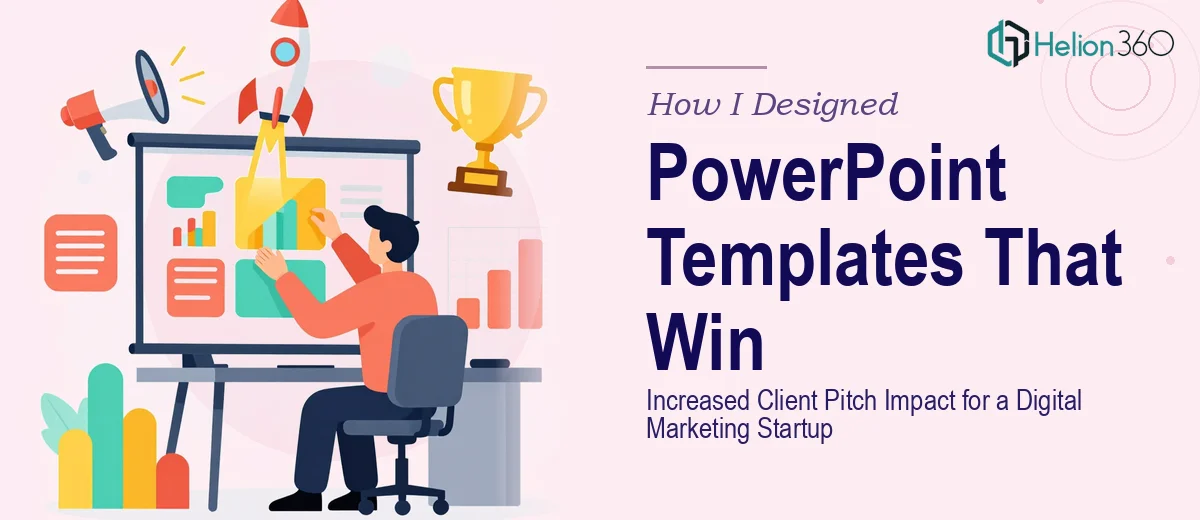
When Our Presentations Stopped Doing Their Job
We were a small digital marketing startup with real results to show — solid campaign data, case studies, and a clear service offering. But every time we walked into a client pitch, something felt off. The numbers were good. The story made sense. Yet the slides looked like they belonged to a company from five years ago.
Our PowerPoint templates had been thrown together quickly in the early days and never properly updated. The layouts were inconsistent, the fonts clashed, and the overall visual tone didn't match the brand we were trying to build. For a team selling marketing solutions, it was a credibility gap we couldn't afford.
What I Tried to Fix on My Own
I spent a few evenings trying to redesign the templates myself. I updated some fonts, swapped in a cleaner color palette, and rearranged a few slide layouts. It looked slightly better, but the improvements were surface-level. The underlying structure was still weak — slides were overcrowded, the visual hierarchy was unclear, and there was no consistent system across the deck.
The bigger issue was that I was solving the wrong problem. I was adjusting aesthetics without thinking about how each slide needed to communicate during a live pitch. Modern presentation design isn't just about looking clean — it's about guiding attention, reinforcing the message, and making information land quickly. That required a skill set and an eye I didn't have the time to develop in the middle of running a startup.
Bringing in the Right Team
After hitting that wall, I reached out to Helion360. I explained the situation — a startup pitch deck that needed to be redesigned from the ground up, with templates that could scale across different client presentations without losing brand consistency.
Their team asked the right questions from the start. What tone did we want to project? Where were we pitching — boardrooms, video calls, demo days? What content types appeared most frequently — data, service breakdowns, case studies? Within the first conversation, it was clear they understood that a presentation redesign for a startup isn't just a visual task. It's a communication problem.
What the Redesigned Templates Actually Changed
Helion360 delivered a full set of PowerPoint templates built around our brand identity. The layouts were restructured so that key messages had room to breathe. They introduced a clear visual hierarchy — headlines that set context, supporting visuals that reinforced the point, and clean data slides that made numbers readable at a glance.
They also built in flexibility. Each template was modular, meaning our team could swap out sections, add slides, or adjust content without breaking the design. The brand colors, typography, and spacing were locked into the master slides so nothing could get accidentally misaligned.
Beyond layout, they made deliberate choices about imagery. Instead of generic stock photos, the visual language they used supported the marketing campaign messaging we were trying to tell. Every design decision connected back to how we would actually use the deck in a pitch.
The Difference in the Room
The first time I used the redesigned presentation in a client meeting, the response was noticeably different. The prospect commented on how polished the deck looked before we even finished the intro slide. More importantly, the conversation stayed focused on the content — which is exactly what good slide design is supposed to do.
Over the following weeks, our team used the templates across multiple pitches. Because the structure was solid and consistent, building new decks took a fraction of the time it used to. The design system Helion360 created didn't just improve one presentation — it improved how we worked going forward.
What I Took Away From This
The gap between a functional presentation and an effective one is wider than most people realize. Fixing fonts and colors gets you halfway there. But a proper PowerPoint redesign — one that accounts for visual storytelling, brand alignment, and how information flows during a real pitch — requires a level of craft that goes beyond what most non-designers can pull off under deadline pressure.
For any startup trying to make an impression in competitive client pitches, the quality of your presentation materials is not a secondary concern. It is part of how you are evaluated.
If you are at the same point I was — knowing your deck needs work but not sure how far to take it — Helion360 is worth reaching out to. They handled the complexity, delivered templates that actually work in the field, and made our pitch process sharper across the board.