

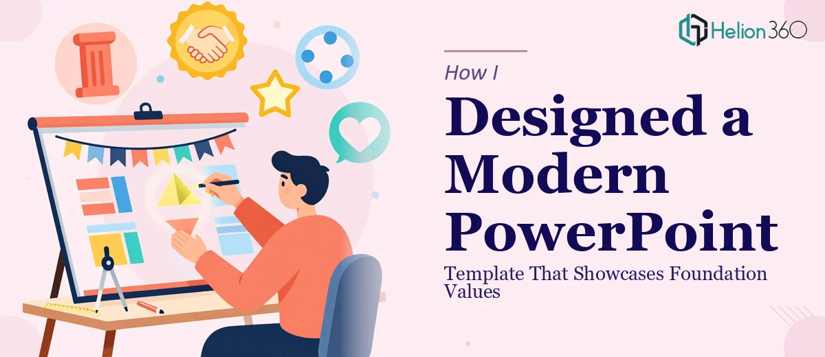
When a Simple Template Request Turned Out to Be More Complex Than Expected
It started with what seemed like a straightforward task — build a PowerPoint template that introduces our organization's foundational values. Clean layout, modern design, easy to update. How hard could it be?
I spent the first day pulling together slide structures, experimenting with color palettes, and trying to figure out how to display core values in a way that felt both professional and memorable. I had a general idea of what I wanted: something visually strong, brand-consistent, and flexible enough that different team members could update it without breaking the formatting.
The problem was, every version I drafted looked either too corporate and cold, or too casual to be taken seriously. Getting the balance right — especially when the template had to carry the weight of communicating organizational identity — was harder than I expected.
The Challenge With Foundation Introduction Decks
A PowerPoint template for introducing foundational values is not the same as a generic company slide deck. It needs to do several things at once. It has to visually express what the organization stands for, guide the viewer through core values without overwhelming them, and stay clean enough that it works across different use cases — internal presentations, stakeholder meetings, onboarding sessions.
Every time I thought I had a working layout, I would add a visual element and suddenly the hierarchy fell apart. Or I would get the typography right and realize the color blocking was too heavy. Customizability was another issue — I wanted whoever used the template later to be able to swap out text, images, and data without needing a design background.
After two days of iteration with no version I was proud of, I realized this was less a content problem and more a structural design problem — and that I needed someone who actually builds these templates professionally.
Bringing In Outside Help
That is when I reached out to Helion360. I explained what we needed: a modern, customizable PowerPoint template built around foundation values, with space for supporting visuals and data, and a layout clean enough to work across multiple presentation contexts. I shared the brand colors, a rough content outline, and a few reference examples of styles I liked.
Their team asked the right questions upfront — what tone we were going for, who the primary audience would be, and how much flexibility we needed across different slide types. Within a short time, they came back with an initial structure that already felt more resolved than anything I had produced on my own.
What the Final Template Looked Like
The delivered template covered all the ground we needed. The opening section gave a strong visual introduction to the organization's mission and founding principles. Each core value had its own dedicated slide layout — designed so the value statement was prominent, supported by a visual element, and paired with space for a brief explanation or data point.
The master slides were set up cleanly, so any team member could step in and update text or swap images without touching the underlying design. Font styles, spacing, and color assignments were locked into the theme, which meant even non-designers could work with it confidently.
Helion360 also built in a few layout variations — a full-bleed visual option, a text-heavy version for data-focused slides, and a summary layout for closing sections. That flexibility made the template genuinely reusable rather than a one-time asset.
What I Took Away From This
The experience taught me that presentation template design — especially for something as identity-driven as a foundation introduction deck — is a specialized skill. It is not just about picking good fonts or finding the right stock image. It is about building a visual system that communicates values clearly and holds together no matter who is using it.
Getting the structure right from the start saves an enormous amount of time downstream. Every stakeholder who uses a well-built template benefits from the decisions made at the design stage — and a poorly built one causes friction every single time someone tries to update it.
If you are working on something similar and finding that your drafts keep missing the mark, Helion360 is worth reaching out to — they took a complex design brief and delivered a template that our team could use immediately and confidently.