

Starting a Consulting Company Means Every First Impression Counts
When I launched my consulting company, I had a clear picture of how I wanted to show up in front of clients and prospects. The website was live, the logo was finalized, and the brand colors and fonts were all locked in. On paper, everything looked ready.
Then I realized I had nothing to actually present with.
Every client meeting, every prospect call, every proposal conversation — it all eventually came down to a PowerPoint deck. And the slides I was putting together were, frankly, embarrassing. They did not reflect the level of professionalism I had spent weeks building into the rest of my brand. Generic layouts, inconsistent fonts, placeholder clip art — it was not the impression I wanted to make.
Why I Tried to Build the Template Myself First
I figured it could not be that complicated. I had the brand assets — logo files, the exact hex codes, the font names from the website. I opened PowerPoint, pulled up the slide master view, and started experimenting.
An hour in, I had made a mess. The font sizing was off across different slide types, the logo placement looked awkward on certain layouts, and the color combinations that looked clean on the website felt flat and unbalanced on a slide. Presentation design, I quickly understood, is a different discipline from web or graphic design. The constraints are different. The hierarchy works differently. Spacing behaves differently.
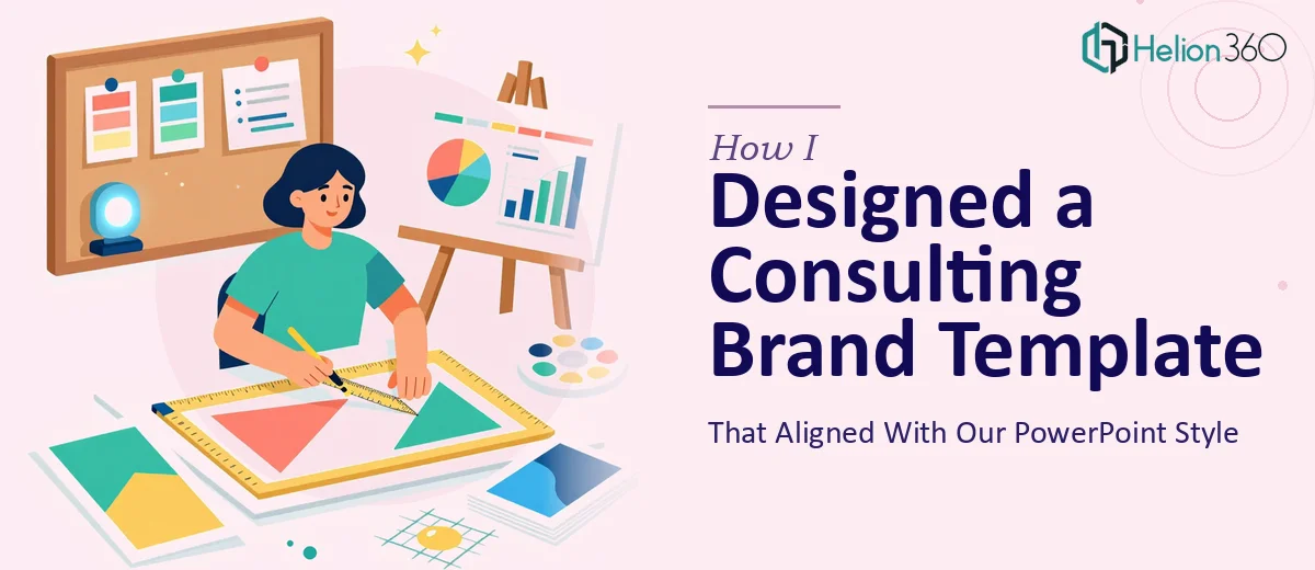
I also realized I needed more than one slide style. A consulting company needs a title slide, a section divider, a content layout, a data-heavy slide, a two-column layout, and a closing slide — at minimum. Building all of that from scratch with consistent branding across every layout was going to take far more time than I had.
Handing It Over to a Team That Understood Both Branding and Slide Design
After a few days of trial and error, I came across Helion360. I explained what I was working on — a branded PowerPoint template for a new consulting practice, built from existing brand assets, meant to be professional enough to use with enterprise clients right away.
What stood out was that they asked the right questions before starting anything. They wanted to understand the types of presentations I would be building, the audience I would be presenting to, and whether the template needed to be editable by non-designers on my team. That last question alone showed they were thinking practically, not just aesthetically.
I shared my logo files, brand guidelines, and a link to the website. From there, their team took over.
What the Final Template Actually Looked Like
The template they delivered covered every slide type I needed. The master layouts were clean and consistent — same font hierarchy across every layout, colors used intentionally rather than decoratively, and the logo placed in a way that felt professional without being intrusive.
The section dividers gave the presentations a structured, high-end consulting feel. The content slides had enough flexibility to work for text-heavy decks and visual decks alike. The data slide layouts made it easy to drop in charts without having to reformat anything manually.
Perhaps most importantly, the template was built so that anyone on my team could use it without breaking the design. Placeholder text was clear, image boxes were properly sized, and the color palette was locked in so no one could accidentally drift off-brand.
What I Took Away From the Process
Building a professional PowerPoint template is genuinely harder than it looks — not because the tools are complicated, but because good presentation design requires decisions that go beyond picking a nice font. Slide hierarchy, whitespace, layout flexibility, and brand consistency all have to work together across a dozen or more slide types.
For a consulting company, that template is also a credibility signal. Clients notice when slides look polished and intentional. It quietly communicates that you run a serious operation.
The time I saved by not trying to figure out slide master logic, layout inheritance, and design balance on my own was worth every bit of the investment. I went from patching together slides before every meeting to having a system unified across teams.
If you are launching a consulting practice or any professional services business and need a branded PowerPoint template that actually reflects your standards, Helion360 is worth a conversation — they handled the parts I could not, and the result was exactly what the business needed.