

When Every Presentation Looked Different
I was helping coordinate communications for a nonprofit organization, and one pattern kept showing up in every team meeting: no two presentations looked the same. One deck used a teal background, another had a white layout with a different font, and a third had the logo placed in three different spots across its slides. It was not a branding disaster, but it was close.
The organization had a clear mission and strong work to show for it. The problem was that none of that came through visually. When you are trying to build credibility — whether with donors, board members, or community partners — inconsistency in your materials quietly undermines the message.
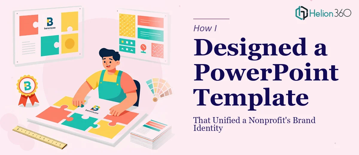
So I volunteered to fix it. I would design a PowerPoint template that everyone could use: consistent, branded, and flexible enough to work for an overview presentation, an impact report, an event announcement, or a donor update.
What I Tried to Build on My Own
I started in PowerPoint, working from the Slide Master view. I pulled the organization's logo, set the primary color palette, and began laying out a title slide. That part went reasonably well.
The complications started when I tried to design multiple layout variations — one for mission and overview slides, one for impact stories with room for photos and pull quotes, one for data-heavy slides, and one for the contact and closing section. Each layout needed to feel cohesive but not repetitive. And every element — font sizing, spacing, icon placement, color hierarchy — had to work together across all of them.
I also realized partway through that what I was building was too rigid. Nonprofit teams are not designers. If the template was not intuitive to use, people would go off-script and the inconsistency problem would come back. I needed placeholder logic, locked vs. editable zones, and clear structure — and that level of template architecture was beyond what I could execute cleanly on my own.
Bringing in Outside Help
After about a week of iteration and a few layouts I was not happy with, I reached out to Helion360. I explained what the organization needed: a professional PowerPoint template with consistent branding, multiple slide layouts, and enough built-in flexibility for non-designers to use without breaking anything.
Their team asked the right questions upfront — color codes, logo files, the types of content each section needed to support, and how formal versus warm the tone should feel for a nonprofit audience. Within a day, the brief was clear and the work began.
What the Final Template Included
Helion360 delivered a fully structured PowerPoint template with a set of coordinated layouts. The title slide anchored the organization's brand with the logo, color palette, and a clean typographic hierarchy. From there, the template included a mission statement layout designed to highlight key language without feeling like a wall of text, an impact stories layout with space for a photo, a short narrative, and a standout stat, an upcoming events layout formatted for clarity and quick scanning, and a contact and closing slide that matched the tone of the rest of the deck.
Every layout was built in the Slide Master so that fonts, colors, and spacing stayed locked across the entire file. Editable zones were clearly defined, and placeholder text guided users on what to put where. The branding in the presentation was consistent without being restrictive.
What Made the Difference
The biggest shift was not just the visual quality — it was usability. When I tested the template with a few team members who had no design background, they could fill in their content without breaking the layout. That was the goal from the start, and it took the right level of design expertise to pull off.
A well-built nonprofit PowerPoint template is not just about looking polished. It is about giving a team a repeatable tool they will actually use. When slides are consistent, the organization looks more credible — and the mission gets a fair chance to land.
If you are working on something similar — a branded presentation template for an organization that needs structure and consistency — Helion360 is worth reaching out to. They handled the complexity I could not and delivered a template the whole team could work with.