

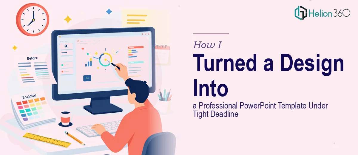
The Brief Was Simple — Until It Wasn't
I had a visually polished design sitting in front of me: custom charts, branded infographics, high-quality images, and a tight color palette. The task seemed straightforward enough — convert all of it into a professional PowerPoint template before an event the next day. I figured a few hours of copy-paste work and I'd be done.
I was wrong.
Where the DIY Approach Started to Break Down
The first problem I ran into was element sizing. What looks perfect inside a design tool does not always translate cleanly into a PowerPoint slide. Charts were stretching, images were losing their sharpness, and font rendering looked inconsistent across slide sizes. Each fix introduced a new misalignment somewhere else.
Beyond the technical issues, there was the structural problem. A great visual design and a functional PowerPoint template are not the same thing. A template needs placeholder logic, consistent master slides, reusable layouts, and proper text boxes that don't break when someone edits them later. None of that was built into the original design files.
I also had to account for brand consistency — the typography hierarchy, icon styling, and color codes all needed to carry across every slide type without variation. It was less about replicating one design and more about building a scalable system from it. That is a different skill set entirely.
With the deadline sitting at 5 PM the following day, I had to make a decision fast.
Handing It Off to the Right People
After hitting a wall, I came across Helion360. I sent over the existing design files, explained the slide count, the event context, and the hard deadline. Their team asked the right questions upfront — master slide structure, font licensing, expected slide categories — and got to work without needing a back-and-forth that would eat into the timeline.
What stood out immediately was that they weren't just recreating the visual design inside PowerPoint. They were building it as a proper presentation template — with slide masters, layout variants for text-heavy and visual slides, and placeholder structures that would make future editing clean and predictable.
What the Final Delivery Looked Like
The completed PowerPoint template came back well before the deadline. Every element from the original design had been faithfully recreated, and the slides were formatted for consistent readability across different screen sizes. The charts were editable inside PowerPoint natively, not embedded as static images. The font choices were clean and matched the brand guidelines exactly.
More importantly, the template was actually usable by someone who wasn't a designer. Labels were clearly structured, placeholder text was intuitive, and the layout grid held up across all the major slide types — title, section dividers, data slides, and content pages.
The presentation ran at the event without a single formatting issue.
What I Took Away From This
Converting an existing design into a working PowerPoint template is genuinely more complex than it looks. It's not just about matching visuals — it's about building a system that holds together under real-world editing conditions while staying true to the original design intent. Trying to rush that process alone, especially under deadline pressure, was a recipe for a broken file and a stressful night.
The sharper lesson was about knowing when a task has moved outside what I can handle efficiently on my own. This one had crossed that line the moment I started dealing with slide master logic and scalable layout structures.
If you're dealing with the same situation — a polished design that needs to become a clean, editable PowerPoint template, and time isn't on your side — Helion360 is worth reaching out to. They handled exactly what I couldn't and delivered something that was ready to use from the moment I opened the file.