

When Persona Data Sits in a Spreadsheet, Nobody Reads It
Our team had done solid research on our ideal customer profiles. We had mapped out age ranges, job functions, industries, core challenges, and desired outcomes for four distinct persona groups. The data was thorough. The problem was that it lived in a spreadsheet and a rough Word document that nobody outside the research team was actually reading.
Every time we needed to share our ICP user personas with sales, product, or a new team member, we would paste rows of information into an email or walk someone through the spreadsheet manually. It was tedious, and the personas were not landing the way they should.
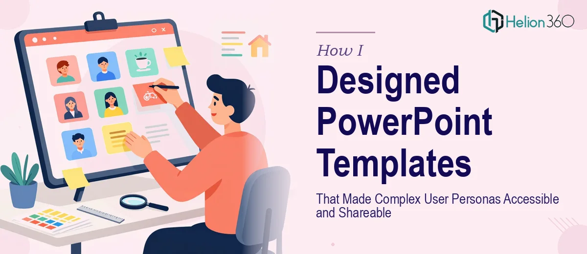
The obvious fix was to turn them into well-designed PowerPoint templates — visual, structured, and easy to share across the organization.
What I Tried Before Asking for Help
I am comfortable building slides for internal meetings, so I figured this would not take long. I pulled up PowerPoint, found a clean layout, and started dropping in persona details for the first profile.
About an hour in, I ran into the real challenge. The problem was not filling in the information — it was making the design work across all four personas while keeping each one visually distinct yet consistent. The templates needed a clear visual hierarchy so that someone scanning the slide could immediately understand who the persona was, what they cared about, and what stood in their way. That kind of structured presentation design requires more than swapping colors and moving text boxes around.
I also wanted the templates to be reusable. Anyone on the team should be able to open a file, update a persona field, and have the slide still look professional. Building that kind of flexible PowerPoint template from scratch — with proper placeholder logic, consistent icon usage, and typography that scaled cleanly — was beyond what I could do quickly without making things look inconsistent.
After a full afternoon of mixed results, I stepped back and decided to get professional help.
Bringing in a Team That Understood Both Design and Structure
A colleague pointed me toward Helion360. I explained the project — four ICP user persona groups, each with specific fields like age, job function, industry, challenges, and desired outcomes, and a need for templates that were both visually appealing and easy for non-designers to update.
Their team asked the right questions upfront. They wanted to understand how the templates would be used — in internal presentations, shared as PDFs, or edited regularly by the team. That context shaped how they approached the design.
What the Final Templates Looked Like
What came back was a set of four persona PowerPoint templates that were clean, structured, and genuinely useful. Each slide used a consistent layout with clear sections for demographics, professional context, key challenges, and goals. The visual hierarchy made it easy to scan — something a wall of spreadsheet text never achieves.
The design was distinct for each persona group without feeling disconnected. Shared typography and layout logic gave the whole set a cohesive look, while color accents and supporting visuals helped differentiate between profiles at a glance.
The templates were also built to be editable. Text placeholders were properly set up so that updating a field did not break the layout. Icons and visual elements were grouped and labeled sensibly. Anyone on the team could open the file and work with it without needing a design background.
What Changed After We Rolled Them Out
Once the customer persona design templates were shared internally, the difference was immediate. Sales started referencing them in calls. Product leads used them in planning sessions. New team members could get up to speed on our ideal customer profiles in minutes instead of sitting through a long walkthrough.
The data had not changed — only how it was presented. That is the part that is easy to underestimate. A well-structured presentation design does not just make information look better. It makes people actually engage with it.
I also learned something practical: building reusable PowerPoint templates for structured data like user personas is a specific kind of design work. It requires thinking about layout logic, visual hierarchy, and long-term usability all at once — not just making one slide look good.
If you are sitting on persona research or any structured data that is not getting the attention it deserves, Helion360 is worth a conversation. They handled the parts that were slowing me down and delivered templates that the whole team continues to use.