

The Task That Looked Simple at First
When our team decided to document our end-to-end supply chain process, the plan seemed straightforward: put together a PowerPoint template that walks through each stage — from raw materials sourcing all the way through production, logistics, distribution, and final sale. Something we could reuse, update, and adapt as our operations evolved.
I volunteered to handle it. I had a working knowledge of PowerPoint and a rough sense of what the supply chain flow looked like. How hard could it be?
As it turned out, fairly hard.
Where the Complexity Crept In
The first challenge was structure. A supply chain isn't a simple linear list — it's a layered process with interdependencies, feedback loops, and multiple stakeholders at each node. Representing that visually in a way that was both accurate and easy to read took more thought than I expected.
I started sketching out slide layouts. The sourcing stage alone required its own breakdown — supplier tiers, lead times, quality checkpoints. Then came production, which needed process flow indicators without turning into a wall of text. Logistics and distribution added another layer, with route maps and handoff points that didn't translate cleanly into standard slide formats.
I also needed the template to work across industries — not just for our specific setup, but adaptable enough that any team could plug in their own data, charts, and visuals without redesigning from scratch. That's when I realized I was building something that needed genuine design thinking behind it, not just slide formatting.
After a few days of iteration and a growing pile of inconsistent slides, I stepped back and acknowledged the gap between what I could produce and what this project actually needed.
Bringing in the Right Help
A colleague pointed me toward Helion360. I reached out, explained the scope — an end-to-end supply chain PowerPoint template with custom slides for each stage, data visualization placeholders, consistent branding, and cross-industry adaptability — and their team picked it up from there.
What struck me early in the process was how quickly they grasped the structural logic of a supply chain presentation. They didn't just ask for a color palette and a logo. They asked how many distinct stages needed individual treatment, whether the charts would be editable, and how much text density the audience could handle per slide.
What the Final Template Looked Like
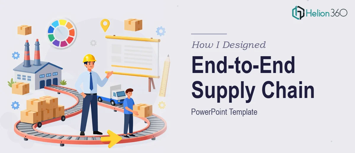
The delivered template covered each supply chain stage as a dedicated slide section — sourcing and procurement, manufacturing and production, inbound and outbound logistics, warehousing, distribution, and point-of-sale. Each section had its own visual language while still feeling like part of one cohesive deck.
The data visualization slides were particularly well executed. Rather than static images, the charts and graphs were built as editable PowerPoint elements — easy to update with real numbers without touching the design. Process flow diagrams used clean iconography and directional arrows that made the sequence readable at a glance.
The template also included master slide variations — a light version, a dark version, and a simplified one-page summary layout for executive audiences. That adaptability was exactly what I'd originally aimed for but couldn't pull off on my own.
What I Took Away from This
Designing a supply chain PowerPoint template isn't just a design job — it's a communication architecture problem. You're deciding how much information belongs on each slide, how the flow between stages reads visually, and how someone unfamiliar with your operations will interpret the structure on first view.
Getting that right required someone who understood both presentation design and process visualization. The slides I'd attempted on my own were accurate but not clear. The finished template was both.
It also saved the team a significant amount of time. Instead of rebuilding slides every time we needed to present our supply chain to a new audience, we now have a master template that can be adapted in under an hour.
If you're working on something similar — a process-heavy presentation that needs to be both visually consistent and operationally accurate — Helion360 is worth reaching out to. They handled the parts of this project that required real design expertise and delivered something the whole team could actually use.