

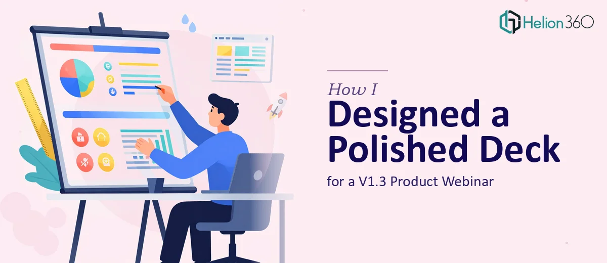
The Task: A Webinar Deck That Had to Do a Lot of Heavy Lifting
When our product team wrapped up the V1.3 release cycle, the next step was clear — we needed a webinar to walk our users through what had changed, what was better, and what was coming next. That meant putting together a PowerPoint presentation that could hold the attention of a mixed audience: developers who knew the product inside out, and business users who cared more about outcomes than technical specifics.
I volunteered to take the first pass at the product webinar presentation. I had the content — feature notes, performance data, UX change logs, a rough roadmap — but translating all of that into a clean, well-structured PPT deck was a different challenge entirely.
Where the DIY Approach Hit a Wall
I started building slides in PowerPoint with the best intentions. I had a structure in mind: an opening summary, a section on user experience improvements, a technical enhancements section, a before-and-after comparison using performance metrics, and a forward-looking roadmap.
The problem wasn't the content. The problem was making it all feel cohesive and visually credible. My charts looked clunky. The slides didn't have a consistent visual language. The color palette I pulled from our brand guidelines didn't translate well to a slide format. And the data — load time improvements, error rate reductions, throughput gains — was sitting in spreadsheets that needed to become clear, readable charts in the presentation.
I also realized that for a mixed audience, the deck needed to work on two levels simultaneously: technically accurate for the engineers in the room, and accessible and benefit-focused for everyone else. Getting that balance right in slide design is harder than it sounds.
After a couple of rounds of drafts that still felt rough, I decided to stop pushing and get proper help.
Bringing in Helion360
I came across Helion360 while looking for a presentation design team that understood both visual design and content structure for technical products. I reached out, shared the brief, dumped my draft slides, the raw performance data, and the content outline into a shared folder, and let their team take it from there.
What I appreciated immediately was that they asked the right questions upfront — who's the primary audience, what's the tone of the webinar, what does the brand palette look like in actual use, and which metrics were most important to highlight. It wasn't a generic intake process. They were already thinking about how the deck would land with the actual audience.
What the Final Deck Looked Like
Helion360 delivered a product webinar presentation that was genuinely polished. Here's what stood out:
Structure that made sense. The deck opened with a quick visual summary of what V1.3 addressed, moved into UX improvements with annotated screen visuals, then covered the technical enhancements in a way that was digestible without being dumbed down. The roadmap section closed it out with a clean timeline format.
Data visualization that actually communicated. The before-and-after performance metrics — things like page load times, API response improvements, and error frequency — were turned into clear bar charts and comparison visuals. The numbers told a story rather than just filling a slide.
Consistent visual design. The color palette worked with our branding without feeling like a template. Every slide had visual breathing room. Icons and diagrams were used purposefully, not decoratively.
Dual-audience readability. Technical slides had enough specificity for engineering-minded attendees, while the summary callouts on each section ensured that non-technical viewers could follow the narrative.
What I Took Away From This
The content knowledge was always there on our end. What we lacked was the design execution to make that content land the way it needed to. A webinar deck for a product update isn't just a slide file — it's a communication tool that represents the quality of the product itself.
Working with Helion360 made that gap visible and then closed it. The deck we presented felt like something we were proud to put in front of our audience, and the feedback after the webinar reflected that.
If you're sitting on a product update or feature rollout and the presentation design is holding up the process, it may be worth passing that piece to people who do it well.
Need a Presentation That Matches the Quality of Your Product?
If your next webinar, product update, or internal rollout deserves a deck that's as well-built as the work behind it, Helion360 is the team to call. They step in where the complexity starts and deliver something you can actually use.