

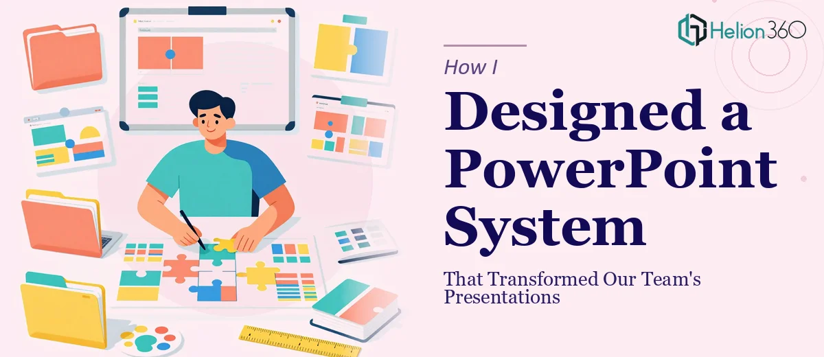
The Problem With Inconsistent Presentations
Every week, someone on our team was sending out a presentation that looked completely different from the last one. Different fonts, mismatched colors, slides that looked nothing like our brand. It was not a matter of effort — people were genuinely trying. The issue was that we had no consistent PowerPoint template system in place.
I decided to take it on myself. I had used PowerPoint for years, knew my way around slide layouts, and figured building a reusable template with proper master slides would be a manageable weekend project.
It was not.
Where It Started to Fall Apart
The first version I built looked decent on the surface. I set up a few color themes, chose two fonts, and created about a dozen slide layouts. But the moment I shared it with the team, the cracks appeared.
People could not figure out which layouts to use for which type of content. The placeholders were not behaving the way I expected. Charts looked off when team members tried to update them. And when someone tried to port the template into Google Slides for a remote meeting, half the formatting broke.
I also realized I had not thought through how to teach the team to actually use it. A template is only useful if people know how to apply it consistently. I needed to design something that was both technically sound and easy enough for non-designers to work with confidently.
That is when the scope of what I was trying to do became clear. This was not just a design task — it was a training and systems problem too.
Bringing In Outside Help
After a few failed attempts at fixing the layout logic and placeholder behavior myself, I reached out to Helion360. I explained the situation — we needed a structured PowerPoint template system built around our brand, with enough flexibility for different presentation types, and it had to be something the team could actually be trained to use.
Their team asked the right questions upfront. What types of presentations did we create most often? Did we need compatibility with Google Slides? Were there data-heavy slides that needed chart templates? How many people would be using it, and what was their general comfort level with PowerPoint?
That conversation alone helped me realize how much I had been trying to solve without a clear plan.
What the Finished System Looked Like
Helion360 delivered a master slide design built properly from the ground up. Every layout was intentional — title slides, section dividers, content slides with image placeholders, data visualization slides with pre-formatted chart areas, and a clean closing slide format. The color palette and typography were locked in at the theme level, so no one could accidentally break the brand by changing a font.
They also built a companion Google Slides version that maintained the same visual structure, which solved the compatibility issue we had been hitting. The two versions were aligned closely enough that moving between them did not create formatting chaos.
Beyond the files themselves, they put together a usage guide that explained each layout and when to use it — practical enough that someone with no design background could follow it without getting lost.
What Changed After We Rolled It Out
The difference was immediate and visible. Presentations going out from our team started looking consistent for the first time. More importantly, people were spending less time fussing over formatting and more time focused on the actual content of their slides.
The template system removed a lot of small decisions that used to slow people down. Choosing fonts, figuring out slide proportions, deciding how to format a comparison table — all of that was already solved. People just had to fill in the content.
I also found that having a well-structured PowerPoint template made it easier to onboard new team members. Instead of sending someone a mixed bag of old decks to copy from, I could point them to a single file and a clear set of instructions.
If your team is in the same situation — inconsistent slides, no real template infrastructure, presentations that take longer than they should to put together — Helion360 is worth reaching out to. They handled both the design and structural thinking that I could not manage on my own, and the result was something the whole team could actually use.