

The Brief Looked Simple. The Execution Was Not.
When I was handed the task of building a product launch presentation, I assumed it would take a weekend. The outline was straightforward enough — key product features, target audience insights, marketing strategies, and supporting statistics. Around 20 slides, delivered in high resolution, with a cover slide, table of contents, and a closing thank-you slide.
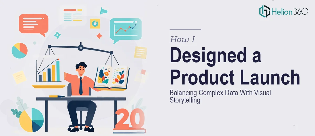
But once I opened PowerPoint and started laying things out, the complexity of the brief hit me. This was not just a formatting job. It required every section to tell a coherent story while also carrying real data — market sizing, audience segmentation, campaign channel breakdowns. Making that flow logically without turning each slide into a wall of text or a cluttered chart was a genuinely difficult design challenge.
Where the Difficulty Actually Lived
The data was the hardest part. I had statistics that needed to support the narrative without overwhelming it. Every time I placed a chart on a slide, it either shrank the surrounding content into something unreadable, or the slide started to look like a report rather than a presentation. The whole point of a product launch presentation is to build momentum — excitement, clarity, confidence. Data-heavy slides were working against that.
On top of that, I had brand guidelines to work within. Font choices, color palettes, logo placement rules — all of it had to be respected consistently across every slide. Maintaining that level of cohesion while also making each slide visually interesting was more time-consuming than I had anticipated. I was spending more time adjusting margins and troubleshooting font rendering than actually thinking about the story.
The deadline was firm. A draft was needed by end of the week for internal review, which left almost no room for a slow, iterative process.
Bringing in the Right Support
About two days in, it was clear I needed help — not because the brief was beyond understanding, but because the execution required a level of design precision and speed that I could not deliver alone under the timeline. That is when I reached out to Helion360.
I shared the brand guidelines, the raw content, and the structural outline I had started. Their team asked a few focused questions about the presentation's primary audience and the tone we were going for — whether it leaned more toward an internal executive review or an external stakeholder pitch. Those questions told me they were thinking about the presentation the right way.
From there, they took over the design work entirely.
What the Final Deck Actually Looked Like
The finished presentation came back as a clean, 20-slide deck that genuinely solved the core problem. The data slides were the most impressive part. Charts that I had been struggling to make legible were redesigned using a combination of simplified visuals and supporting callout text — the kind of layout where the key insight is immediately obvious without the viewer needing to decode the graph first.
The slide flow worked the way a good product launch presentation should. It opened with a strong cover slide, moved through context and audience insight, built into the product's core value proposition, and closed with the marketing strategy and next steps. Each section had its own visual rhythm but stayed within the same design system. Consistent typography, intentional use of white space, and on-brand color usage throughout.
Helion360 also delivered the deck in high resolution, formatted correctly for both screen presentation and print — something I had not even had time to think about properly.
What I Took Away From This
Building a product launch presentation is not the same as building a slide deck that happens to cover a product launch. The design has to do real work — guiding attention, supporting complex data without drowning the story, and maintaining a visual identity that feels intentional rather than assembled. That combination of skills takes time and experience.
I also learned that having a clear structure before handing off the work made the collaboration much faster. The clearer the brief, the better the output.
If you are working on a similar project — a product launch, a go-to-market presentation, or any deck where data and visual storytelling need to coexist — Helion360 is worth reaching out to. They handled the parts that were slowing me down and delivered a presentation ready for a real boardroom.