

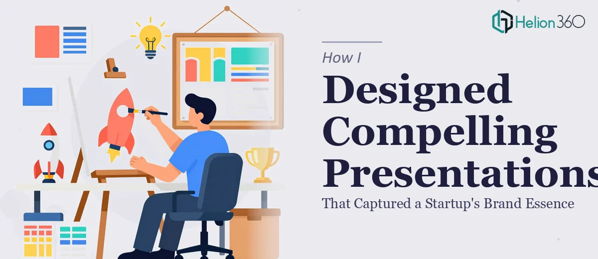
When a Startup Asks You to Make Their Vision Visible
I was brought into a project that seemed straightforward at first: help a startup put together a set of visually compelling presentations for an early-stage marketing campaign. They had the ideas, the energy, and a clear sense of who they were as a brand. What they needed was someone to translate all of that into slides that could actually communicate it.
The brief was ambitious. Every slide needed to feel on-brand, thought-provoking, and memorable — not just decorated with their logo and a few bullet points. They wanted storytelling baked into the design itself.
The Gap Between Vision and Execution
I started by mapping out the narrative flow across the slides. I had a reasonable handle on PowerPoint and a working knowledge of visual hierarchy. But as I got deeper into the project, I ran into a real problem: the brand identity itself was still being defined in real time. The color palette shifted. The tone of voice evolved. New product angles were introduced mid-process.
Designing compelling presentations for a startup that is still shaping its own brand is genuinely difficult. Every time I locked in a layout, something upstream changed. I was spending more time reworking than building, and the slides were starting to feel inconsistent — some modern and clean, others cluttered and off-tone.
I also realized that what they needed went beyond PowerPoint skills. They needed someone who could work with brand identity principles, apply them consistently across a multi-slide deck, and still keep the design visually engaging throughout. That combination of brand storytelling and presentation design is a specific craft.
Bringing in the Right Team
After a couple of rounds of revisions that still weren't landing quite right, I reached out to Helion360. I walked them through the project — the startup context, the shifting brand requirements, the campaign goals, and the slides I had started. Their team asked sharp questions about the audience, the key messages, and what the startup wanted people to feel after seeing the deck.
From there, they took over the design work. They rebuilt the slide structure with a clear visual language that held together across every section. The typography choices, the use of white space, the iconography — all of it was consistent and purposeful. More importantly, the slides finally felt like they belonged to one brand, not a collection of individual design experiments.
What the Final Deck Actually Delivered
The finished presentation was a significant step up from where things stood. Each slide had a clear focal point and a visual rhythm that guided the viewer through the content without overwhelming them. The brand essence — which the startup had struggled to pin down in words — came through clearly in the design itself.
The campaign deck was used across multiple touchpoints: internal team alignment, early partner conversations, and external marketing moments. The feedback from the startup's team was that the slides finally looked like the company they were trying to become, not just the company they were right now.
What I Took Away From This
Startup presentation design is not just about making things look nice. It is about holding a brand story together visually when the brand is still evolving. That requires judgment, not just technical skill — knowing when to simplify, when to let a visual breathe, and when a design choice is reinforcing the message versus distracting from it.
I also learned that trying to do everything in-house when the scope exceeds your tools or bandwidth is not a sign of capability — it is a project risk. Getting the right support at the right stage made the difference between a deck that looked assembled and one that looked intentional.
If you are working on a startup presentation and finding that the design keeps slipping away from the brand story you are trying to tell, Helion360 is worth a conversation — they stepped in at the hardest point in this project and delivered exactly what the work needed.