

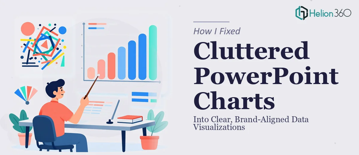
When Your Charts Look Like a Spreadsheet Exploded
I had a presentation due in less than a week, and the data was all there — quarterly metrics, trend lines, comparison breakdowns. The problem was that every chart looked like it had been built in a hurry and never touched again. Gridlines everywhere. Mismatched colors. Axis labels that overlapped and truncated. Legends sitting in random corners. It was technically accurate, but visually, it was a mess.
I spent the first evening trying to fix it myself. I know my way around PowerPoint well enough — I can build a slide from scratch, adjust layouts, and format text. But chart cleanup in PowerPoint is a different kind of problem. It is not just about making things look prettier. It is about deciding what information actually needs to be visible, which chart type serves the data best, and how to apply color in a way that reinforces the brand without flattening the visual hierarchy.
The Real Problem With Cluttered Charts
What I kept running into was the tension between data completeness and visual clarity. I would remove a gridline and suddenly the chart felt unanchored. I would change the color scheme and it would clash with the rest of the slide. I tried a bar chart, then a grouped bar chart, then a combination chart — and nothing felt clean or intentional.
There was also a brand consistency issue. Our presentations needed to follow specific color guidelines, font usage, and overall tone. Getting the data visualization to feel like it belonged in the same deck — and not like a chart pasted in from Excel with default formatting — was harder than I expected. Every chart tweak I made created a new inconsistency somewhere else.
After two days of incremental adjustments and increasingly frustrating undo-redo cycles, I admitted the work needed a more skilled hand than what I could offer in the time available.
Handing It Off to Helion360
A colleague had mentioned Helion360 when we were talking about presentation design work that needed more than basic editing. I reached out, explained the situation — cluttered charts, brand alignment issues, tight deadline — and shared the file.
What stood out immediately was how they approached the brief. They did not just clean up what was there. They asked about the audience for the presentation, what each chart was meant to communicate, and which data points were the priority for each slide. That context changed everything about how the charts were rebuilt.
Helion360 went through each chart systematically. They stripped out the visual noise — redundant gridlines, unnecessary data labels, oversized legends — and rebuilt the color palette using our brand colors in a way that actually created visual hierarchy instead of just applying the same hue to everything. Axis labels were cleaned up and repositioned. Chart types were reconsidered where the original choice was not serving the data.
What the Final Deck Actually Looked Like
The difference was significant. The same data that had looked overwhelming in the original version now read clearly at a glance. A comparison chart that had been a dense grouped bar chart became a clean side-by-side layout with clear callout labels. A trend chart that had been drowning in data points was simplified to show the key movement with supporting annotations.
Every chart felt like it belonged in the same presentation. The brand colors were applied consistently, the typography matched the rest of the deck, and the visual weight of each chart was balanced against the surrounding content. It looked deliberate — which is exactly what a professional presentation needs to look like.
The experience taught me something practical: PowerPoint chart cleanup is not a cosmetic task. It is a design problem that requires decisions about information hierarchy, chart type selection, color use, and brand consistency — all at once. Doing it well takes skill and time that not every project allows for.
If you are dealing with a similar situation — charts that are technically correct but visually confusing, or a presentation that lacks consistency across its data slides — consider Chart Design Services. They handled exactly the kind of detailed, judgment-heavy work that takes hours to get right on your own.
For additional insights on data visualization approaches, explore how to create professional PDCA charts in Word and PowerPoint or learn about designing clear Excel graphs for data insights.