

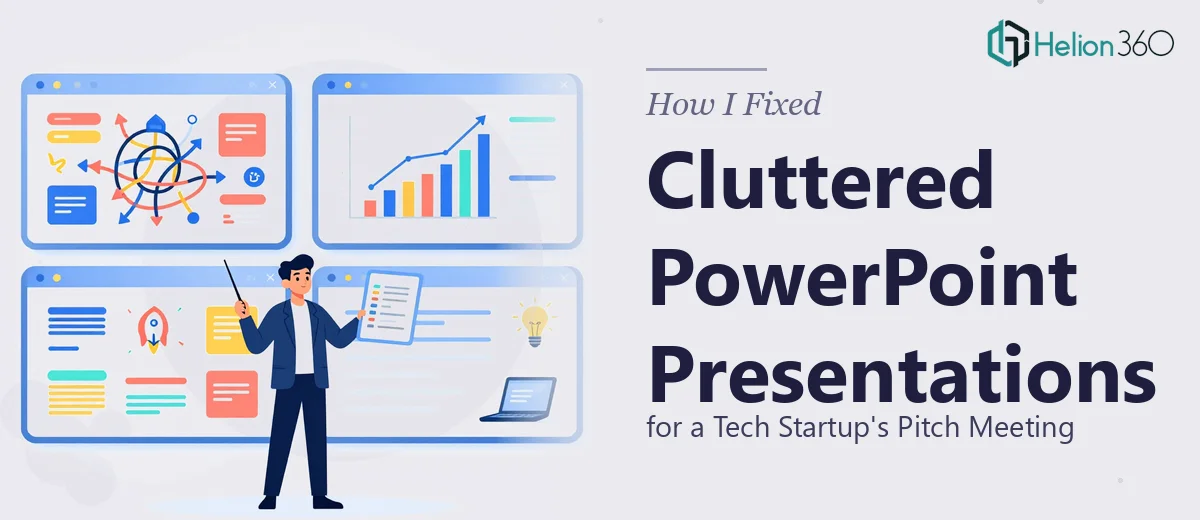
When the Slides Were a Mess and the Meeting Was Close
We had a pitch meeting coming up in less than two weeks. The deck existed — that much was true. But when I opened it to do a final review, what I found was a collection of slides that had clearly been built across multiple sessions, by multiple people, with no consistent thread holding them together. Font sizes jumped between slides. Some pages were dense walls of text. Others had misaligned boxes, off-brand colors, and placeholder content that had never been replaced.
For a startup trying to make a strong first impression with potential investors, this was not the version we could walk into a room with.
What I Tried Before Asking for Help
I started cleaning it up myself. I went slide by slide, standardizing fonts and fixing obvious alignment issues. That part was manageable. But the deeper I went, the more I realized how interconnected the problems were. Fixing one slide's layout broke the visual flow with the next. The content structure itself needed rethinking — not just the formatting. Some slides were trying to say three things at once when they needed to say one.
I also had to be realistic about time. I was running other parts of the business simultaneously. The PowerPoint cleanup was important, but it was consuming hours I did not have, and I was not confident the result would be polished enough for a high-stakes pitch presentation.
Bringing in the Right Support
After hitting that wall, I came across Helion360. I explained the situation — startup pitch deck, multiple cluttered slides, inconsistent formatting, and a tight deadline. Their team asked the right questions upfront: what was the brand identity, who was the audience, what was the core message we needed each section to carry.
That conversation alone told me they understood presentation design as more than a cleanup task. They saw it as communication design.
What the Cleanup Actually Involved
Helion360 went through every slide and addressed the problems at two levels. The first was structural — reorganizing content so each slide had a single, clear purpose. Dense text was broken into digestible points expressed visually, not just as paragraphs. The second level was visual — consistent typography, proper alignment grids, a unified color palette that matched our brand guidelines, and clean spacing throughout.
The slides that had been trying to carry too much weight were simplified without losing substance. The data slides became easier to read at a glance. The overall deck started to feel like one cohesive document rather than a patchwork of contributions.
What the Final Deck Looked Like
The difference between the before and after was significant enough that colleagues who had seen the original version commented on it immediately. The pitch deck now opened with clarity, moved logically through the narrative, and closed with a strong call to action — visually and structurally.
More importantly, when we walked into the pitch meeting, the slides did not distract from what we were saying. They supported it. The investors could follow the story without having to decode cluttered visuals or inconsistent formatting.
What I Took Away From This
PowerPoint cleanup sounds straightforward, but at a certain level of complexity — especially when a presentation is being prepared for investors — it is really a presentation redesign project. It requires someone who understands both design principles and how pitch decks are supposed to communicate. Trying to handle that while also running a startup stretched me too thin and would have compromised the final result.
Knowing when to bring in specialized support, and doing it early enough to still make a real difference, was the practical lesson here.
If your pitch deck is in a similar state — technically functional but visually inconsistent and harder to follow than it should be — Helion360 is worth reaching out to. They took a cluttered set of slides and turned them into a professional presentation that actually worked for the meeting it was built for.