

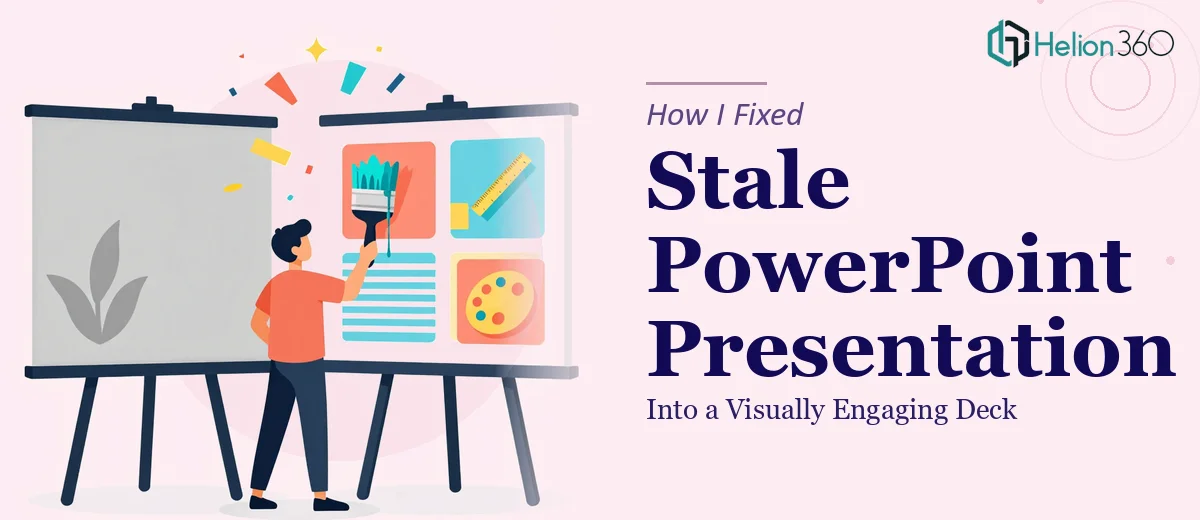
The Slides Were Fine — But Just Fine
I had a PowerPoint presentation that technically worked. The content was there, the key points were covered, and the structure made sense. But every time I opened it to review, something felt off. The slides looked flat. The fonts were inconsistent, the colors felt random, and the overall visual hierarchy was not guiding anyone's eye toward what actually mattered.
This was a startup team deck — meant to communicate our work clearly and confidently. Bringing it in front of an audience in its current state felt like showing up to a meeting in a wrinkled shirt. Functional, but not the impression we wanted to make.
What I Tried Before Asking for Help
I spent a few evenings going through the slides myself. I swapped out a couple of fonts, tried adjusting some colors to match our brand palette, and searched for better stock images to replace the generic ones already in the deck.
But the more I changed, the more inconsistent it became. I would fix one slide and unintentionally break the visual rhythm of the next. The layout felt choppy. I also realized I did not have a clear system for spacing, alignment, or how to handle slides that had too much text crowding the layout.
Presentation design is one of those things that looks simple until you are actually inside it trying to make everything coherent across twenty-plus slides. It is not just about making things look nice — it is about visual hierarchy, brand consistency, and knowing which design decisions to make and which ones to leave alone.
Reaching Out to Helion360
After a few frustrating rounds of trial and error, I reached out to Helion360. I explained what we had — a PowerPoint deck that felt visually stale and inconsistent — and what we needed: cleaner layouts, proper font usage, cohesive colors, and a finished look that matched our brand guidelines.
They asked the right questions upfront. What was the audience? Where was this being presented? Did we have a brand kit or color reference? Within a short back-and-forth, they had a clear picture of the scope and got to work.
What the Redesign Actually Involved
The Helion360 team approached it systematically. They started by establishing a consistent visual foundation — fixing the slide master so that fonts, spacing, and color usage were locked in across the entire deck rather than handled slide-by-slide.
From there, they reworked the layout and structure of the slides that were most crowded or confusing. Text-heavy slides were broken up or reorganized so the key message came through clearly without overwhelming the reader. High-quality graphics and imagery were brought in where the original slides had relied on low-resolution placeholders.
The visual hierarchy across the deck became intentional. Headlines carried weight, supporting text stepped back, and the overall flow of each slide made it easy to follow. Color usage became consistent with the brand rather than arbitrary. Even the small things — icon sizing, margin alignment, slide transitions — were handled with care.
What the Final Deck Looked Like
The difference between the original and the redesigned version was significant. Not because the content had changed, but because the presentation now felt like it belonged to the same visual world from slide one to the last. It read as a cohesive, professional deck rather than a collection of individually built slides.
Presenting it afterward felt noticeably different. There was no need to apologize for how something looked or quickly explain past a messy chart. The design supported the message instead of competing with it.
Redesigning a PowerPoint presentation properly — especially one that needs brand alignment, layout fixes, and visual hierarchy work across an entire deck — takes more than a few hours of self-editing. Knowing when to hand that work to someone with the right skillset saved both time and the quality of the final output.
If your slides are in a similar place — content ready, but the design holding it back — Helion360 is worth reaching out to. They handled exactly what I could not, and the result spoke for itself.