

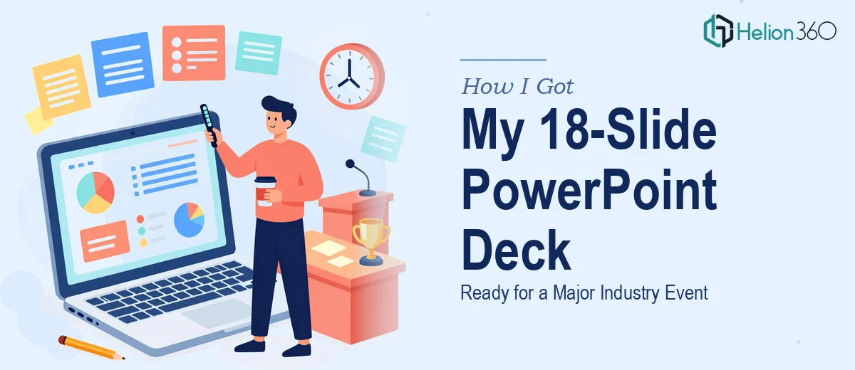
The Presentation Was 10 Days Away and the Deck Looked Like a Draft
I had the content. All 18 slides were mapped out — key messages, supporting data, charts, a few product visuals. Technically, everything was there. But when I sat back and looked at the full deck, it felt flat. The kind of flat that makes an audience drift.
This wasn't an internal team update. It was a key industry event, the kind where first impressions matter and where a polished PowerPoint deck signals credibility before you even open your mouth. I knew the content was solid. The design was the problem.
Why I Couldn't Just Fix It Myself
I tried. I spent an evening adjusting fonts, tweaking colors, and rearranging slide layouts. The result looked like three different people had designed it — because, in a way, they had. I'd pulled elements from different templates, used inconsistent icon sets, and the charts still looked like raw Excel exports.
The issue wasn't skill — it was time and specialization. Professional PowerPoint design involves more than making things look nice. It requires a consistent visual language, purposeful use of white space, brand-accurate typography, and the ability to turn data into something visually clear without stripping away meaning. That's a discipline on its own.
I had ten days. I needed someone who could come in, understand the brief, and produce something presentation-ready without a back-and-forth that ate up a week.
Bringing in the Right Support
After hitting a wall, I came across Helion360. I sent over the deck, explained the event context, shared our brand guidelines, and described the tone I was going for — professional, clear, visually engaging without being over-designed.
Their team came back quickly with questions that told me they were actually reading the brief: What audience would be in the room? Were there specific slides with data-heavy content that needed special treatment? Was animation in scope?
That kind of intake process matters. It meant the design decisions that followed were grounded in purpose, not just aesthetics.
What the Redesign Actually Involved
Helion360 worked through the full 18-slide deck systematically. Here's what changed:
Slide structure and hierarchy — Each slide was cleaned up so the most important point landed first, visually. Supporting details were treated as secondary, not competing for attention.
Brand alignment — Colors, fonts, and logo usage were brought into line with our actual brand identity. No more random blues that didn't match our palette.
Chart and data visualization — The raw data slides were rebuilt. Numbers that were buried in tables became clean bar charts and comparison visuals that a room full of people could read from ten feet away.
Custom graphics and icons — Where text-heavy slides needed breathing room, they replaced blocks of copy with simple custom visuals that conveyed the same point faster.
Consistency across all 18 slides — The deck finally looked like one coherent presentation, not a patchwork.
The Outcome at the Event
I presented the deck three days after receiving the final files. The response in the room was noticeably different from what I'd experienced with earlier, less polished presentations. People were following along. Questions came in at the right moments. A few attendees asked me afterward if we had the slides available to share — which almost never happens.
The content hadn't changed. The design made it land differently.
What I took away from this was straightforward: presentation design is a craft. When you're close to a deadline and the stakes are high, the right move is to work with people who do this every day. Trying to force-fit design work into an already full schedule produces exactly the kind of uneven result I started with.
Helion360 handled the heavy lifting without needing to be managed. The brief was clear, the delivery was clean, and the timeline held. That's what matters when you're preparing for something real.
Working on a Presentation That Needs to Perform?
If you're sitting on a deck that has good content but isn't visually where it needs to be, Helion360's team can take it from workable to presentation-ready with Visual Enhancement of Presentation — without disrupting your schedule. For more on how infographic-style PowerPoint slides can elevate data-heavy content, explore what's possible with the right design support.