

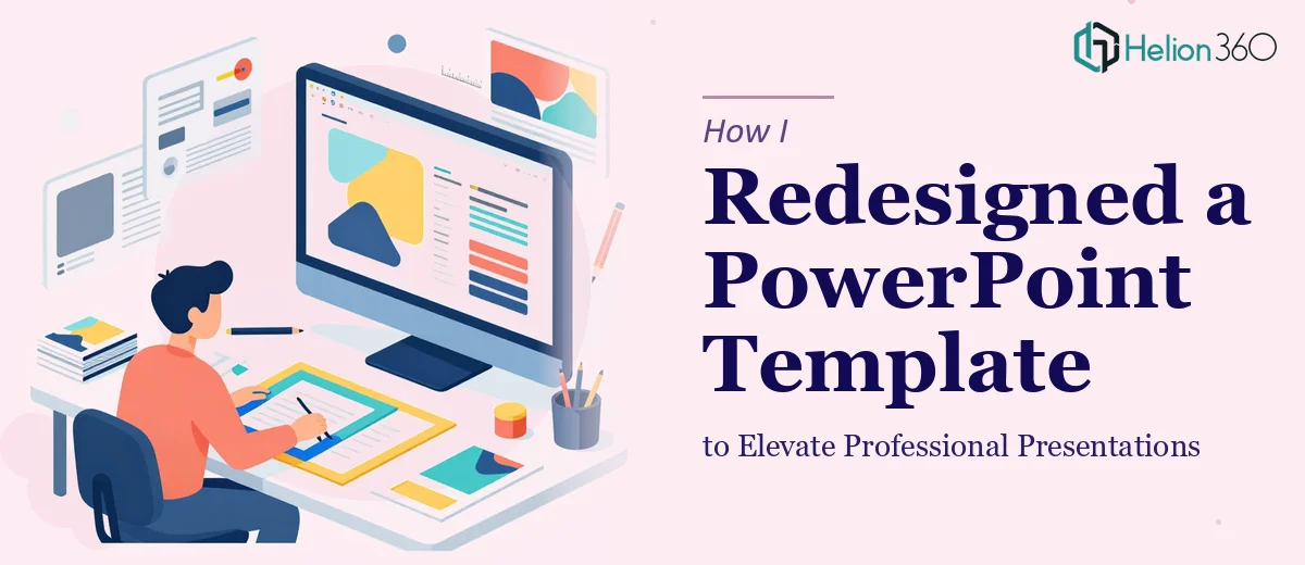
The Template That Needed More Than a Quick Fix
I had a PowerPoint template that had been in use for a while. It worked, technically — the placeholders were in the right places, the structure made sense, and the content was solid. But every time I opened it to prepare a presentation, something felt off. The colors were flat, the fonts clashed subtly, and the overall layout looked like it had been assembled rather than designed.
For internal use, it was fine. But this template was going to represent the business externally — in client meetings, proposals, and professional settings where first impressions count. I knew it needed a real overhaul, not just a color swap.
Where DIY Design Hits a Wall
I started making changes myself. I updated the color palette to something more cohesive, adjusted a few font sizes, and tried to rework the slide master to apply changes globally. I am comfortable with PowerPoint at a functional level, but I quickly realized that getting a template to look truly polished is a different skill set entirely.
The issue was not just visual taste — it was the technical side of template design. Slide masters, layout inheritance, consistent spacing across different slide types, icon styles that actually match, and making sure every placeholder behaves correctly when someone else uses the file. Every time I fixed one thing, something else shifted. The presentation redesign I was attempting was turning into a frustrating loop.
I also realized I had a blind spot around what makes a PowerPoint template feel professional versus merely functional. There is a gap between those two things, and I was clearly sitting on the wrong side of it.
Bringing in the Right Help
After a few sessions of getting nowhere productive, I reached out to Helion360. I explained what I had — a working draft template with established placeholders and a general direction — and what I needed: a professional PowerPoint redesign that maintained the structure but elevated everything visually.
Their team asked a few focused questions about brand colors, the audience for the presentations, and whether there were any existing brand assets to incorporate. It was a brief conversation, but it covered everything that mattered. I shared the file and let them take it from there.
What the Overhaul Actually Involved
What came back was a significant improvement. The slide master had been properly restructured so that font and color changes applied consistently across every layout. The color scheme was refined — not dramatically different, but noticeably more intentional, with a clear primary, secondary, and accent color working together rather than competing.
The typography was cleaned up. Heading and body font pairings were selected to improve readability, and the sizing hierarchy made sense at a glance. Visual elements like dividers, icon placeholders, and section breaks were added where they naturally supported the layout without cluttering the slides.
Perhaps most importantly, the template was easy to use. Every placeholder worked as expected. Dropping content into the slides produced clean results without requiring manual adjustments. That usability is something I had underestimated — a standardized template system is only as good as how it behaves in the hands of whoever uses it next.
What I Took Away From This
The experience clarified something for me: presentation design, particularly at the template level, is a discipline on its own. It combines visual design principles with technical knowledge of how PowerPoint actually works — slide masters, layout hierarchy, theme consistency. Getting one of those right without the other still produces a flawed result.
The redesigned template has since been used across multiple presentation types. The feedback has been consistently positive, specifically around how professional and cohesive everything looks without additional formatting effort from the person building the slides.
If you are working with a PowerPoint template that is functional but not quite where it needs to be, Helion360 is worth reaching out to — they handled the full redesign efficiently and delivered something that actually works in practice, not just in preview.