

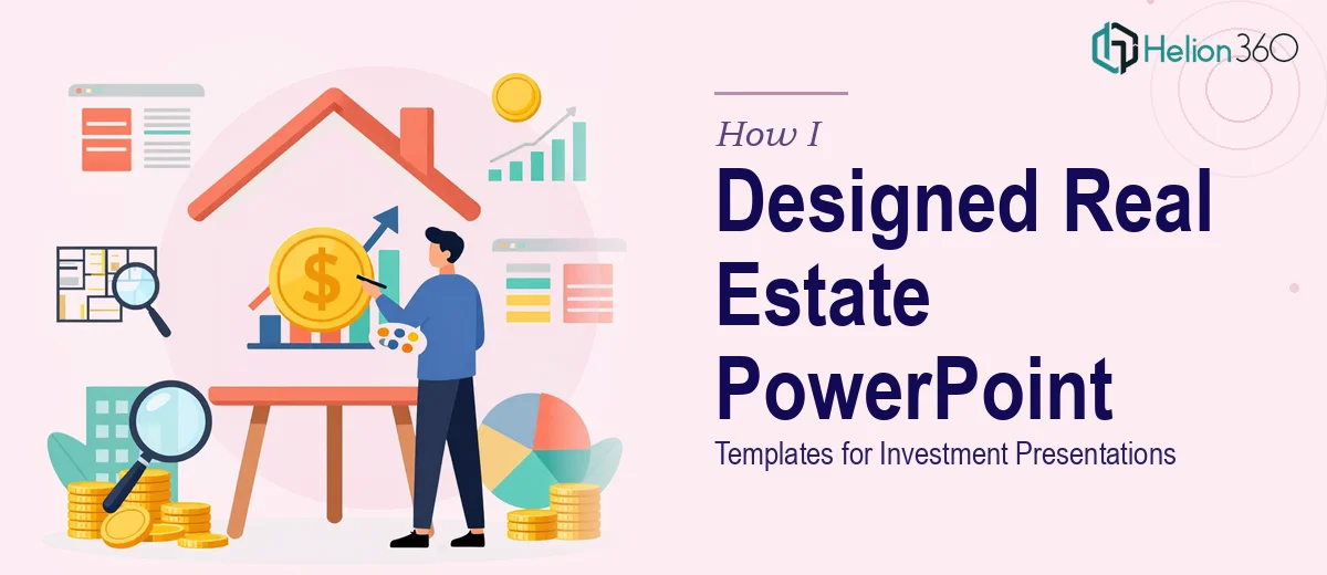
When Good Data Lives Inside a Bad Slide Deck
I work with a team that puts together detailed financial reports for real estate investments. The numbers are solid. The analysis is thorough. But every time we walked into an investment meeting or conference, I could see the energy in the room drop the moment the first slide appeared.
The templates we were using were old, inconsistent, and honestly just hard to read. Different fonts, mismatched colors, charts that looked like they were built in 2010. The content deserved better, and I knew it.
So I decided to take a shot at fixing it myself.
What I Tried Before Asking for Help
I started by going through our existing PowerPoint slides one by one. I cleaned up some fonts, tried to align color schemes, and replaced a few outdated chart styles. For a couple of hours, it felt like I was making progress.
But the deeper I got, the more I realized the problem was structural. It was not just about making things look nicer — the entire presentation template needed a rebuild. The master slides were a mess. Slide layouts were not consistent. Some slides had data crammed into tiny boxes while others had large empty sections. And none of it felt like something you would show at a serious investment meeting.
I also had no clear way to ensure the redesigned templates would look right across different screen sizes and projector setups, which mattered because our presentations were used in various conference environments.
I knew how to clean up a slide. I did not know how to rebuild a presentation system from scratch.
Bringing in the Right Team
After hitting that wall, I came across Helion360. I explained the situation — real estate financial presentations, inconsistent templates, upcoming meetings, tight turnaround. Their team understood the brief immediately.
What I appreciated most was that they did not just start swapping colors and calling it a redesign. They reviewed the existing templates first, asked questions about our audience and use cases, and then came back with a clear approach. They rebuilt the master slide structure so every layout we used would stay visually consistent without manual adjustments. They introduced design elements that made financial data easier to scan — cleaner chart styles, better use of white space, and a color palette that actually matched the professional tone our presentations needed.
They also created a few additional slide layouts to cover gaps in our existing report structure, which I had not even thought to ask for but turned out to be exactly what was missing.
What the Redesigned Templates Actually Delivered
When I got the final files back, the difference was immediate. The same data that used to feel dense and cluttered now had room to breathe. Charts were readable at a glance. The slide layouts guided the eye naturally from the headline to the supporting detail.
More importantly, the templates were built to be reused. Every slide we had — property overviews, financial projections, portfolio summaries — had a consistent structure that my team could update without breaking the design. That alone saved us hours of back-and-forth every time we needed to refresh a report.
At the next investment meeting, the response was noticeably different. People were engaged from the first slide. A few attendees even commented on how clean and professional the presentation looked.
What I Learned from This
A PowerPoint Redesign Services is not just a visual exercise. When you are dealing with financial presentations for real estate investment, the design has to support the data — not compete with it. Getting that balance right requires more than aesthetic judgment. It requires understanding slide architecture, visual hierarchy, and how audiences actually process information in a live presentation setting.
Trying to do that work yourself when you have a content-heavy, multi-layout deck is a fast path to frustration. The better move is to hand it off to people who do this regularly.
If your investment presentations are not landing the way the underlying work deserves, Helion360 is worth reaching out to — they took a broken template system and turned it into something our entire team now relies on. For complex scenarios like ours, outdated presentation redesigns can completely transform how stakeholders engage with your content.