

The Week Before Launch Is Never the Right Time to Realize Your Slides Are a Mess
I had exactly one week before a product launch presentation, and the slides I was working with looked like they had been built by three different people with three different ideas about what "professional" means. Fonts were inconsistent, layouts were cramped, and the color palette was all over the place. For a B2B audience — the kind of buyers who notice when things look unpolished — this was a real problem.
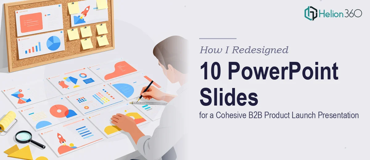
The brief was clear: 10 slides, cohesive layout, on-brand, and visually strong enough to hold attention in a boardroom setting. Simple enough in theory. In practice, it was anything but.
What I Tried to Fix First
I started by going through each slide individually and trying to standardize the layouts manually. I adjusted font sizes, aligned text boxes, and swapped out a few images. I also experimented with a couple of color schemes — pulling the brand's primary blue and pairing it with a neutral gray to keep it clean and corporate.
But the more I adjusted one slide, the more I noticed how off the others looked by comparison. Changing the layout on one slide in PowerPoint is manageable. Changing the layout across 10 slides while maintaining visual consistency, logical flow, and brand alignment is a different problem entirely. The slide master wasn't set up properly, which meant every formatting change had to be made manually per slide. That's where things started to fall apart.
I also realized I wasn't just dealing with a layout issue — I was dealing with a storytelling issue. The slides didn't have a clear visual hierarchy. A viewer couldn't tell at a glance what was the headline, what was supporting detail, and what was a call to action. For a product launch aimed at B2B decision-makers, that lack of clarity is a dealbreaker.
Bringing in the Right Support
After spending the better part of a day making incremental fixes that weren't adding up to anything cohesive, I reached out to Helion360. I explained the situation — tight deadline, 10 slides needing layout overhaul, B2B product launch context, and a need for font and color recommendations that fit the brand.
Their team asked the right questions upfront: What's the product? Who's the audience? What's the tone — formal boardroom or energetic pitch? Do you have brand guidelines? Within a short briefing, they had enough to move forward.
What the Redesign Actually Involved
Helion360 restructured the slide master first, which solved the root problem I had been working around. With a proper master template in place, all 10 slides could be updated consistently without manually touching every element. They applied a clean typographic system — a strong sans-serif for headlines, a lighter weight for body text — and set up a color scheme that balanced the brand's core palette with enough contrast to be readable on projection screens.
The layouts themselves were rebuilt with proper visual hierarchy in mind. Each slide had one clear focal point, supporting content was organized into logical zones, and whitespace was used deliberately rather than accidentally. The result was a product launch presentation that felt intentional from the first slide to the last.
They also flagged a few slides where the content itself was working against the design — too much text, too many competing elements — and suggested how to simplify without losing the message. That kind of input made a real difference.
What the Final Deck Looked Like
By the time the revised file came back, the transformation was significant. The 10 slides looked like they came from the same design system. The B2B product launch presentation had a clear beginning, middle, and end. The color scheme was consistent, the typography was readable, and the layouts gave every piece of content the right amount of space.
More importantly, the deck was ready to present — not just visually, but structurally. It communicated the product clearly, respected the audience's intelligence, and held together as a professional piece of work.
If you're staring down a similar situation — a cluttered presentation redesigned before a tight deadline, or a polished PowerPoint presentation that needs to land with decision-makers — Helion360 is worth reaching out to. They stepped in at the point where I was losing time on fixes that weren't working, and delivered exactly what the presentation needed.