

When the Presentation Backlog Started Piling Up
Our marketing team was moving fast. New proposals going out every week, client decks being requested from multiple directions, and a growing stack of rough draft presentations that needed to be turned into something actually presentable. The content was solid — the ideas were there — but getting those ideas into clean, polished Canva slideshows was where things kept stalling.
I took it on myself at first. I spent a few evenings in Canva trying to clean up the drafts, align everything properly, and make the slides look consistent with our branding. For one or two decks, that approach worked. But when the volume picked up, the quality started slipping. I was spending more time wrestling with layout decisions than actually moving work forward.
The Real Challenge With Canva Presentation Work
The issue was not the tool itself. Canva is genuinely usable — even for someone without a deep design background. The challenge was maintaining visual consistency across multiple presentations, each with different content structures, different audiences, and different goals. One deck was a client proposal. Another was a capability overview. A third was a quick sales leave-behind.
Each required its own visual logic while still looking like it came from the same company. Getting that balance right takes more than just dragging and dropping elements. It takes an eye for spacing, hierarchy, color balance, and the ability to reinterpret rough content into something that communicates clearly at a glance. I was managing too many moving parts to do that well on my own.
Reaching Out to Helion360
After a particularly messy week of late-night edits and inconsistent slide outputs, I came across Helion360. I explained the situation — a growing backlog of Canva presentations that needed to go from rough draft to polished, client-ready slideshows, with consistent branding and fast turnaround.
Their team picked it up quickly. I shared the rough drafts along with our brand colors, logo files, and a few notes on tone. From there, they handled the layout restructuring, the visual cleanup, and the slide-by-slide formatting. What had been taking me hours per deck was being returned to me looking clean and professional — usually within a day or two.
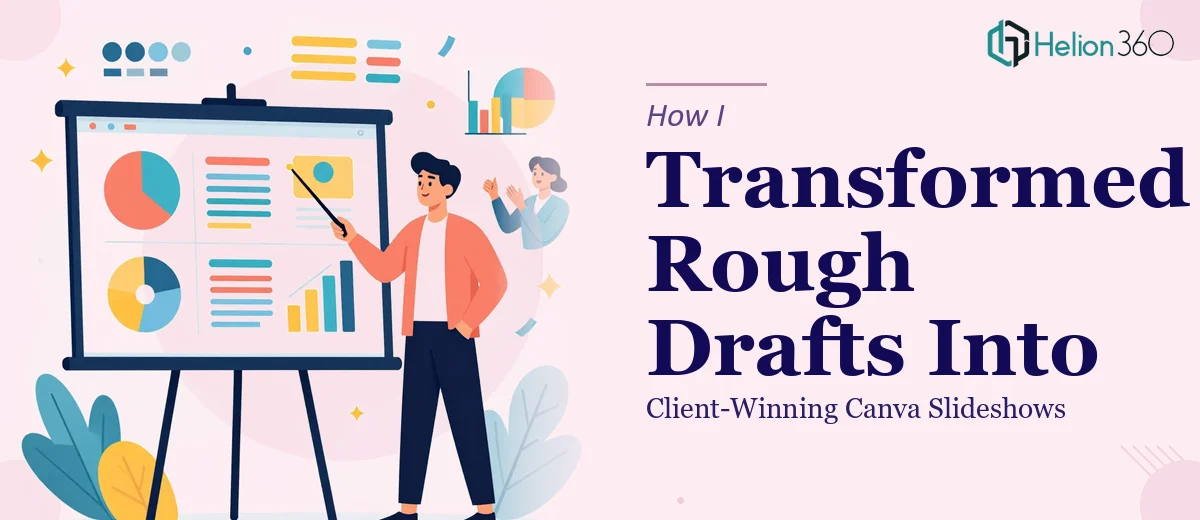
What the Final Presentations Actually Looked Like
The difference between the rough drafts and the finished Canva slideshows was significant. Slides that had been cluttered with too much text were restructured into clear visual sections. Data points that had been buried in paragraphs were pulled out and given visual weight. Brand elements were applied consistently across every deck without any of the visual drift I had been struggling with.
More importantly, the presentations started doing their job. They looked credible in client meetings. The proposal decks felt like they were built by a company that takes its own presentation seriously — which, in turn, made clients take the proposals seriously too.
What This Process Taught Me
There is a threshold where managing presentation design in-house stops making sense, especially when the volume is high and the stakes are real. Canva makes it easy to start, but finishing a presentation well — making it visually sharp, consistently branded, and structured in a way that actually lands with an audience — is a different skill set.
Keeping up with the demand for high-quality visuals while also running everything else on the marketing side simply was not sustainable without support. Having a team that could take rough drafts into polished slideshows changed how quickly we could move.
If you are dealing with a similar backlog of presentations that need to go from draft to done, Helion360 is worth reaching out to — they handled exactly that for us and consistently delivered brand-aligned presentations ready to use without rounds of back-and-forth.