

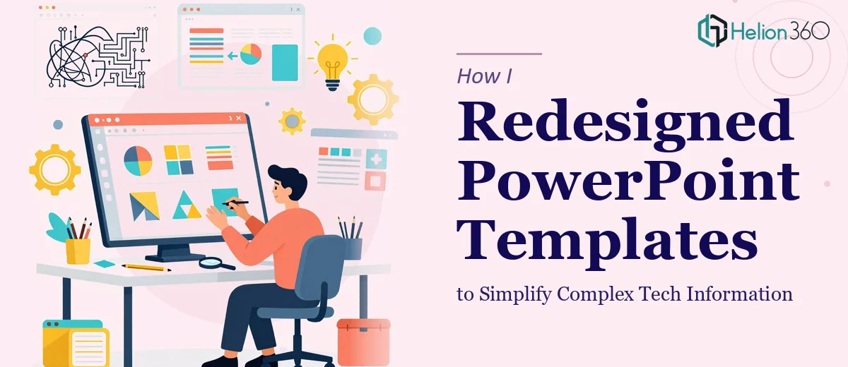
When Your Slides Stop Doing Their Job
We had a problem that crept up slowly. Our internal PowerPoint templates had been patched together over time — different fonts here, inconsistent color blocks there, slides that tried to say everything and ended up communicating nothing. For a tech company dealing in dense product information, that was a real issue.
I took it on myself to fix it. I figured a PowerPoint redesign couldn't be that complicated. I knew the content, I understood the brand direction, and I had enough familiarity with PowerPoint to get started.
What I Ran Into Trying to Do It Myself
The first problem was the templates themselves. They weren't just visually outdated — they were structurally inconsistent. Slide masters were a mess, placeholder positioning varied across layouts, and some slides had been manually formatted so many times that the underlying structure was essentially broken.
I spent a few hours trying to rebuild the master slides, but every time I fixed one layout, something shifted in another. Text boxes overlapped. Fonts reverted. The color palette I was trying to enforce kept getting overridden by older theme settings buried in the file.
Beyond the technical side, I also ran into the harder design challenge: how do you take genuinely complex technical information and make it look simple without dumbing it down? That's a very specific visual storytelling skill, and honestly, it's not something you can figure out in an afternoon.
Bringing in a Team That Knew What They Were Doing
After about two days of fighting with slide masters and watching the design drift further from what I had in mind, I decided to stop guessing and get help. A colleague pointed me toward Helion360, and after a quick look at their work, I reached out.
I shared the existing templates, our brand guidelines, and a brief explaining what the slides needed to accomplish — primarily, making complex tech product information readable for both internal teams and external audiences. The Helion360 team asked the right questions up front: What tone did we want? Who was the primary audience? Were there specific slide types we used most often?
That back-and-forth gave me confidence they weren't just going to slap a new color scheme on the old files and call it done.
What the Redesigned Templates Actually Looked Like
The first draft came back cleaner than I expected. The slide master was rebuilt properly — consistent spacing, correct font hierarchy, and a color palette that matched our brand without feeling corporate and flat. Each layout had a clear purpose, and the structure made it easy for anyone on the team to drop in content without breaking the design.
More importantly, the approach to complex information was thoughtful. Dense technical specs that used to sit in paragraph blocks were reworked into visual frameworks — structured layouts that used space and contrast to guide the reader's eye rather than relying on bullet points and walls of text. The slides didn't simplify the content; they made it easier to follow.
We went through one round of revisions — minor adjustments to a few slide layouts and some tweaks to the icon style — and then the templates were ready to roll out.
What Changed After the Redesign
The difference showed up immediately in how our team used the slides. People stopped building their own rogue versions because the new templates were actually flexible enough to work with. Presenters spent less time fixing formatting and more time refining their actual message.
For a tech company where clarity and credibility go hand in hand, having professional presentation design that holds up under scrutiny matters. A slide deck that looks inconsistent or dated undermines the content before the presenter even speaks.
The other thing I took away from this experience: a PowerPoint redesign isn't just a visual exercise. It's a structural and communication challenge. Getting the layouts right, making the master slides actually functional, and designing for complex information — that combination requires a specific kind of expertise.
If you're sitting on a set of outdated templates that your team keeps working around rather than with, Helion360 is worth reaching out to. They took a technically broken, visually inconsistent set of files and turned them into something the whole team could actually use.