

When the Content Is Complex, the Design Has to Work Harder
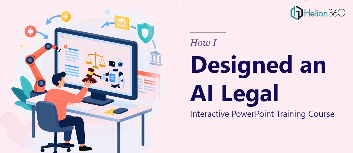
I was tasked with building a PowerPoint presentation for an AI legal training course aimed at law students and practicing legal professionals. On paper, that sounds straightforward. In practice, it was anything but.
The course covered a wide range — starting from basic AI fundamentals and moving all the way into advanced legal applications like contract analysis, predictive litigation tools, and regulatory compliance. The audience was sharp, technically curious, and would immediately disengage if the slides felt generic or poorly structured.
So I opened PowerPoint and started building. That was the beginning of the problem.
What I Tried to Do on My Own
My first attempt was to organize the content into clean sections with consistent typography and a color scheme that felt professional without being dull. I tried to make each module visually distinct — using icons, section dividers, and callout boxes to break up the dense legal and technical material.
But the more content I worked with, the clearer it became that this presentation needed more than formatting. It needed instructional design thinking baked into every slide. The course had to move between conceptual explanations and real-world legal scenarios, and those transitions needed to feel smooth and logical rather than abrupt.
I also struggled with the interactive elements. The training required clickable navigation, module progress indicators, and scenario-based slides where learners could explore different legal outcomes. Building those properly in PowerPoint — especially in a way that held up across different screen sizes and presenter setups — was taking far longer than I had anticipated.
I spent two full days and still felt like I was building the foundation rather than finishing the deck.
Bringing in the Right Team
After hitting that wall, I reached out to Helion360. I explained the scope — a multi-module AI legal training course, a technically informed audience, and the need for interactive PowerPoint design that balanced visual clarity with instructional depth.
Their team asked the right questions upfront. They wanted to understand the flow of the course, how the slides would be presented (live session vs. self-paced), and what the existing content structure looked like. That alone told me they were thinking about the presentation as a functional learning tool, not just a visual product.
What the Final Presentation Looked Like
Helion360 rebuilt the deck with a structured visual hierarchy that made the complexity of AI and law feel digestible rather than overwhelming. Each module had its own visual identity within a consistent design system — so learners always knew where they were in the course without needing a roadmap slide every few minutes.
The interactive elements were clean and reliable. Clickable menus, branching scenario slides, and section summaries were all built directly into the PowerPoint file without relying on third-party plugins. The result was a self-contained, instructor-ready training presentation that could be used as-is or adapted for a self-paced format.
Typography, spacing, and slide density were all carefully calibrated for a legal professional audience — enough information to be substantive, presented clearly enough that nothing required a second read.
What I Learned From This
Designing an interactive PowerPoint for a specialized training course is a genuinely different discipline from building a standard business presentation. The content complexity of combining AI concepts with legal applications demanded design decisions that I simply was not positioned to make quickly or confidently on my own.
The lesson I took from this project: if the content is multi-layered, the audience is expert-level, and the presentation needs to function as an actual learning experience, the design work deserves the same level of specialization as the content itself.
If you're working on a training presentation that involves dense subject matter, interactive navigation, or a professional audience that will notice every design choice, Helion360 is worth reaching out to — they treated this as a real instructional design challenge and delivered a finished product that reflected that.