

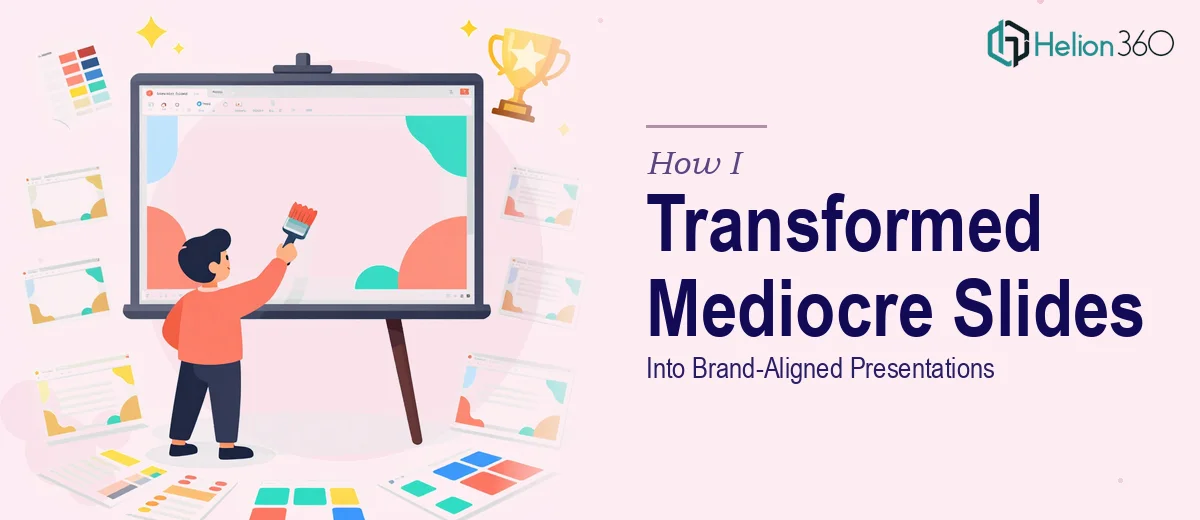
The Slides That Were Holding Us Back
I had a set of 20 PowerPoint slides that had been built up over time by different people, across different projects, with no consistent visual logic holding them together. Some used one font, others used three. The color palette shifted from slide to slide. A few had walls of text while others had barely any content at all. They technically communicated the right information, but they looked unprofessional and felt disconnected from everything else we put out as a company.
I knew they needed work. What I underestimated was how much.
Why I Thought I Could Handle It Myself
I have a decent eye for design and I know my way around PowerPoint well enough. So I started going through the slides one by one, cleaning up fonts, adjusting spacing, replacing low-quality images. The first few came together reasonably well. But by slide eight or nine, I hit a real problem — I was making each slide look better in isolation, but the deck still felt fragmented. There was no cohesive visual system tying everything together.
The bigger issue was brand alignment. Our company had brand guidelines — specific colors, typography rules, logo usage standards — and working those consistently into 20 slides while also improving readability, visual hierarchy, and overall layout was genuinely complex. It was not just a cleanup job. It was a full redesign that required both design skill and a solid understanding of how brand identity works in a presentation context.
I also did not have the time to give this the attention it needed. Every hour I spent adjusting slide margins was an hour I was not spending on actual work.
Handing It Over
After a few days of slow progress and inconsistent results, I reached out to Helion360. I shared the existing slides, the brand guidelines document, and a brief explanation of what the deck was supposed to achieve and who the audience was. Their team asked a few clarifying questions — mostly about tone, the key messages on certain slides, and whether any slides needed structural changes versus just visual improvements.
That initial conversation gave me confidence. They were not just going to reskin the slides and call it done. They understood that presentation redesign means thinking about hierarchy, flow, and how each slide connects to the next.
What the Redesigned Deck Looked Like
When I got the revised deck back, the difference was immediate. Every slide used the correct brand colors, the typography was consistent and legible, and the layouts had a clear visual structure — headline, supporting information, visual element — that made each slide easy to scan. Dense text blocks had been broken up and rewritten for clarity. Charts and data points were formatted cleanly rather than just dropped into a default Excel-generated style.
The slides felt like they belonged together. More importantly, they felt like they belonged to us — they reflected the brand accurately and projected the level of professionalism we needed.
Helion360 also made sure the slide master was set up properly, which meant any future slides I added would automatically inherit the correct fonts and colors. That was something I had not even asked for, but it saved me a significant amount of time going forward.
What This Experience Taught Me About Presentation Design
The biggest takeaway was understanding the difference between editing slides and redesigning them. Editing is surface-level — fixing typos, swapping images, adjusting a color here and there. Redesigning means stepping back and thinking about the deck as a whole: does it communicate clearly, does it look consistent, does it represent the brand correctly, and does it guide the viewer's attention in the right direction on every slide?
The second thing I learned is that brand alignment in presentations is harder than it looks. It is not just about using the right logo or color. It is about applying a visual language consistently across layouts that vary significantly from slide to slide — title slides, data slides, section dividers, closing slides. Getting that right takes both design judgment and attention to detail.
If you have a deck that is technically functional but visually inconsistent or off-brand, Helion360 is worth reaching out to — they took what I had, understood what it needed to become, and delivered a polished result that I could not have produced on my own in that timeframe.