

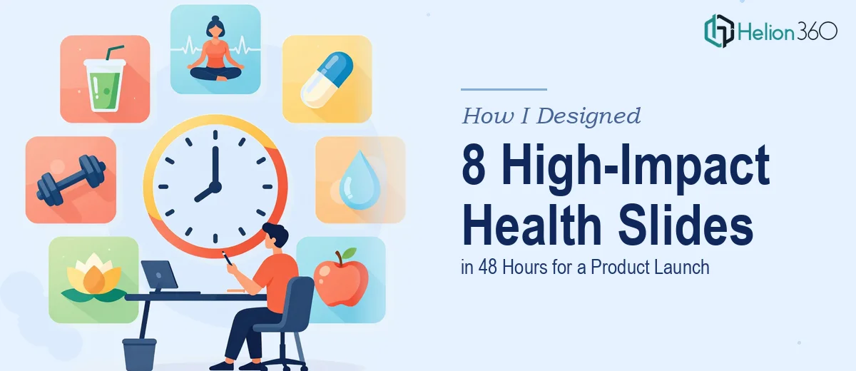
The Brief Arrived With Less Than Two Days on the Clock
I had just wrapped up a routine week when the message came through — we needed a full product launch presentation ready for a stakeholder meeting in less than 48 hours. Eight slides. Health and wellness theme. Polished, professional, and packed with key benefits, product features, supporting data, and visuals that could hold a room's attention.
On paper, eight slides sounds manageable. In practice, when you factor in sourcing relevant imagery, building out clean data visualizations, maintaining consistent branding, and making sure the narrative flows from slide to slide — it becomes a serious project under normal timelines. With less than two days, it felt like trying to build a house before the foundation had dried.
Where the Complexity Started Piling Up
I started with what I had — the product brief, a few internal documents outlining key features, and some rough ideas about what the presentation needed to communicate. The goal was clear: walk an audience through what this health and wellness product does, why it matters, and why now is the right moment to launch it.
I got the outline together fairly quickly. But when I sat down to actually build the slides in PowerPoint, I ran into the gap that always exists between knowing what you want and being able to execute it visually. The data needed to be turned into clean, readable charts. The product benefits needed to be laid out in a way that felt compelling without being wall-to-wall text. The imagery had to feel on-brand and relevant to the health and wellness space — not generic stock photos that look like every other corporate deck.
I spent a few hours attempting to push through it myself, but the results were not where they needed to be. The slides looked functional, not finished. For an internal update, that might have been acceptable. For a product launch presentation, it was not.
Bringing in the Right Support
After hitting that wall, I reached out to Helion360. I explained the situation — tight turnaround, eight slides, health and wellness product launch, a meeting already scheduled. I shared the brief, the content notes, and a few reference points for the visual direction I had in mind.
Their team took it from there. What I noticed immediately was that they did not just drop content into a template and call it done. They approached each slide as its own design problem — what does this slide need to communicate, and what is the clearest way to show it? The data was translated into well-structured charts that were easy to read at a glance. The product benefit slides used a layout that gave each point room to breathe rather than crowding everything together. The imagery felt intentional and consistent with the health and wellness tone rather than generic.
What the Finished Deck Looked Like
By the time the presentation came back to me, all eight slides were complete, visually cohesive, and ready to present without any last-minute patching. The health and wellness theme carried through every slide — in the color choices, the photography style, the typography, and the way the data was presented. It did not look like a rushed job. It looked like a considered piece of work.
The product launch meeting went smoothly. The slides held the room's attention in the way that a well-designed presentation does — the audience was focused on the content, not distracted by inconsistent formatting or hard-to-read charts.
What a Tight Deadline Taught Me About Presentation Design
The experience reinforced something I already suspected but had not fully tested: good presentation design is not just about making things look nice. It is about structuring information so that an audience absorbs it quickly and retains it. That takes time and skill, and when you are under pressure, trying to do it all yourself often produces work that is just functional enough to regret.
For a product launch — where the goal is to build confidence and excitement — the quality of the presentation design directly affects how the product itself is perceived. That is not a detail worth cutting corners on.
If you are facing a similar situation — a tight deadline, a high-stakes presentation, and not enough time to do justice to the design — Helion360 is worth reaching out to. They handled what I could not within the window I had, and the final product was exactly what the moment called for.