

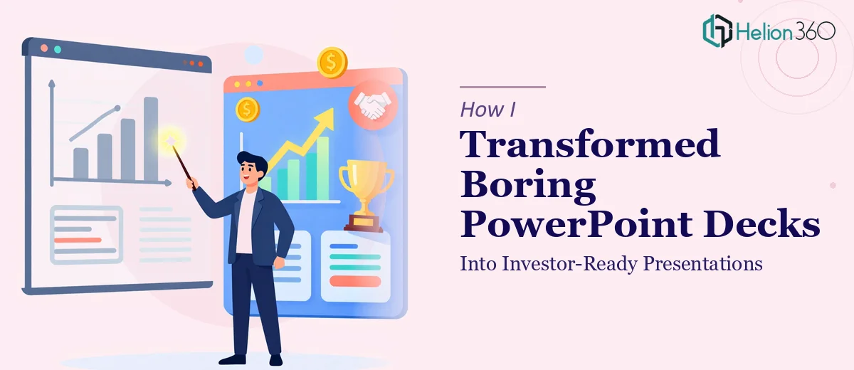
When Internal Slides Just Won't Cut It Anymore
We had a problem that's common in fast-growing startups: presentations that worked fine for internal stand-ups but fell completely flat the moment they were in front of an external audience. Think conference stages, investor rooms, and marketing pitches — environments where a misaligned font or a cluttered data slide doesn't just look bad, it costs you credibility.
The decks existed. The content was solid. But the gap between "functional slides" and a genuinely investor-ready presentation turned out to be enormous. With a fundraising pitch coming up and a conference appearance on the calendar, I needed these decks elevated fast — not patched, not prettied up with a few new colors, but actually rebuilt to land with a sophisticated external audience.
I knew straight away this wasn't a weekend fix. It needed to be done right.
What I Found Out the Moment I Looked Closely
I started researching what a proper PowerPoint redesign — specifically for investor-facing and conference use — actually involves. What I found quickly dispelled any notion this was a cosmetic exercise.
First, the narrative structure of a startup presentation has real rules. Investors follow a known sequence: problem, solution, market size, traction, team, ask. Each slide has to earn its place and move the story forward. Slides that were written for internal context carry assumptions that an external audience simply won't share — they need to be restructured from the ground up, not just reworded.
Second, data visualization at this level is a discipline of its own. Charts that looked fine in internal reporting become confusing or untrustworthy when presented to investors who are scanning for signal fast. The chart type, the label density, the axis logic — all of it signals whether the team behind the deck understands its own numbers.
Third, brand consistency at the slide level is far more demanding than most people expect. It's not just logo placement. It's a coherent system of type hierarchy, color usage, spacing, and iconography that holds across every single slide.
What a Proper Presentation Elevation Actually Involves
The work starts with a full structural audit of the existing slides. Done well, this means mapping every slide to a clear narrative purpose — identifying which slides carry load-bearing information, which ones bury the key message in body copy, and which ones need to be collapsed, reordered, or cut entirely. For a startup deck heading into investor meetings, the story arc typically runs across 10–15 slides, with each slide serving one idea. Restructuring that from an internal deck that sprawls across 30-plus slides is real editorial work. It requires understanding both the business context and the conventions of the audience receiving it — and getting that wrong undermines everything that follows.
Visual mechanics come next, and this is where the execution complexity compounds quickly. A professional presentation operates on a layout grid — typically a 12-column structure — with a strict typographic hierarchy: headline at 36pt, subhead at 24pt, body at 16pt, captions at 12pt. Charts get rebuilt to investor-grade standards: bar charts for comparisons, line charts for trends, no 3D effects, no pie charts with more than four segments. Setting this up correctly across master slides and slide layouts, and ensuring every element snaps to the grid without exceptions, takes hours of precise work even for someone experienced. For someone new to it, it's a multi-day learning curve before a single polished slide exists.
Polish and brand consistency is the final layer, and it's what separates a deck that looks "pretty good" from one that reads as professionally produced. This means applying a maximum of four brand colors with defined usage rules — primary for headlines, accent for data callouts, neutrals for backgrounds — and enforcing that system without deviation across every slide. Icon sets need to be unified in weight and style. Spacing between elements needs to be mathematically consistent, not eyeballed. The moment a slide breaks the system — a slightly different shade of blue, an icon at the wrong weight — the deck loses the quiet authority that investor-ready presentations carry.
Why I Brought Helion360 In to Handle the Full Project
When I mapped out what a proper transformation actually required — structural rework, investor-grade data visualization, and full brand system enforcement across every slide — it was immediately clear that attempting this in-house wasn't realistic. Not because the work was mysterious, but because doing it well requires a combination of editorial judgment, design system expertise, and sheer execution capacity that takes years to build.
I brought Helion360 in to handle the project end-to-end. They covered the full scope: auditing and restructuring the narrative across all the decks, rebuilding the data slides to investor-grade visual standards, and applying a consistent brand system from the master slides down to every caption and icon. The turnaround was fast — done in days, not the weeks it would have taken to learn and execute this properly from scratch. What came back was production-ready, not a draft that needed another round of fixes.
The Result and What I'd Tell Anyone Looking at the Same Problem
The decks that came back were a different category of work from what went in. The investor pitch had a clean 12-slide narrative arc, data slides that communicated at a glance, and a visual consistency that held across every page. The conference presentation was built for a room — high-contrast layouts, large type, and a visual flow that didn't require the speaker to explain what the audience was looking at.
The fundraising conversation moved faster because the materials didn't create friction. Investors spent time on the content, not decoding the slides.
If you're looking at a similar gap — internal slides that need to become genuinely investor-ready or conference-grade presentations — and you want it handled end-to-end without the weeks of learning curve, Helion360 is the team to engage. They delivered fast, handled the full depth of execution this kind of work requires, and the result reflected it.