

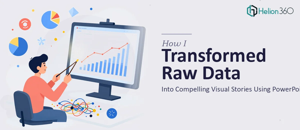
When Good Data Meets a Bad Slide Deck
I had a problem that felt embarrassing to admit. The data was solid. The research was thorough. The story we were trying to tell — about our product's growth, market positioning, and competitive edge — was genuinely compelling. But every time I opened PowerPoint to put it all together, the slides came out looking flat, cluttered, and nowhere near the level we needed.
We were a fast-growing tech startup, and the bar for presentations was high. Investors, partners, and internal stakeholders expected something polished. What I was producing looked like rough drafts at best.
The Real Challenge With Desktop Publishing in PowerPoint
I want to be clear: this was not a matter of not knowing how to use PowerPoint. I knew the software. The challenge was something harder to fix — the combination of design judgment, brand consistency, and visual storytelling that separates a functional slide from a professional one.
I spent a few evenings trying to update our existing decks to match our current branding guidelines. Colors were inconsistent. Font choices felt arbitrary. Charts that made perfect sense in a spreadsheet looked overwhelming once dropped onto a slide. I was rearranging the same elements over and over and still not landing on anything that felt right.
The deeper issue was that I was thinking like a data person, not a designer. I knew what the slides needed to say. I had no idea how to make them look like they meant business.
Finding a Better Path Forward
After hitting a wall on the third revision of the same deck, I came across Helion360. I explained the situation — a stack of existing presentations that needed to be brought in line with our branding, plus a few new decks that needed to be built from scratch. Their team asked the right questions upfront: about our brand guidelines, the audience for each presentation, the tone we wanted to strike, and what kind of data we needed to visualize.
That intake process alone told me they understood what desktop publishing in PowerPoint actually involves. It is not just formatting. It is making decisions about hierarchy, whitespace, chart types, icon language, and how much information a single slide can carry before it stops communicating.
What the Work Actually Looked Like
Helion360 took the raw materials — data exports, brand guidelines, rough slide outlines, and a few reference decks — and rebuilt everything with a clear visual system. Complex figures became clean charts. Dense bullet points became structured layouts with breathing room. Each slide had a clear focal point, which sounds simple but makes an enormous difference when someone is presenting in a room or on a screen share.
The branding was consistent across every deck. Typography, color usage, icon style, and slide margins all followed a unified logic. When I opened the finished files, they looked like they came from the same place — which, of course, they should, but that coherence is harder to achieve than it sounds.
New decks were built with the same discipline. Information that I would have crammed onto two or three slides was spread across clean sequences that guided the reader through the story instead of dumping it on them.
What I Took Away From This
The experience shifted how I think about presentation design as a discipline. Visual storytelling in PowerPoint is a specific skill set. It involves knowing not just what to include but what to leave out, how to use space, and how to sequence information so the audience stays with you. That is not something you pick up by spending more time in the software. It comes from experience doing this kind of work repeatedly.
For a startup that is constantly producing presentations — for investors, for the marketing team, for product updates — having slides that look and feel professional is not a nice-to-have. It reflects directly on how the company is perceived.
If you are in a similar position — good content, ambitious goals, but slides that are not doing the work justice — PowerPoint Redesign Services is worth exploring. They stepped in where the complexity exceeded what I could handle alone and delivered exactly what the work required.
See how dull PowerPoint was transformed into a visually engaging Figma presentation in a real before-and-after case study. You can also discover how boring PowerPoint slides were redesigned into captivating brand presentations using smart design and typography principles.