

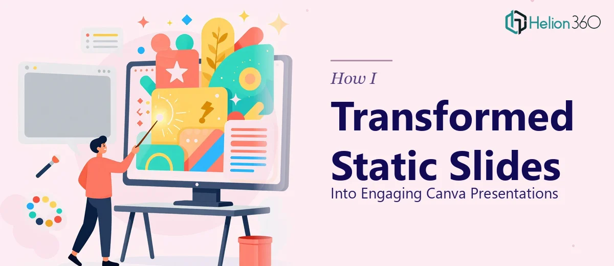
The Problem With the Existing Slides
I was sitting in front of a folder of PowerPoint files that had been built over the years — some going back to earlier brand guidelines, others thrown together for quick internal meetings. The content was solid. The design was not. Bullet point after bullet point, plain white backgrounds, inconsistent fonts, and charts that looked like they were assembled in a hurry.
These slides needed to be used in a proper external presentation. The audience would expect something polished, something that held attention beyond the first minute. I knew moving everything into Canva was the right call — the platform had the templates, the flexibility, and the visual depth that PowerPoint lacked in our hands. The question was how to actually do it well.
What I Tried on My Own
I opened Canva, imported a few slides manually, and started rebuilding from scratch. It went fine for the first couple of slides. I found a template that roughly matched the brand colors, swapped in the text, and dropped in a few icons. But by slide eight, I was already running into trouble.
The font hierarchy was not consistent across slides. The template I had chosen was not designed to carry a full 30-plus slide deck without visual repetition. Some of the data slides — the ones with multiple charts and comparative statistics — simply did not translate cleanly from PowerPoint. Fitting that density of information into a Canva layout without making it look cramped required design decisions I was not confident making on the fly.
Beyond the design choices, the time was adding up fast. Rebuilding each slide individually, managing element alignment, and keeping visual storytelling coherent across a deck that size was going to take far more than a weekend.
Bringing in the Right Support
After hitting that wall, I reached out to Helion360. I explained the situation — a full PowerPoint to Canva redesign, roughly 30 slides, with specific brand guidelines and a mix of text-heavy and data-heavy layouts. Their team asked a few focused questions about the audience, the intended tone, and whether I wanted the slides editable after delivery. Within a short turnaround, they had a clear plan.
What made the handoff smooth was that I did not need to explain basic design concepts. They understood immediately what a Canva presentation redesign involved — which templates scale across a full deck, how to handle chart-heavy slides without losing clarity, and how to maintain visual consistency when you are working with inherited PowerPoint content that was never built around a single design system.
What the Redesigned Canva Presentation Actually Looked Like
The result was a significant shift. Each slide had a clear visual hierarchy — headline, supporting visual, one key idea per frame. The data slides used clean infographic-style layouts instead of raw PowerPoint charts, which made the numbers easier to read at a glance. The color palette was consistent from the first slide to the last, which is something I had completely failed to control in my own attempt.
The template structure they built inside Canva also meant that if I needed to update text or swap a chart later, I could do it myself without breaking the layout. That was a practical detail that mattered a lot for ongoing use.
The entire project — around 50 hours of work — came back as a fully structured Canva presentation that felt professionally designed without looking overproduced. It struck the right balance between visual engagement and clear communication.
What I Took Away From This
The gap between knowing Canva exists and actually using it to redesign a complex PowerPoint deck is wider than most people expect. The platform is capable, but a presentation redesign at this scale involves real decisions about layout, typography, visual storytelling, and consistency — not just picking a template and pasting content in.
I also learned that starting the process myself was not wasted effort. It helped me understand exactly where the complexity was, which made the brief I handed over much more specific and useful.
If you are looking at a similar stack of static slides and wondering whether the redesign is something you can absorb into your own schedule, Helion360 is worth a conversation — they took on exactly the kind of work that was slowing me down and delivered polished, professional decks that actually held up under real use.