

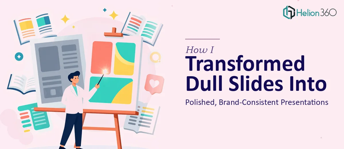
The Slides Were Functional. Just Not Good Enough.
We produce informational presentations for clients on a regular basis. The content is solid — researched, accurate, and genuinely useful. But the slides themselves? They looked like they were assembled in a hurry, because most of them were.
Different font sizes across sections. Mismatched colors. Layouts that shifted from slide to slide without any visual logic. Nothing technically broken, but nothing that looked intentional either. When a client opens a deck and every slide feels slightly different from the last, it quietly undermines the professionalism of everything inside it.
I knew the presentations needed work. I just underestimated how much.
What I Tried to Fix on My Own
My first instinct was to handle it internally. I spent a few hours going through the slides, standardizing font choices, adjusting spacing, and trying to apply a consistent color palette. For a slide or two, this worked reasonably well. But as I moved through the full deck, new problems kept surfacing.
Aligning elements across slides without a proper master slide setup meant every manual fix created a new inconsistency somewhere else. I tried working from a template, but the existing content did not map cleanly onto it. Some slides had too much text, others had images that were stretched or off-brand. The more I adjusted, the more I realized that fixing the surface level was not going to solve the underlying structural problem.
This was not a matter of not knowing PowerPoint. It was a matter of not having the time or the design framework to rebuild the presentation properly while keeping the content intact.
Bringing In the Right Help
After hitting a wall with the third iteration of the same deck, I reached out to Helion360. I explained the situation — a set of existing slides that needed a full enhancement, not a rebuild from scratch. Consistent branding, clean layouts, proper visual hierarchy, and slides that could be used repeatedly across different client deliverables.
Their team asked the right questions upfront. What was the brand palette? Were there existing brand guidelines? Which slides were highest priority? Within a short exchange, they had enough context to move forward without back-and-forth slowing things down.
What the Enhanced Slides Actually Looked Like
The difference between the before and after was more significant than I expected, and it was not just cosmetic. The team restructured the slide layouts so that content areas were consistent across every slide. Headers sat in the same position. Icons and visuals were uniform in size and style. The typography was cleaned up and applied through a proper master slide, which meant any future updates would stay consistent automatically.
Branding elements — the logo, color scheme, and font choices — were no longer scattered across the deck. They were anchored. Every slide now communicated the same visual identity without the reader noticing the design work itself, which is exactly the point.
The slides felt authoritative without feeling overdesigned. Clean, readable, and consistent from the first slide to the last.
What This Experience Clarified for Me
Enhancing existing PowerPoint slides sounds like a smaller task than building something from scratch. In practice, it can be more complex. You are working within constraints — existing content, existing structure, sometimes existing brand rules that were never properly documented. Getting it right requires both design skill and an understanding of how presentations are actually used.
I also came away with a more practical takeaway: the value of a well-structured master slide cannot be overstated. Once Helion360 set that up properly, every slide we produced afterward looked consistent with no additional effort. That alone saved time on future decks.
Presentation redesign is one of those tasks that seems approachable until you are inside it. The gap between a functional slide and a polished, brand-consistent one is wider than it looks from the outside.
If your slides are in a similar state — technically complete but visually inconsistent — Helion360 is worth reaching out to. They took a messy collection of informational slides and turned them into something we could confidently put in front of clients.