

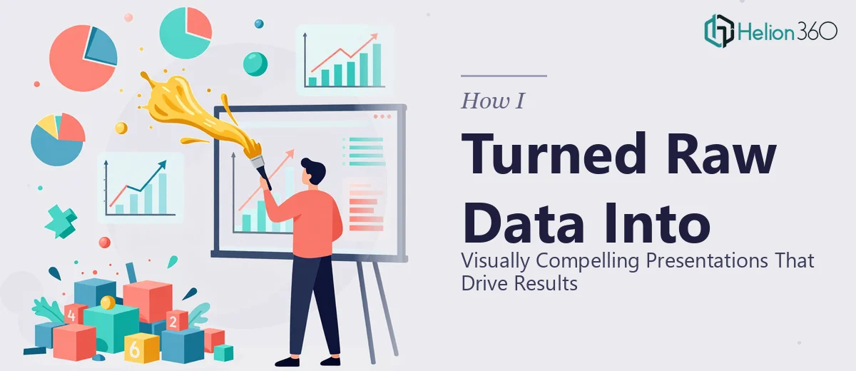
When the Numbers Are Right But the Slides Are Wrong
I had everything I needed — spreadsheets, statistics, performance figures, trend lines. On paper, the data told a strong story. But when I dropped it all into PowerPoint, the slides looked exactly like what they were: a wall of numbers with no visual logic behind them.
The project involved presenting a series of complex metrics to a team that needed to make decisions based on what they saw. That means accuracy mattered, but so did clarity. A misread chart or an unlabeled axis could send the entire conversation in the wrong direction.
I knew the content. I just did not know how to make it look like something worth presenting.
What I Tried Before Asking for Help
My first instinct was to handle it myself. I started by building basic bar charts directly in PowerPoint and pulling graphs from Excel. They were functional, but that was the best thing I could say about them. The charts were crowded, the colors clashed with the slide background, and nothing had a consistent visual style.
I tried adjusting the chart types — switching from bar to line to pie — hoping something would click. It helped a little, but the underlying problem was not the chart type. It was that I was thinking like someone who understood the data, not like someone who needed to receive it.
Data visualization in a presentation is a specific skill. You have to decide what deserves emphasis, what can be simplified, what needs a callout, and how to keep the visual hierarchy clean enough that someone scanning the slide can still extract the key point in under five seconds. That combination of analytical judgment and design sensibility was not something I could fake on a deadline.
How Helion360 Stepped In
After a couple of frustrating revision cycles, I reached out to Helion360. I explained the situation — raw figures, a data-heavy presentation, and a need for charts and visual elements that would actually communicate something rather than just display information.
Their team asked the right questions upfront. What was the audience? What decisions needed to be made after viewing this? Were there specific metrics that needed to stand out? That level of context-gathering made a real difference in the output.
They took the raw data I provided and rebuilt the visual layer from scratch. Every chart was chosen based on what it needed to communicate, not just what was easiest to generate. Trend data became clean line charts with clear annotations. Comparative figures were structured into grouped visuals that made the contrast immediate. Summary stats were pulled out as highlighted callouts rather than buried inside tables.
What the Final Presentation Actually Looked Like
The difference was significant. The slides that once looked like exported spreadsheets now had a coherent visual structure. Each data visualization had a clear hierarchy — a headline that stated the point, a chart that supported it, and supporting labels that did not clutter the space.
Accuracy was handled carefully throughout. Every figure was verified against the source data before it was placed in the presentation. No rounding errors, no mislabeled axes, no chart that contradicted the numbers it was supposed to represent. That attention to detail was exactly what the project required.
The presentation went from something I was hesitant to share to something I felt confident putting in front of decision-makers. The data did not change — the way it was communicated did.
What This Experience Taught Me About Data in Presentations
There is a real gap between understanding data and presenting it effectively. Raw figures do not speak for themselves. They need to be translated into visuals that reduce cognitive load, highlight what matters most, and give the viewer a clear path through the information.
Building charts in PowerPoint is easy. Building compelling visual presentations that are accurate, visually clean, appropriately scaled, and contextually meaningful — that requires a different level of skill. It also requires time, which most working professionals simply do not have when the deadline is close.
If you are sitting on a dataset that needs to become a polished, professional presentation and you are running into the same wall I was, Helion360 is worth reaching out to — they took over exactly where I got stuck and delivered something that worked.