

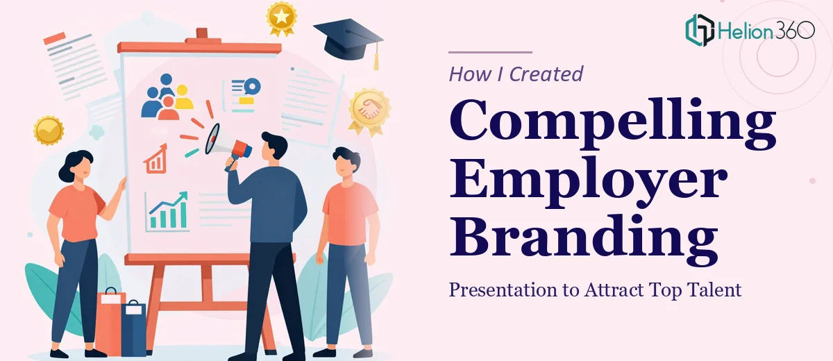
The Task That Seemed Simple at First
I had an upcoming HR and recruitment conference, and my goal was straightforward enough: build a workshop presentation on employer branding that would show our company culture and make a strong case for why top talent should choose us. Clean, professional, engaging. How hard could it be?
As it turned out — harder than I expected.
I had the ideas. I knew our culture well. But translating that into a presentation that actually communicated value, held attention, and looked polished enough for a professional conference setting was a different challenge altogether.
Where Things Got Complicated
I started building the slides myself. I had a rough structure — who we are, what we stand for, what working here looks like, and what we offer. But every time I tried to make it visually compelling, it felt flat. The slides were full of text. The flow was off. I kept second-guessing the messaging hierarchy.
Employer branding is not just about listing perks. It is about storytelling — making someone feel something about your company before they have even walked through the door. Getting that emotional pull into a slide deck, while keeping it professional enough for a conference audience, required a level of design and messaging skill I did not have time to develop on my own.
The deadline was closing in, and what I had was not conference-ready.
Bringing in the Right Support
After spending two evenings reworking the same five slides without progress, I reached out to Helion360. I explained the context — a workshop presentation on employer branding, a real conference deadline, an audience of HR leaders and decision-makers, and content that needed to balance authentic storytelling with sharp professional design.
Their team asked the right questions upfront. What was the core message I wanted every attendee to walk away with? What did our culture actually look like day-to-day? What tone did I want — aspirational, grounded, or somewhere in between? That conversation alone helped me get clearer on what the presentation was really supposed to accomplish.
What the Final Presentation Looked Like
Helion360 took the rough content I had and rebuilt the structure from scratch. The narrative arc became much cleaner — it opened with the talent landscape challenge, moved into who we are as an employer, showed real culture signals through visuals and concise statements, and closed with a clear value proposition for potential candidates.
The design matched the tone we were going for: modern but not cold, professional but human. They used visual storytelling techniques to make abstract things like culture and values feel tangible on screen. Each slide had a clear purpose. Nothing felt padded or generic.
The workshop format also required audience interaction moments, and they built those into the flow naturally — discussion prompts and pause points that would make the session feel like a conversation rather than a lecture.
What I Took Away From This
Presenting on employer branding is not the same as writing an internal HR policy. The audience is evaluating your authenticity in real time. If the presentation looks generic or reads like a brochure, it undermines the very message you are trying to deliver.
Getting the structure, the visual language, and the narrative arc right — all at once, under deadline — is genuinely difficult. I had the content knowledge, but I did not have the design or messaging bandwidth to pull it together at that level.
The conference session went well. The feedback I received was that the workshop felt well-prepared and the material was easy to engage with. That outcome came from having a presentation that was actually built to do its job.
If you are in a similar position — you know your subject but you are running out of time or struggling to make the slides match the quality of your ideas — Helion360 is worth reaching out to. They handled the parts I was stuck on and delivered something I could present with confidence.