

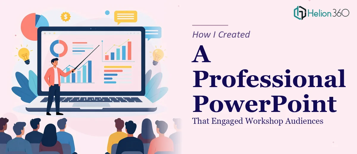
I Had the Content. The Slides Were the Problem.
I had spent weeks preparing for an upcoming workshop. The research was solid, the talking points were clear, and I knew exactly what I wanted to communicate. What I did not have was a PowerPoint presentation that looked anywhere close to professional.
My first attempt was exactly what you would expect from someone who knows the subject but not the software. I dumped content onto slides, picked a default theme, and called it a day. When I previewed it, the result was a wall of text interrupted by mismatched clip art. It did not reflect the quality of the material underneath it.
Why DIY Slide Design Gets Complicated Fast
I tried to fix it myself over a weekend. I watched a few tutorials on layout and spacing, experimented with fonts, and tried to build a consistent visual style. Some slides improved. But the moment I tried to apply that same look across all the sections — the introduction, the detailed content slides, the product benefits section, and the conclusion — things started to fall apart visually.
Branding consistency alone was a challenge. I needed the logo placed correctly on every slide without it looking tacked on. I wanted charts and graphics to support the content without overwhelming it. And the slides needed to flow logically so that a room full of workshop attendees could follow along without getting lost.
Every time I fixed one problem, another appeared. The deadline was approaching and I could not afford to keep circling.
Handing It Over to Someone Who Knew What They Were Doing
After hitting a wall, I reached out to Helion360. I explained the situation — I had all the content ready, I had a rough structure in mind, and I needed someone to take it and turn it into a presentation that actually looked the part.
Their team asked the right questions upfront. What was the tone of the workshop? Who was the audience? Were there brand guidelines to follow? Once I shared the content, the logo files, and a rough outline, they got to work.
What the Final Presentation Looked Like
The difference between what I had built and what Helion360 delivered was significant. The slide design was modern and clean, with a consistent visual style carried across every section. The introduction set the right tone without overloading the audience. The detailed content slides were broken into digestible chunks with supporting visuals. The benefits section used simple graphics that made the value proposition immediately clear. And the conclusion tied everything together in a way that felt intentional rather than rushed.
The logo was integrated properly throughout, not just placed in a corner as an afterthought. Where data needed a chart, there was a chart — formatted cleanly and labeled clearly. Where a concept needed a graphic, the visual actually reinforced the point instead of decorating around it.
When I walked into the workshop and ran through the slides, the presentation held the room. Attendees followed the flow, asked questions at the right moments, and commented on how organized the material felt. That kind of response does not happen when your slides are a mess.
What I Took Away From This
Knowing your content deeply and knowing how to present it visually are two different skills. I had the first one covered. The second required a different kind of expertise — someone who understands layout, pacing, visual hierarchy, and branding consistency in the context of professional PowerPoint design.
The tight deadline made the decision easier. There was no time to keep experimenting. But honestly, even without the time pressure, handing this off was the right call. The outcome was better than anything I would have produced on my own, and the workshop was stronger for it.
If you are in a similar position — content ready, deadline close, and slides that are not doing your material justice — Helion360 is worth reaching out to. They took everything I had prepared and shaped it into something that actually worked in the room.