

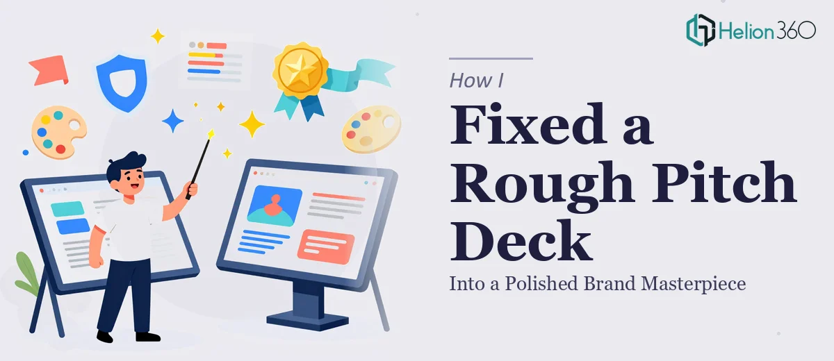
The Deck Was a Mess and the Stakes Were Real
Our team had put together a first draft of our startup pitch deck under pressure. Slides were mismatched in font sizes, the brand colors weren't consistent from one section to the next, and several slides had outright typos sitting in headline positions. It wasn't a blank-canvas problem — the structure was roughly there — but the execution gap between where the deck sat and where it needed to be was significant.
The audience we were heading into wasn't going to be forgiving. Early-stage investors notice everything, and a rough-looking deck signals that a team either doesn't take the details seriously or hasn't thought carefully about how they present. Neither impression was one we could afford to make. I recognized quickly that getting this deck to a genuinely polished state wasn't a light editing job — it was a real project.
What I Found That Pitch Deck Polishing Actually Involves
I spent some time understanding what a proper pitch deck clean-up actually requires before doing anything else. The gap between a rough draft and a polished, investor-ready deck isn't just about spell-checking. There are at least three layers of work that need to happen simultaneously.
First, there's the content layer — every sentence needs to communicate clearly and confidently, with no ambiguity about what the company does, what the market opportunity is, or what the ask is. Then there's the visual mechanics layer — font hierarchies, spacing, alignment, and grid consistency need to hold up across every single slide, not just the cover. And then there's brand discipline — color palettes applied correctly, logo usage consistent, and tone unified from the first slide to the last.
The combination of all three hit me as clearly beyond a weekend project. Each layer is its own craft, and doing all three together without breaking something in the process requires genuine expertise.
The Real Work Behind a Pitch Deck Clean-Up
The foundation of any pitch deck polish job is a content and narrative audit. The right approach starts with reading every slide against the core story the deck is trying to tell — does each slide earn its place, does the language match the stage and audience, and does the narrative arc hold together from problem through solution to ask? Proper copy refinement means working to a strict standard: no jargon that isn't explained, no claims that aren't supported on the slide itself, and no headline that's doing double-duty as body copy. This layer alone takes more time than most people expect, because changing one slide's framing often has a ripple effect on two or three others.
Visual mechanics are where rough drafts most visibly fall apart. A properly structured presentation runs on a consistent layout grid — typically a 12-column system — with a defined type hierarchy across three levels: a primary headline (around 36pt), a secondary label or subhead (around 24pt), and supporting body text (around 16pt). Every element on every slide needs to snap to that system. Misaligned text boxes, inconsistent line heights, and runaway font substitutions are endemic in team-built decks, and fixing them slide by slide without accidentally inheriting the original errors is painstaking work that trips up anyone who hasn't done it many times before.
Brand application is the finishing layer that separates a cleaned-up deck from a genuinely polished one. The standard is strict: a maximum of four brand colors used with clear rules about which is dominant, which is accent, and which is reserved for data or callouts. Logo placement, margins, and background treatments need to follow a single template that was defined from the start. In team-built decks, this layer is almost always inconsistent — someone used an off-brand blue on slide seven, someone else stretched the logo on slide twelve — and correcting it requires going back to the brand guidelines and reapplying them from scratch rather than patching each slide individually.
Why I Brought Helion360 In to Handle the Full Project
I didn't try to work through this myself. Looking at what the clean-up actually required — a content pass, a full visual rebuild to a proper grid, and a brand consistency audit across every slide — it was obvious that attempting it in-house would cost us more time than we had and would likely produce a deck that was better but still not good enough.
Helion360 handled the full project end-to-end. That meant the content refinement pass, the complete visual re-architecture of the slide layouts, and the brand consistency layer applied across every slide — not just the headline slides. They turned it around quickly, in a fraction of the time it would have taken us to work through the same scope ourselves. What I got back wasn't a patched version of the original — it was a deck rebuilt to a professional standard, with all three layers of work done properly and cohesively.
The speed mattered as much as the quality. Done in days, not weeks, with no back-and-forth on basics.
What Came Out of It and What I'd Tell Anyone in My Position
The delivered deck held together as a single coherent document — consistent typography, brand colors applied correctly throughout, copy that read with clarity and confidence at every stage of the narrative. The slides that had carried the most embarrassing errors were now the ones that landed hardest. Walking into that investor conversation, I wasn't thinking about whether the deck looked right — I was thinking about the conversation itself, which is exactly where my head needed to be.
The gap between a rough internal draft and a pitch-ready deck is wider than it looks from the inside. If you're staring at a deck that your team built under pressure and you know it needs real work before it goes in front of anyone important, don't underestimate what that work actually involves. If you want it handled end-to-end and delivered fast, Helion360 is the team to engage — they have the expertise and the process already in place to take a rough draft across the finish line properly.