

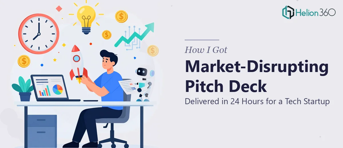
The Deadline That Made It Real
I was sitting with a tech startup team that had a window — a genuine, don't-miss-it window — to present their new product to a room of people who could change the trajectory of the company. The problem was the pitch deck didn't exist yet, and we had 24 hours.
This wasn't a deck that could be rough around the edges. It needed to cover market research, competitive analysis, go-to-market strategy, financial projections, and team credentials — all of it — while looking polished, on-brand, and built to hold the attention of a sophisticated audience. The stakes were real. A weak presentation at a moment like this doesn't just fail to impress; it actively works against you.
I knew immediately this needed to be done right, not done quickly by someone learning on the job.
What I Found a Startup Pitch Deck Actually Requires
When I started thinking through what a proper startup pitch deck involves at this level, the scope came into focus fast. This isn't a matter of dropping bullet points onto branded slides. A pitch deck for a product launch with competitive positioning, market sizing, and financial projections is a structured argument — and every section has to earn its place.
The first signal of real complexity was the narrative architecture. Investors and stakeholders read pitch decks the same way they read proposals — they're looking for a logical thread that connects the problem, the solution, the market opportunity, and the team's ability to execute. If that thread breaks anywhere, the deck loses its audience.
The second signal was the visual work. The deck had to carry the startup's brand identity — the right color palette, typography, and layout — consistently across every slide, including data-heavy ones like market size charts and financial projection tables.
The third signal was the content depth. Market research slides require sourced data presented credibly. Competitive analysis requires a framework that doesn't just list competitors but positions the product's differentiation clearly. Financial projections need to be legible and defensible, not just numbers in a table. Each of these sections is its own sub-project.
What the Work Actually Looks Like When Done Well
The structural work starts with a narrative audit of every content element the team has — raw notes, product docs, financial models, research — and mapping it against the standard pitch arc: problem, solution, market size, product, traction, business model, go-to-market, team, and ask. Done well, this isn't a passive sorting exercise. A practitioner makes deliberate decisions about which data points earn slide real estate and which get cut entirely. Decks that try to say everything say nothing. Getting from a pile of source material to a clean, investor-grade story arc typically takes several hours of disciplined structural editing before a single visual decision gets made.
The visual mechanics of a startup pitch deck follow specific rules. A 12-column layout grid keeps slide compositions consistent across slides of wildly different content types — a text-forward problem slide and a data-heavy market sizing chart need the same underlying structure so the deck doesn't feel disjointed. Typography hierarchies in a professional deck run something like 36pt for primary headlines, 24pt for subheads, and 16pt for body — and those sizes have to be enforced across master slides, not adjusted ad hoc per slide. Chart choices matter too: TAM/SAM/SOM market sizing typically renders as a nested circle diagram, not a bar chart, because the visual relationship between layers is the point. Getting these mechanics right from the start — before content is applied — is where amateurs lose hours to rework.
Polish and brand consistency is where decks either land or fall apart at the finish line. A startup's brand identity — primary and accent colors, logo placement rules, icon style — needs to propagate correctly across every slide type, including ones that are mostly financial data. The safe rule is no more than four brand colors in active use across the deck, with a clear hierarchy for which color carries emphasis versus which recedes. Applying this consistently across a 20-to-25 slide deck, including edge cases like dark-background slides and co-branded title treatments, is detail work that takes time and a trained eye. One misaligned element on a key slide signals carelessness to an audience that's already looking for reasons to be skeptical.
Why I Brought in Helion360 to Handle It
I didn't spend time debating whether to attempt this internally. The scope was clear, the timeline was brutal, and the cost of a mediocre output was too high. The right move was to engage a team that does this work every day and already has the tooling, templates, and process to move fast without sacrificing quality.
Helion360 handled the full project end-to-end — narrative structure, visual design, brand application, and the data-heavy sections including the competitive analysis framework and the financial projection slides. They turned it around in a fraction of the time it would have taken anyone on our team to learn and execute it from scratch. The deck was done in under 24 hours: story arc locked, slides built, brand consistent throughout, and the financial and market sections presented in a way that held up under scrutiny.
That kind of speed comes from having the workflow already built — not from rushing.
What I'd Tell Anyone Looking at the Same Situation
The deck that came out of this project was the version of the story the startup needed to tell — coherent, visually credible, and specific enough to invite serious questions rather than polite deflection. The team walked into that room with something they were proud to present, which matters more than people admit.
The lesson I took away is simple: when the timeline is tight and the output has to be right, the decision to engage a specialist team isn't a luxury — it's the only realistic path. Trying to do this internally under a tight deadline, with no prior pitch deck design process in place, is how you end up with a deck that looks like it was made under a 24-hour deadline.
If you're staring at a similar crunch — a product launch deck, an investor meeting, a competitive presentation that has to be airtight — Helion360 is the team I'd engage. They delivered fast, handled the full execution depth this kind of work requires, and the result spoke for itself.