

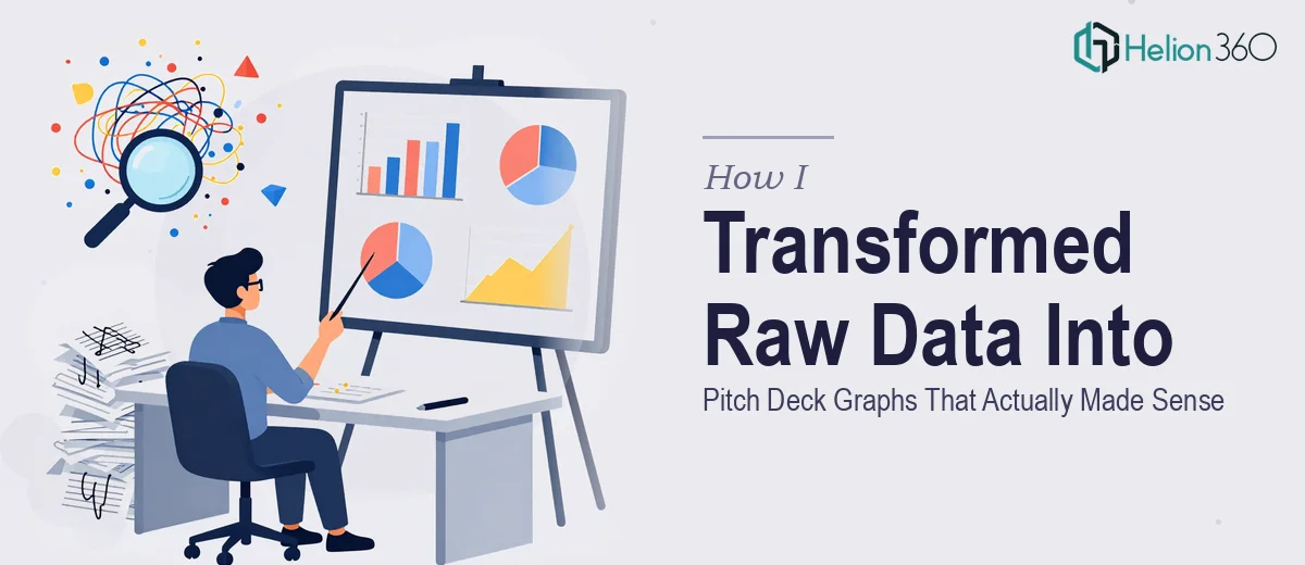
The Data Was Ready. The Presentation Was Not.
I had a business idea I was genuinely confident in, and I had the numbers to back it up. Market size, customer demographics, financial projections, growth trajectory — the raw material was all there. What I didn't have was a pitch deck that could put that data in front of investors and make it land.
The stakes were clear. Investors form impressions fast, and if the graphs on my slides looked like something thrown together in an afternoon, the credibility of the underlying numbers would take a hit before I'd said a word. I needed charts that were visually consistent with the brand, easy to read in a live presentation setting, and precise enough to hold up under scrutiny. That combination — clarity, brand alignment, and analytical accuracy — isn't something you just knock out over a weekend. I recognized quickly that this needed to be handled by people who do this work at a professional level.
What I Found Out Pitch Deck Data Visualization Actually Requires
I spent some time researching what good pitch deck graphs actually involve before I did anything else. The gap between a passable chart and one that works in a high-stakes investor context is larger than most people expect.
The first thing that stood out was how much chart selection matters. A bar chart and a waterfall chart can display similar data — but one tells the story of growth stages and the other just compares totals. Choosing the wrong chart type doesn't just look amateurish; it obscures the argument you're trying to make.
The second thing was brand consistency. Colors, fonts, line weights, and label styles have to be deliberately set and then applied uniformly across every chart in the deck. One off-brand graph in a ten-slide deck pulls the eye and signals that the presentation wasn't made by one cohesive team.
The third signal of real complexity was interactivity. If the goal is graphs that viewers can explore — filtering by segment or drilling into projections — that's a different technical output entirely from static slide charts. It requires a different build process, different export formats, and someone who understands how that deliverable gets used in a real presentation environment.
What the Work to Build These Graphs Actually Involves
The first thing that has to happen is a structural audit of the data and the narrative it needs to support. For a pitch deck, each chart earns its place by answering a specific investor question — market size, feasibility, competitive positioning, or growth outlook. The practitioner's job is to map each dataset to its purpose before a single chart is built. This means deciding which data points belong on which slides, what the takeaway of each chart should be, and whether the chart type chosen (clustered bar, line trend, pie breakdown, waterfall) actually communicates that takeaway cleanly. Getting this architecture wrong means the charts look fine individually but don't build a coherent case across the deck. Reworking the narrative structure mid-build costs hours and usually requires redoing charts from scratch.
The second layer is the visual mechanics of the charts themselves. A well-built pitch deck graph typically adheres to a strict type hierarchy — title labels at around 14-16pt, axis labels at 10-12pt, data callouts at 11-13pt — and uses a palette capped at three to four brand-aligned colors with clear contrast ratios for legibility on a projected screen. Gridlines, tick marks, axis titles, and legends all require deliberate decisions about whether they add clarity or visual noise. These rules aren't complicated in isolation, but applying them consistently across ten or more charts — especially when the data shapes vary — means constant manual adjustment. Someone new to this will spend more time on formatting than on the actual analysis.
The third piece is polish and cross-deck consistency. Every chart in the deck needs to feel like it came from the same visual system: matching corner radii on bar elements, identical font rendering, consistent spacing between the chart area and the slide frame. In practice, this means working from a master style configuration and checking every chart against it before export. Even small deviations — a slightly different shade of the brand blue, a data label that sits one pixel outside the bar — are visible to trained eyes and erode the sense of professional execution. Achieving that level of finish across a full set of financial and market data charts takes attention to detail that compounds quickly.
Why I Brought Helion360 in to Handle the Full Build
I didn't attempt to build these charts myself. Once I understood what the work actually required — the narrative mapping, the chart mechanics, the brand consistency across the full set — it was obvious that doing it properly would take far longer than I had before my investor conversations.
Helion360 handled the entire project end-to-end. That meant taking the raw data across market research, customer demographics, and financial projections and determining the right chart type and visual treatment for each dataset. It meant building every chart to brand spec and ensuring the full set read as a unified visual system. And it meant delivering the full output quickly — done in days, not the weeks it would have taken me to learn the tooling and execute it at this level.
The team already had the process, the templates, and the expertise in place. There was no ramp-up time, no iteration on fundamentals.
What the Deck Delivered and What I'd Tell Anyone in the Same Spot
What came back was a complete set of charts for market sizing, demographic breakdowns, and financial projections that looked like they belonged together, aligned to my brand, and made the data argument clearly on each slide. The investor conversations I'd been building toward felt different with visuals that held up under scrutiny. The underlying analysis was unchanged; what changed was that it was now credible on sight.
If you're sitting on solid data for a pitch deck and you're realizing that turning it into clear, branded, presentation-ready graphs is its own specialized job — it is. If you want it handled end-to-end and delivered fast, Helion360 is the team to engage.