

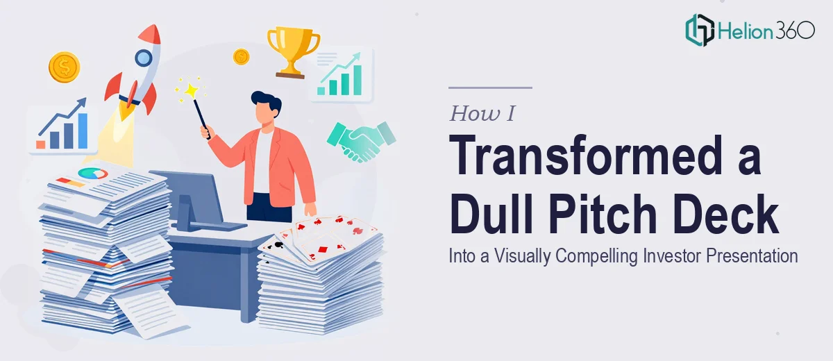
The Presentation Was Ready. The Design Was Not.
I had the content — a 22-slide investor pitch deck covering our company story, product, market research, competitive positioning, financials, testimonials, and team. The narrative was solid. What I didn't have was a presentation that looked the part. This was going to investors and potential business partners, and the visual quality of the deck directly signals the quality of the team behind it.
The deadline was tight. One week. And the stakes weren't abstract — a poorly designed pitch deck undermines credibility before a single word is spoken. I knew immediately that this wasn't a situation where an average effort would do. Getting the pitch deck design right, on a short timeline, with investor-grade visual standards, was the only acceptable outcome.
What I Found a Professional Pitch Deck Actually Requires
I started looking into what a properly designed investor pitch deck involves, and it became clear quickly that this is a much deeper discipline than formatting slides. The design has to work on two levels simultaneously: visual craft and narrative clarity.
First, each slide type — company intro, product description, market research summary, competitive analysis, financial projections, team bios — has its own layout logic. What works for a market data slide is completely different from what works for a testimonial slide or a financial projections slide. There's no single template that handles all of them well.
Second, investor-facing decks carry an expectation of brand consistency and typographic precision that most general presentation files don't meet. The moment a font size drifts or a color is off-brand, it reads as careless. And third, sourcing and placing high-quality, sector-relevant imagery — licensed correctly — is its own time-consuming task that requires both taste and access to the right asset libraries.
This was not a weekend project. Not even close.
What the Work Actually Involves
The foundation of a strong pitch deck is narrative structure mapped to slide architecture. Before a single visual element is placed, the flow of the deck needs to be audited: does the company mission land before the product slide? Does the market research summary set up the competitive advantage slide? Does the financial projections slide appear at the right moment in the story arc — after credibility has been established, not before? Each slide must earn its position and hand off cleanly to the next. Getting this right means treating the deck as a single continuous argument, not a collection of independent pages. Experienced designers read decks this way instinctively; for someone doing it for the first time, just mapping the story arc correctly can take more time than the visual work itself.
Visual mechanics — grid, typography, and color — are where a pitch deck either holds together or falls apart. The right approach uses a consistent layout grid across all 22 slides, typically a 12-column structure, so that text blocks, images, and data visuals align predictably no matter what content type is on the page. Typography hierarchy follows a strict scale: a headline at 36pt, supporting text at 24pt, and body or caption copy at 16pt. No exceptions. Brand color usage is capped — typically a maximum of four colors applied with discipline. Deviating from any of these rules, even subtly, produces a deck that feels unpolished even when the content is strong. Enforcing this consistency across 22 different slides, each with different content loads, is the kind of detail work that trips up even experienced generalists.
Financial and data visualization slides introduce a specific layer of complexity. A financial projections slide and a market research summary slide both require the right chart types — not just aesthetically chosen, but chosen because they communicate the correct relationship in the data. A bar chart and a line chart tell different stories; using the wrong one misleads the reader. Data labels, axis titles, and legend placement need to follow visualization conventions that investors recognize immediately. Beyond chart selection, any data-heavy slide requires visual hierarchy treatment so that the key number — the one the audience should take away — reads first. This is precision work, and doing it correctly while maintaining the deck's overall visual tone requires both design skill and data fluency.
Why I Brought in Helion360 to Handle It
I didn't attempt this myself. One look at the full scope — narrative structure, slide-by-slide layout architecture, typography discipline, data visualization, imagery sourcing, brand consistency across 22 slides — and the calculation was straightforward. This work requires a team that does it every day, with the process and tooling already in place.
Helion360 handled the full project end-to-end. That meant auditing the narrative flow and restructuring where needed, building the visual system from the ground up — grid, type scale, color palette — and applying it consistently across every slide type, including the financial projections and market research sections. They sourced and licensed sector-relevant imagery without me having to chase down assets. The entire deck was turned around in days, not weeks — a fraction of the time it would have taken me to learn and execute this at the required level.
The speed mattered as much as the quality. With a one-week window, there was no room for iteration loops on fundamentals. Helion360 came in with the expertise already built in, which meant the output was investor-grade from the first version.
What the Deck Delivered — and What I'd Tell Anyone in My Spot
The finished deck was a presentation I was genuinely confident putting in front of investors. The company intro slides established credibility immediately. The product and competitive advantage slides were visually clean and easy to follow. The financial projections and market research slides communicated data clearly without overwhelming the reader. The team bios looked polished and professional. Every slide felt like it belonged to the same story.
More importantly, the design didn't compete with the content — it supported it. That's the right outcome for an investor pitch deck: the audience is focused on the argument, not distracted by the visuals.
If you're looking at a similar situation — a high-stakes pitch deck with a tight deadline and no margin for a rough first attempt — Helion360 is the team to engage. They delivered the full project fast and handled the execution depth this kind of work demands.