

The Deadline Was Real and the Stakes Were Higher Than I Expected
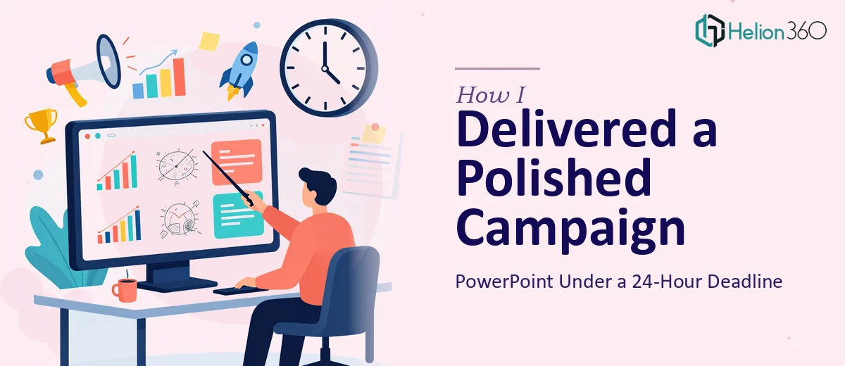
I had a marketing campaign presentation due to senior leadership in less than 24 hours. Not a rough draft — a polished, brand-compliant deck that would be shown in a formal review meeting with people who notice when fonts are off, when slide padding is inconsistent, or when a chart looks like it was pulled from a default Excel template.
Our startup had a full set of brand guidelines: a defined color palette, specific logo usage rules, a typography system, and a visual language that had taken months to establish. The expectation was that every single slide reflected all of it — accurately, consistently, and at a standard that matched what we'd put in front of clients externally.
I knew immediately this wasn't something I could patch together in an evening. Done wrong, it would undermine the professionalism of the campaign itself. It needed to be done right, and it needed to be done fast.
What I Found Out a Brand-Compliant Presentation Actually Requires
Before I made any decisions, I spent an hour understanding what a properly executed on-brand PowerPoint actually involves. What I found made it clear this was a real discipline, not a styling exercise.
First, applying brand guidelines to a multi-slide deck isn't just swapping colors and fonts. It requires setting up slide masters and layouts so that every element — text boxes, image placeholders, divider lines, footer zones — inherits the correct specifications. One inconsistency in the master propagates across every slide that uses it.
Second, the visual elements — charts, data callouts, infographics — have to be rebuilt from scratch to match the brand aesthetic. Default chart styles in PowerPoint don't come close to a polished visual standard, and mapping data clearly while staying within a restricted palette takes real decisions about chart type, label placement, and color assignment.
Third, incorporating current design trends without breaking the established brand identity requires judgment. It's not about applying whatever looks modern — it's about knowing which trends (clean whitespace, large-format typography, minimal icon systems) actually reinforce a tech startup's visual language rather than conflict with it.
That research took about an hour. Building it correctly would take far longer.
What the Work Actually Involves From Start to Finish
The first thing that needs to happen is a structured audit of the brand guidelines document against the current slide file. Proper brand application means confirming the exact hex values for primary, secondary, and accent colors — typically a maximum of four brand colors used consistently — and checking that the font hierarchy is enforced at the right sizes: commonly 36pt for slide titles, 24pt for section headers, and 16pt for body text. Deviations as small as two points on a subtitle can break the visual rhythm across a 20-slide deck. This audit phase sounds quick, but a guidelines document that covers logo safe zones, font licensing, and image treatment rules takes careful cross-referencing before a single slide is touched.
Visual mechanics come next, and this is where execution depth matters most. A properly structured layout uses a consistent column grid — typically a 12-column system — so that content blocks, images, and charts align precisely across slides. Charts need to be rebuilt using the brand's color sequence, with axis labels, gridlines, and data callouts styled to match the deck's typography. A bar chart that uses the wrong shade of the primary color or has default gray gridlines reads immediately as unfinished. Getting the chart architecture right across six or eight data slides, each with different chart types, takes hours of careful work even for someone experienced with the tooling.
Polish and consistency across the full deck is the final layer, and it's where most self-built presentations fall apart under scrutiny. Every slide needs the same margin insets — usually 0.5 to 0.75 inches on all sides — the same footer treatment, and the same image cropping behavior. Slide transitions and any animation need to be consistent in type and duration. A final quality pass also means checking that all hyperlinks resolve, all embedded images are high-resolution, and no slide contains placeholder text or legacy design artifacts from earlier versions. This pass alone, done properly, takes longer than most people plan for.
Why I Brought in Helion360 to Handle It
I didn't attempt any of this myself. The work was clear, the time window was narrow, and the standard was non-negotiable. Attempting it without the right expertise and tooling would have produced something that looked like effort without looking like quality — and that's not a trade-off worth making in front of senior leadership.
Helion360 handled the full project end-to-end: they took the brand guidelines document, the raw content, and the data assets and turned around a completed, polished deck quickly — well within the window I had. They handled the slide master setup, rebuilt all the charts to match the brand visual system, applied the full typography hierarchy across every layout, and ran the quality pass before delivery.
What made the difference was that this is work they do every day. The tooling is already in place, the process is already built, and the eye for brand consistency is already trained. What would have taken me days to learn and execute was handled in a fraction of that time.
The Result and What I'd Tell Anyone Facing the Same Situation
The deck landed exactly where it needed to. Leadership reviewed it without a single comment on design — which, in that room, is the outcome you want. The slides were clean, the data was readable, the brand was right, and the narrative moved logically from campaign context through objectives to execution plan. It reflected the standard the company had set for its visual identity, and it did so under a deadline that left no room for rework.
For anyone who's looked at a request like this — a brand-compliant, professionally designed PowerPoint with real visual depth needed fast — and thought about attempting it themselves, I'd give them the same advice I gave myself: recognize what the work actually requires, and engage the team that already has it handled. If you're in that spot and need it done end-to-end without the learning curve, Helion360 is the team I'd engage — they delivered fast and brought exactly the execution depth this kind of work demands.
See also: polished presentations delivered fast for a deeper look at what professional design processes actually involve.