

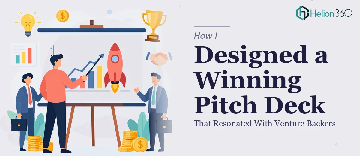
The Situation I Was Staring Down
I had a startup in the sustainable development space — Green Growth Solutions — and a real funding conversation coming up faster than I'd anticipated. The pitch deck needed to cover everything: market analysis, product positioning, competitive landscape, financial projections, and team background. It wasn't a placeholder doc. It was the first impression for venture backers who see dozens of decks a week and move on within seconds if something doesn't land.
The stakes were clear. A deck that looked rough or told the story in the wrong order wasn't just a missed opportunity — it was a signal about how the company operates. I knew the content. I had the structure mapped out. What I didn't have was the time, the design depth, or the specialist experience to turn that outline into something that would actually hold up in a VC room. That recognition came quickly, and it pointed in one obvious direction.
What I Found Out the Moment I Looked Closely
I started researching what a genuinely effective investor pitch deck requires — not a template with placeholder text, but something that actually performs in front of sophisticated investors. What I found made it obvious this wasn't a weekend project.
First, narrative sequencing is everything. Investors don't want a data dump — they want a story that moves from problem to solution to market opportunity to defensibility, in an order that builds conviction. Getting that arc wrong, even with good content, causes the deck to lose the room before the financial slides appear.
Second, the data-heavy slides — market sizing, competitive positioning, and financial projections — each carry their own visual and structural requirements. A market analysis slide needs to distinguish between TAM, SAM, and SOM in a way that's instantly readable, not buried in paragraphs. A financial projection slide requires chart types that communicate trajectory, not just numbers.
Third, visual consistency across a multi-slide deck is harder than it looks. Typography hierarchies, color discipline, and layout grids that stay coherent from the cover slide to the appendix — that's a full design system, not a formatting pass.
What the Work Actually Involves
The right approach to an investor pitch deck with data visualizations starts with a structural audit of the source content. A practitioner working on this maps the narrative arc before touching a single slide — identifying where the problem statement lives, how the solution connects to market demand, and where the financial story needs to arrive relative to the credibility-building sections. For a deck covering market analysis, competitive landscape, product offering, financials, and team, that sequencing work alone can take several iterations. Skipping it and jumping straight to design produces slides that look polished but fail to build the logical momentum investors expect.
Visual mechanics on an investor pitch deck are specific. The work involves a consistent layout grid — typically a 12-column structure — with a type hierarchy of roughly 36pt for slide headlines, 24pt for supporting callouts, and 16pt for body text. Chart selection matters: a TAM/SAM/SOM breakdown reads most clearly as nested circles or a segmented bar, not a table. Financial projections need line or bar charts that show trajectory over a three-to-five year horizon, labeled clearly enough that no one has to ask what the Y-axis represents. Practitioners also enforce a palette of no more than four brand colors across every slide. These decisions require experience to execute correctly the first time — and take significant revision cycles when they're not.
Polish and brand consistency across a full deck is where a lot of first-time attempts fall apart. Every slide — from the cover to the team page to the appendix — needs to share the same spacing rules, icon style, image treatment, and color application. In a deck with twelve to eighteen slides, a single misaligned element or inconsistent font weight registers immediately to a trained eye. Getting this right requires working from a properly built master slide system, not manual slide-by-slide formatting. That master system takes time to architect correctly and even more time to test across different screen sizes and projector outputs.
Why I Brought Helion360 In to Handle It
I didn't attempt to build this myself. I looked at what the work actually required — the narrative architecture, the data visualization decisions, the design system, the financial slide structure — and recognized that trying to learn and execute all of that under deadline pressure would produce something mediocre at best.
Helion360 handled the full project end-to-end. That meant taking my content outline and raw materials, building the narrative sequence, designing every slide from the cover through the financial projections and team page, and delivering a deck that was coherent, brand-consistent, and visually ready for a VC meeting. The turnaround was fast — done in days, not weeks — which mattered because the timeline on a funding conversation doesn't move for a deck that's still in progress.
What made the difference was that this is work Helion360 does at volume. The tooling is already in place, the design decisions are made from experience rather than first principles, and the execution depth that would have taken me weeks to approximate was handled in a fraction of the time.
The Result and What I'd Tell Anyone in the Same Position
What came back was a complete, presentation-ready pitch deck that secured investor interest — cover slide, executive summary, market analysis with clear TAM/SAM/SOM framing, product positioning with USP callouts, a competitive landscape comparison, financial projections with supporting charts, and a team slide that established credibility without overexplaining. The visual system was consistent across every page, the narrative moved in the right direction, and the deck held up to the scrutiny of people who review investment opportunities professionally.
The business outcome was exactly what I needed going into those conversations: a deck that communicated clearly, looked serious, and didn't require me to apologize for the slides before getting to the content.
If you're looking at a similar situation — content ready, timeline real, and the gap between what you have and what investors expect clearly visible — Helion360 is the team to engage. They delivered the full execution fast, and the work reflects the kind of depth that a high-stakes pitch deck actually requires.