

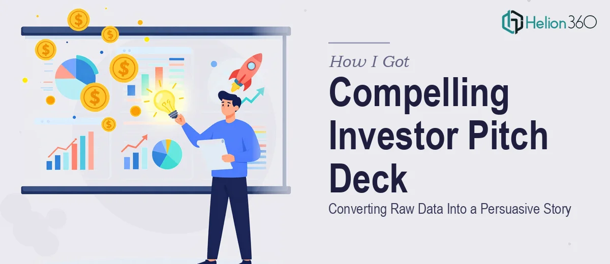
The Situation: Data Ready, Story Nowhere in Sight
We had a funding round coming up and a presentation that was technically complete — numbers, market sizing, product overview, all of it. What we didn't have was something an investor would actually want to sit through. The slides were dense, the flow was disjointed, and the design had clearly been assembled by people (myself included) who were experts in the business, not in communication.
The stakes were real. This wasn't an internal update. This was going in front of people whose job is to evaluate whether your story holds together under pressure. A deck that reads like a data dump — even accurate data — signals that the team hasn't thought clearly about what they're asking for and why. I knew immediately this needed to be rebuilt properly, not patched.
What I Found Out This Work Actually Required
My first instinct was to think this was a design job. Clean it up, make it look professional, done. That framing lasted about ten minutes of research.
What building a strong investor pitch deck actually requires is a combination of narrative architecture and visual execution that's harder to separate than it sounds. The story arc has to do specific work: establish the problem, make the market opportunity feel real, position the product as the credible solution, and build trust in the team — all within 10 to 15 slides. Every slide has a job. If one slide doesn't earn its place, the whole sequence weakens.
On top of that, there's the brand application. Working from a brand book means every design decision — color usage, typography hierarchy, icon language, layout spacing — has to stay inside defined rules while still producing slides that feel dynamic and investor-ready. That's a much tighter constraint than a blank-canvas design project. And doing it across 12 to 15 slides consistently, without drift, is its own technical challenge. I realized quickly this wasn't a weekend project.
What the Work Actually Involves
The right approach to an investor pitch deck with data visualizations starts with a structural audit of the source material. A practitioner working this kind of project goes through every data point and content block and asks: what is this slide supposed to make the investor feel or believe? The standard investor narrative arc — problem, solution, market size, business model, traction, team, ask — isn't a template to fill in. It's a logic sequence, and the placement of each claim within that sequence affects whether it lands. Reorganizing source content into that arc, cutting what doesn't serve it, and writing slide headlines that carry argumentative weight takes focused time and editorial judgment that most people significantly underestimate.
Visual mechanics are where execution complexity compounds quickly. A well-built investor deck typically uses a 12-column layout grid that keeps elements optically consistent across every slide. Typography runs a strict hierarchy — a title weight around 36pt, a body weight around 20–22pt, and supporting labels around 14–16pt — and those scales have to be set once in the master slide and held across all layouts. Chart types need to match data type: a market size story calls for a different visual treatment than a revenue projection or a competitive landscape. The decision a practitioner makes here is to choose the chart form that communicates the relationship, not the one that looks most impressive. Getting that right for every data-heavy slide, while keeping the visual language clean, takes real command of the tool.
Brand application across 10 to 15 slides is more demanding than it looks on paper. Working from a brand book means the palette is fixed — usually a primary set of 3 to 4 colors — but how those colors are allocated across slide backgrounds, accent elements, typography, and data visualizations requires deliberate decisions on every layout. Brand drift in pitch decks, where slides 1 through 5 look cohesive but slides 10 through 15 feel slightly off, is one of the most common quality problems in investor decks built under time pressure. Preventing it requires setting up properly configured master slides and layouts before any content slides are built, not retrofitting consistency at the end. For someone doing this without that foundation already built, the rework cost alone is significant.
Why I Brought Helion360 In to Handle It
I looked at what the project actually required — narrative restructuring, proper slide architecture, brand-accurate visual execution across every layout — and I was clear-eyed about what I didn't have: the time, the specialized tooling, or the presentation design depth to do it right on the timeline we were working with.
Helion360 handled the full project end-to-end. That meant taking our existing data and content, restructuring the narrative arc from the ground up, building a master slide system aligned to our brand book, and executing the full 12-slide deck with proper typography hierarchy, chart selection, and layout consistency. They turned it around quickly — done in days, not the weeks it would have taken me to learn and execute the mechanics properly. What I handed over was a content-heavy file that needed to become a story. What came back was a presentation that was ready to be in front of investors.
The Result and What I'd Tell Anyone in the Same Position
The finished deck was a different object than what we started with. The narrative was tight, the slides each had a clear job, the data was visualized in ways that made the opportunity feel immediate rather than abstract, and the brand application was consistent from the first slide to the last. Walking into that investor meeting, I wasn't nervous about the deck. That's not a small thing.
Anyone looking at a similar situation — existing content that needs to become an investor-ready pitch, a brand book that needs to be applied correctly, and a real deadline — should think honestly about what the work requires before attempting it in-house. If you want it handled end-to-end and delivered fast, Helion360 is the team I'd engage without hesitation.