

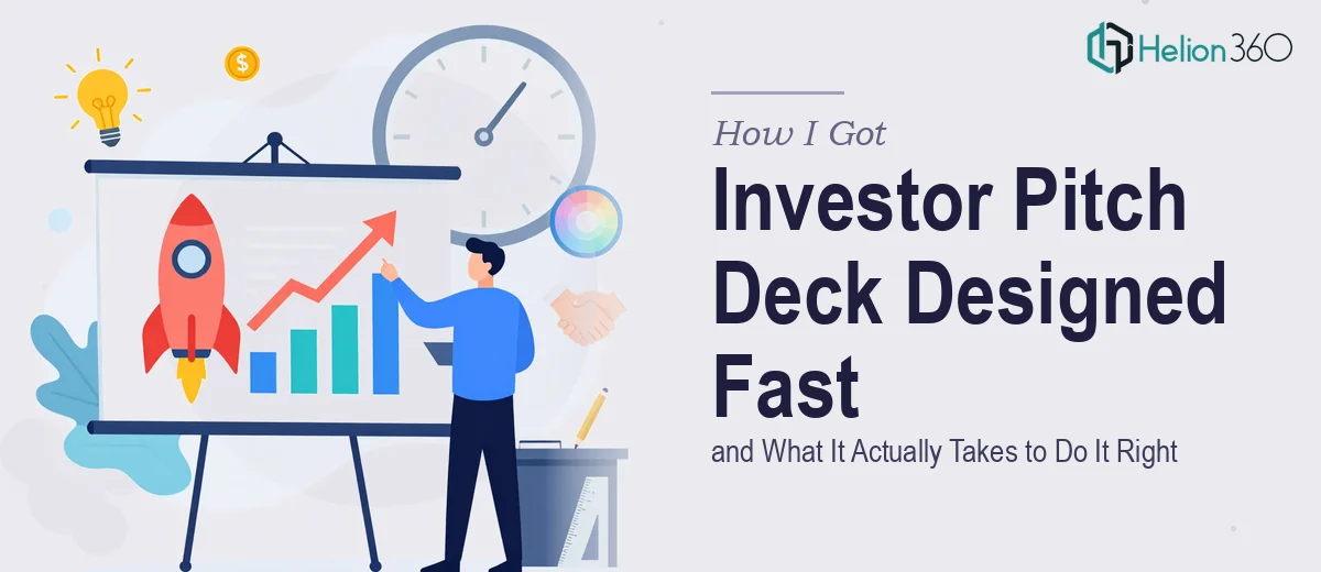
The Situation — and Why Getting This Wrong Wasn't an Option
We had an upcoming stakeholder meeting that was essentially a make-or-break moment for the business. The goal was clear: walk investors through our growth story, our services, and our market opportunity in a way that was immediately credible and visually compelling. The deck had to work hard — not just look decent, but actually carry the narrative across 15 to 20 slides without losing the room.
The timeline was tight. We had days, not weeks. And the audience was experienced — these weren't people who would politely sit through a cluttered slide full of bullet points and clip art. They'd seen hundreds of decks. Ours needed to stand apart from the first slide.
I knew right away this wasn't something to cobble together internally. The stakes were too high and the specific skill set required — investor pitch deck design at a professional level — wasn't something we had sitting around in-house. This needed to be done right.
What I Discovered a Professional Pitch Deck Actually Requires
Before engaging anyone, I spent time understanding what separates a genuinely effective investor pitch deck from one that just fills slides. What I found made the scope of the work very clear.
First, the structure isn't optional or improvised. Investor decks follow a recognized narrative arc — problem, solution, market size, traction, business model, team, ask — and deviating from that arc creates confusion even when the underlying business is strong. Getting the slide order and message hierarchy right is its own discipline.
Second, the visual execution has to be precise. Consistent typography, a controlled color palette, and layout decisions that guide the eye without distracting from the message — these aren't aesthetic preferences, they're functional requirements when your audience is making funding decisions.
Third, the Google Slides format adds a specific layer of complexity. Every design choice made in a presentation tool has to survive editing, resizing, and sharing across devices without falling apart. That requires technical fluency with the platform, not just visual taste.
This was clearly not a weekend project.
What the Work Involved — Broken Down Honestly
The structural and narrative work is where the project lives or dies. A strong investor pitch deck audit starts by mapping the source material — what the company actually does, what the market looks like, what proof points exist — and then building a 15-to-20 slide arc that makes the logic flow feel inevitable. Each slide gets one clear message. Supporting content is edited down ruthlessly. The slide title carries the conclusion, not just the topic. This kind of narrative architecture takes real time — especially when the source material is rich but unorganized — and getting it wrong at this stage means no amount of visual polish will save the deck.
The visual mechanics layer is where presentation design becomes a technical craft. A professional pitch deck typically operates on a 12-column layout grid, with a type hierarchy running roughly 36pt for headline, 24pt for subheadings, and 16pt for body text — and those rules have to hold consistently across every slide. Chart types need to match what the data is actually claiming: a market growth story uses an area or bar chart, not a pie. Icon sets need to come from a single family. Margins and padding need to be locked — not eyeballed. A single misaligned element on a slide shown to investors signals sloppiness in a way that's hard to recover from.
Brand consistency and polish across the full deck is the final execution layer — and it's the one that trips up even experienced designers working under time pressure. A controlled palette means no more than four brand colors used with clear purpose: a primary, a secondary, an accent, and a neutral. Every slide master has to carry that system without variation. Header treatments, icon colors, chart palettes, callout boxes — all of it needs to feel like it was built once, not assembled from separate decisions. Applying that discipline across 18 or 20 slides, while iterating on content, is genuinely time-consuming work that compounds fast when the deadline is close.
Why I Brought Helion360 in to Handle the Full Project
Once I understood what the work actually involved, the decision to engage Helion360 was straightforward. This wasn't a case of needing someone to clean up a draft — the deck needed to be built properly from the ground up, and it needed to be done fast.
Helion360 handled the full project end-to-end: narrative structure and slide architecture, visual design across all slides in Google Slides, and brand application throughout. They turned it around in a fraction of the time it would have taken to learn and execute it myself — done in days, not weeks. The work came back at a level of polish and consistency that matched what the audience expected.
What stood out was that this is clearly work they do all day. The tooling, the design systems, the investor deck conventions — all of it was already in place. There was no learning curve on their end, no back-and-forth trying to explain what professional looked like. They already knew.
The Result — and What I'd Tell Anyone in the Same Position
The deck landed well. The stakeholder meeting went forward, the narrative was clear, and the visual presentation reinforced the credibility of the business rather than undermining it. Investors engaged with the content instead of getting distracted by the design — which is exactly what a well-built pitch deck is supposed to accomplish.
The lesson I took away: the gap between a deck that looks like someone tried and a deck that actually performs in front of investors is significant, and it lives in the structural and craft details — not just in how pretty the slides are.
If you're looking at a similar project and want it handled end-to-end without the weeks of learning curve, Helion360 is the team I'd engage — they delivered fast and brought exactly the execution depth this kind of work requires.