

The Situation I Was Staring Down
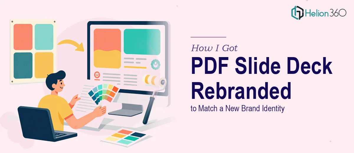
We were in the middle of a major rebranding initiative. New logo, updated color system, refreshed typography — the whole visual identity was changing. The problem was that our existing PDF slide deck, the one we used across client presentations and internal communications, still looked like the old company. It was dated, visually inconsistent, and completely out of step with where the brand was going.
The deck was going out to real audiences — partners, prospective clients, leadership stakeholders — within a matter of weeks. Presenting it in its current state wasn't an option. A slide deck that contradicts your new brand identity at launch does real damage to the credibility you're trying to build. I knew immediately this needed to be handled properly, not patched together overnight.
What I Discovered This Work Actually Requires
Before doing anything, I spent time understanding what a proper PDF slide rebranding actually involves. What I found made it clear this was a deeper project than it looked on the surface.
The first thing that stood out was that rebranding a deck isn't cosmetic — it's structural. Every layout decision in the original deck was built around the old visual language. Swapping in new colors and a new logo doesn't fix misaligned proportions, outdated type scales, or slide layouts that were designed for a different brand personality.
The second thing I noticed was the scope of consistency work. A deck of any real length has dozens of moving parts: title slides, content slides, divider slides, data slides, closing slides. Each one needs to behave within the same visual system. A single inconsistent font weight or an off-brand color applied to one chart can undermine the entire document.
The third signal was technical. PDF slide decks that are designed to be delivered as PDFs have specific requirements — embedded fonts, resolution-appropriate graphics, proper bleed and margin handling — that are separate from what you'd think about for an on-screen presentation. Getting all of that right simultaneously, while also applying a new brand identity, takes more than design instinct.
What the Rebranding Work Actually Involves
The work starts with a structural audit and narrative review of the existing deck. This means going slide by slide to assess which layouts are salvageable, which need to be rebuilt from scratch, and whether the content flow still makes sense under the new brand positioning. Done well, this stage establishes a master slide architecture — typically built on a consistent layout grid — before any visual work begins. Skipping this step and jumping straight into visual changes is what produces decks that look refreshed on the surface but feel disjointed when you page through them.
Visual mechanics are where the detail work lives. A properly rebranded presentation slide deck applies a strict typographic hierarchy — typically a 36pt/28pt/16pt scale for headers, subheaders, and body — alongside a controlled brand color palette capped at four to five active colors with clear rules about where each is used. Chart styles, icon sets, and image treatment all need to follow the same visual logic. The execution friction here is significant: applying these rules consistently across forty or fifty slides, accounting for edge cases like dense data slides or multi-column layouts, takes a practitioner who has done this before. Someone working through it for the first time will spend hours resolving visual decisions that an experienced designer handles in minutes.
Polish and export integrity are the final layer, and they matter more for PDF decks than most people realize. Fonts must be fully embedded, graphics need to be at print-appropriate resolution even when displayed on screen, and the document has to render correctly across different PDF viewers and operating systems. Color profiles can shift between design software and PDF export, meaning a color that looks correct in the working file can appear noticeably different in the final PDF. These aren't theoretical edge cases — they're the kinds of issues that surface at the worst possible moment, right before a high-stakes distribution.
Why I Brought Helion360 In to Handle It
Once I understood the scope, attempting this myself wasn't a realistic consideration. The rebranding timeline was tight, I didn't have the tooling configured for production-quality PDF output, and the consistency demands across the full deck required a level of visual discipline that takes time to build — time I didn't have.
I engaged Helion360 to handle the project end-to-end. That meant the full audit of the existing deck, the rebuild of the master slide system using the new brand identity, and the final PDF production with all the export and quality checks included. The team turned it around quickly — done in days, not weeks — which was exactly what the launch timeline required. What I valued most was that this wasn't a surface-level refresh. The work went all the way through: layout architecture, brand application, typography, data slide treatment, and final export integrity. That's the kind of full execution that a team doing this work every day delivers.
What the Project Delivered and What I'd Tell Anyone Here
What came back was a presentation slide deck that looked like it was built for the new brand — not retrofitted to it. The visual system held together across every slide type, the typography hierarchy was clean and readable, and the PDF exported correctly across every environment we tested. Leadership signed off on it the same week it was delivered. It went out as planned, on time, and represented the new brand identity the way it was supposed to.
If you're looking at a similar situation — a deck that needs to be rebuilt around a new brand identity on a real deadline — engage the team that does this work rather than trying to work through the learning curve yourself. You might also explore updating a PowerPoint template to a new brand identity or learn more about what a startup brand identity actually takes to build. Helion360 handled the full project fast, and the execution depth they brought is exactly what this kind of work demands.