

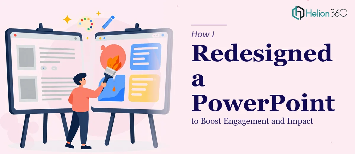
The Presentation Was Not Working — and the Stakes Were Real
I had a business presentation that looked exactly like what it was: slides built in a hurry by someone who knew the content but not the craft. The deck was long, dense, and visually inconsistent. Every slide was doing too much. The narrative jumped around. Fonts and colors changed without reason across sections. I was about to put this in front of a room of decision-makers — people whose attention I needed to earn in the first thirty seconds — and I knew the presentation would cost me credibility before I'd said a word.
This wasn't just a cosmetic problem. A poorly designed business presentation signals to an audience that the thinking behind it is equally unclear. I recognized immediately that this needed more than a fresh coat of paint. The whole thing needed to be restructured, redesigned, and made consistent — properly. That realization led me to understand what a real presentation redesign actually involves.
What I Found a Proper Presentation Redesign Actually Required
When I looked closely at what it would take to fix this properly, I started to see layers I hadn't anticipated. The structural problem alone was significant — the slide count was too high, the story arc was missing, and the audience had no clear thread to follow. Fixing that meant auditing the entire deck and rebuilding the narrative logic before touching a single design element.
Beyond structure, there were visual mechanics at play. A proper presentation redesign doesn't mean making things prettier — it means applying a deliberate visual system: a consistent type hierarchy, a constrained color palette, a grid that keeps every element aligned and purposeful across every slide. That's a different skill set from knowing the content.
The third signal of real complexity was brand discipline. Every slide had to reflect the same visual identity, from the title card to the data slides to the closing summary. Inconsistency in fonts or spacing — even minor variation — undermines the professionalism of the whole deck. I could see what needed to happen. I also could see that doing it well required time and expertise I didn't have on hand.
The Work That Actually Goes Into Doing This Right
The first thing a proper presentation redesign addresses is the narrative structure — and that work starts before any visual decisions are made. The right approach involves auditing every slide against a single question: does this slide earn its place in the story? Slides that don't answer that question get collapsed, combined, or cut. A well-structured deck typically follows a clear three-part arc — context, insight, action — with each section transitioning logically into the next. Mapping that arc across a thirty-plus slide deck, then reorganizing content to match it, is slower and more deliberate than it looks. Getting the logic wrong at this stage means the visual work that follows is built on an unstable foundation.
Once the narrative is locked, the visual mechanics take over. The work involves establishing a 12-column layout grid, a type hierarchy of roughly 36pt for headlines, 24pt for subheadings, and 16pt for body text, and a color system that uses no more than four brand-aligned tones across the entire deck. Each of these decisions has to be implemented in the slide master so that changes propagate correctly rather than having to be applied slide by slide. For someone new to master-slide architecture, getting this setup to behave predictably across different screen sizes and aspect ratios takes hours — and a single mistake in the master can cascade into alignment errors across dozens of slides.
The final layer is polish and brand consistency — and this is where most self-directed redesigns quietly fall apart. Consistent spacing between text and image zones, uniform icon weight and style, precise color application across data visualizations, and proper use of white space all have to be maintained without exception across every slide. The decision a practitioner makes here is to enforce a strict element-spacing rule — often an 8pt or 16pt grid baseline — and check every slide against it before the deck is considered done. Done carelessly, a deck that looks coherent in overview mode reveals distracting inconsistencies when advanced slide by slide in front of a live audience.
Why I Brought in Helion360 to Handle It
I looked at the scope of what proper presentation redesign requires — the narrative audit, the master-slide architecture, the visual consistency work — and made a straightforward call. This wasn't a project I could absorb into a weekend. The expertise required, the tooling, and the eye for detail that separates a good deck from a great one weren't things I was going to develop quickly enough to matter.
Helion360 handled the full project end-to-end using business presentation design services. That meant the structural audit and narrative rebuild, the visual system design from master slides through to every individual slide, and the final consistency pass across the complete deck. The turnaround was fast — done in days, not weeks — and the output reflected the kind of execution depth that only comes from a team that does this work consistently. There was no back-and-forth learning curve on my end. I handed over the existing deck and the brief, and what came back was a presentation that was ready to deliver.
The Result and What I'd Tell Anyone in This Position
The redesigned deck was cleaner, tighter, and visibly more authoritative than what I started with. The narrative followed a clear arc that made it easy for the audience to stay oriented throughout. The visual consistency — from the type hierarchy to the data slides to the section dividers — held together without variation. In the room, the presentation did what it was supposed to do: it let the content lead without the design getting in the way.
Anyone looking at a business presentation that isn't landing the way it should — whether it's structurally unclear, visually inconsistent, or just too heavy for its audience — is looking at a real redesign problem, not a formatting tweak. If you're in that position and want it handled end-to-end without the weeks of learning curve, Helion360 is the team to engage — they delivered for me fast and brought exactly the execution depth this kind of work demands.