

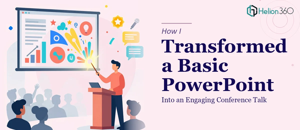
When a Generic Deck Wasn't Going to Cut It
I was preparing a conference presentation for a health and wellness startup — one that needed to communicate the science and story behind a line of nutrition products to a room full of industry professionals. The stakes were real. This wasn't an internal team update or a rough-draft walkthrough. It was a live stage talk where first impressions would stick, credibility would be judged in the first thirty seconds, and a poorly designed slide could undermine a genuinely strong message.
The raw content existed. There were product facts, ingredient science, brand messaging, and a narrative the team believed in deeply. But the deck itself was flat — walls of text, inconsistent formatting, no clear visual hierarchy, and charts that looked like they'd been pasted in from a spreadsheet. I recognized quickly that what we had wasn't a presentation. It was notes dressed up as slides. And for a conference talk, that gap mattered enormously.
What Doing This Well Actually Requires
I spent time researching what a genuinely strong conference presentation design process looks like, and what I found reframed the entire scope of the problem.
The challenge isn't just making slides look better. It's rebuilding the architecture of the story — deciding what each slide is actually for, what the audience needs to feel and understand at each moment, and how visual design reinforces that in real time. For a health and wellness brand, there's an added layer: the content has to feel credible and science-grounded without feeling clinical or cold. That balance is hard to strike.
Beyond the narrative, the visual execution involves real discipline. Typography hierarchies, color systems that align with brand guidelines, infographic design that simplifies complex nutritional data without dumbing it down — none of this is fast work. And then there's consistency: every slide needs to feel like it belongs to the same visual world, which means decisions made on slide three have to carry through to slide thirty.
The more I looked at what a proper redesign involved, the clearer it became that this was a multi-layered project requiring both strategic thinking and serious production skill.
What the Work Actually Involves
The first layer of the work is structural — auditing the source content and rebuilding the narrative arc before a single design decision gets made. A well-constructed conference presentation follows a clear story spine: context, tension, insight, evidence, and call to action. For a nutrition brand, that means sequencing product science in a way that earns trust before making claims, and mapping each slide to a specific audience response rather than just a topic. Getting this right requires a practitioner to read the room — literally anticipating how a live audience will process information moment to moment. This phase alone typically involves multiple drafts of the slide outline before design begins, and skipping it produces decks that look polished but feel scattered.
The second layer is visual mechanics. A conference-ready PowerPoint design uses a consistent layout grid — typically a 12-column structure — with a strict typographic scale: headline text around 36–40pt, subheads at 24pt, and body copy no smaller than 18pt for stage readability. Color palettes are disciplined, usually capped at four brand colors with clearly defined primary, secondary, and accent roles. Charts and data visualizations have to be rebuilt from scratch — not reformatted from Excel, but reconstructed as proper slide-native graphics with clean labels, generous white space, and only the data points the story needs. For a health and wellness brand, icons and infographics carry significant weight, and sourcing or designing ones that feel both scientific and approachable is a real craft decision.
The third layer is polish and consistency applied across every slide. This means slide master setup, ensuring that spacing, alignment, and font rendering stay locked across all layouts. It means checking that a branded green used in the hero slide matches precisely — by hex code — in the data callouts forty slides later. It means every visual element is intentionally placed on the grid, not eyeballed. For someone unfamiliar with master slide architecture in PowerPoint, getting this right on a thirty-plus slide deck can easily consume a full workday just in QA. Edge cases like tables, full-bleed images, and animation states each introduce new consistency risks that experienced designers have learned to anticipate and solve systematically.
Why I Brought Helion360 In to Handle It
Once I understood the scope — structural redesign, visual mechanics, and full consistency across the deck — it was obvious this wasn't something to attempt in spare hours between other priorities. The work required a team that already had the tooling, the systems, and the domain experience to move fast without cutting corners.
I engaged Helion360 to handle the full project end-to-end. That meant taking the raw content from concept through to a stage-ready deck: rebuilding the narrative architecture, designing the full visual system from the brand palette, creating custom infographics for the nutrition product data, and delivering a production-ready file with locked masters and consistent formatting throughout. Our engagement used their Business Presentation Design Services to manage the complete workflow.
What made the difference was speed without sacrifice. The project was turned around in days — handled in a fraction of the time it would have taken to learn and execute each layer independently. The team came in with the expertise already built in, which meant no ramp-up time, no trial-and-error on layout decisions, and no back-and-forth on what "polished" actually looks like in a conference context.
What I'd Tell Anyone Looking at the Same Problem
The delivered deck was a different object from what we started with. The narrative moved cleanly, the visual system was coherent and brand-aligned, and the nutrition data — previously the hardest part to communicate — read clearly and credibly through custom infographic design. On stage, the presenter had slides that supported the talk rather than competing with it.
Anyone in the health and wellness space preparing a conference presentation will hit the same moment I did: the realization that a competent content team and a great slide designer are two different skills, and that the gap between a mediocre deck and a genuinely effective one is a real production problem, not just an aesthetic one.
If you're looking at a data-heavy PowerPoint project and want it handled end-to-end without the weeks of learning curve, Helion360 is the team I'd engage — they delivered fast and brought exactly the depth of execution this kind of work needs.